Unlock a world of possibilities! Login now and discover the exclusive benefits awaiting you.
- Qlik Community
- :
- Forums
- :
- Analytics & AI
- :
- Products & Topics
- :
- Visualization and Usability
- :
- How to Create Scatter Plot
- Subscribe to RSS Feed
- Mark Topic as New
- Mark Topic as Read
- Float this Topic for Current User
- Bookmark
- Subscribe
- Mute
- Printer Friendly Page
- Mark as New
- Bookmark
- Subscribe
- Mute
- Subscribe to RSS Feed
- Permalink
- Report Inappropriate Content
How to Create Scatter Plot
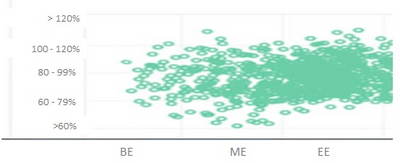
How to create Scatter Plot with attached data. Output : Count of Emp in Plot area (Bubbles)
Thanks
- Mark as New
- Bookmark
- Subscribe
- Mute
- Subscribe to RSS Feed
- Permalink
- Report Inappropriate Content
Hi Sona,
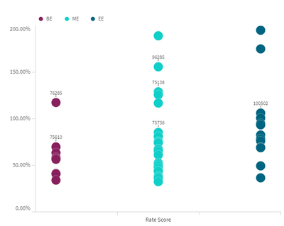
I miss what determines the horizontal spread of values inside the Ratio Score. I was able to create scatter plot, but without mentioned horizontal spread of values inside each Ratio Score segment.
BR
m
- Mark as New
- Bookmark
- Subscribe
- Mute
- Subscribe to RSS Feed
- Permalink
- Report Inappropriate Content
Qlik Sense actually has 2 chart types that are like what you are showing.
Scatter Plots accept 1 Dimension and 2 Measures. So each dot is Something and the X Axis shows 1 of Something's Values and the Y Axis shows another of somethings Values.
A Grid Plot looks similar but it accepts 2 Dimensions and only 1 Measure.
Both chart types would allow you to set the SIZE of the dots based on another Measure and the COLOR of the dots on yet another Measure.
- Mark as New
- Bookmark
- Subscribe
- Mute
- Subscribe to RSS Feed
- Permalink
- Report Inappropriate Content
Hi,
Can you share that QVF? How you are using this data for the scatter plot?
Thanks.
- Mark as New
- Bookmark
- Subscribe
- Mute
- Subscribe to RSS Feed
- Permalink
- Report Inappropriate Content
Hi Mato,
Can you share that QVF? How you are using this data for the scatter plot?
Thanks.
- Mark as New
- Bookmark
- Subscribe
- Mute
- Subscribe to RSS Feed
- Permalink
- Report Inappropriate Content
Hi Sona,
script:
tab:
LOAD
"Emp. Code",
dual("Rate Score",pick(match("Rate Score",'BE','ME','EE'),1,2,3)) as "Rate Score",
Ratio
FROM [lib://XXXXXXX/Scatter Chart.xlsx]
(ooxml, embedded labels, table is Sheet1);
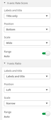
Visualization:
BR
m


