Unlock a world of possibilities! Login now and discover the exclusive benefits awaiting you.
- Qlik Community
- :
- Forums
- :
- Analytics & AI
- :
- Products & Topics
- :
- Visualization and Usability
- :
- How to change the font and info bubble of pie char...
- Subscribe to RSS Feed
- Mark Topic as New
- Mark Topic as Read
- Float this Topic for Current User
- Bookmark
- Subscribe
- Mute
- Printer Friendly Page
- Mark as New
- Bookmark
- Subscribe
- Mute
- Subscribe to RSS Feed
- Permalink
- Report Inappropriate Content
How to change the font and info bubble of pie chart? [Qlik Sense]
Hi,
I am using Qlik sense pie chart to visualize some of my table data. My table data as below:
| GeoName | GeoDocumentWorkflowStage |
|---|---|
| India | Completed |
| Japan | Completed |
| Africa | Incomplete |
| USA | Incomplete |
| China | Completed |
| ANZ | Competed |
| ASGR | Incomplete |
My chart details are as below:
Dimension :
GeoDocumentWorkflowStage
Measure:
if(GeoDocumentWorkflowStage='Completed',Count(DISTINCT{$<GeoDocumentWorkflowStage = {"Completed"}>} [GeoName]),
Count(DISTINCT{$<GeoDocumentWorkflowStage = {"Incomplete"}>} [GeoName]))
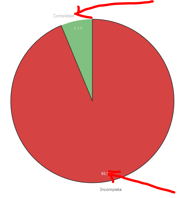
In below chart image you can see, the font of Completed, Incomplete and share part. I want to change the format of font as bold and font size should be little bigger.
Can anyone suggest how can I do that?
Thanks
Dilip Solanki
Dilip Solanki
- Tags:
- qlik sense pie chart
- Mark as New
- Bookmark
- Subscribe
- Mute
- Subscribe to RSS Feed
- Permalink
- Report Inappropriate Content
You just can't. Not with the native pie chart object.
Maybe you'll find an extension that allow this.
Please take a look here:
- Mark as New
- Bookmark
- Subscribe
- Mute
- Subscribe to RSS Feed
- Permalink
- Report Inappropriate Content
It's out of the box functionality. It's not possible. That's what i think.
Thank you!
- Mark as New
- Bookmark
- Subscribe
- Mute
- Subscribe to RSS Feed
- Permalink
- Report Inappropriate Content
Not possible with native pie chart.
may possible by styling with the help of widgets/extensions.
or try looking for extensions in qlik Branch.