Unlock a world of possibilities! Login now and discover the exclusive benefits awaiting you.

- Qlik Community
- :
- Forums
- :
- Analytics & AI
- :
- Products & Topics
- :
- Visualization and Usability
- :
- How to create a bar chart with multiple calculated...
- Subscribe to RSS Feed
- Mark Topic as New
- Mark Topic as Read
- Float this Topic for Current User
- Bookmark
- Subscribe
- Mute
- Printer Friendly Page

- Mark as New
- Bookmark
- Subscribe
- Mute
- Subscribe to RSS Feed
- Permalink
- Report Inappropriate Content
How to create a bar chart with multiple calculated dimensions?
I have a bar chart where I'm using a dimensions like this:
class(aggr(FirstSortedValue(value, -time), category), 5)
and the measure is
count(distinct category)
This chart looks like I expect
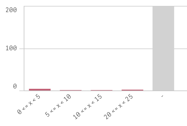
Now I want to add a second bar to this chart with a dimension like this:
class(aggr(FirstSortedValue(value2, -time), category), 5)
Charting the second dimension on its own also looks like I expect:
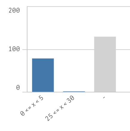
But using both of those dimensions in one chart looks nothing like I expect:
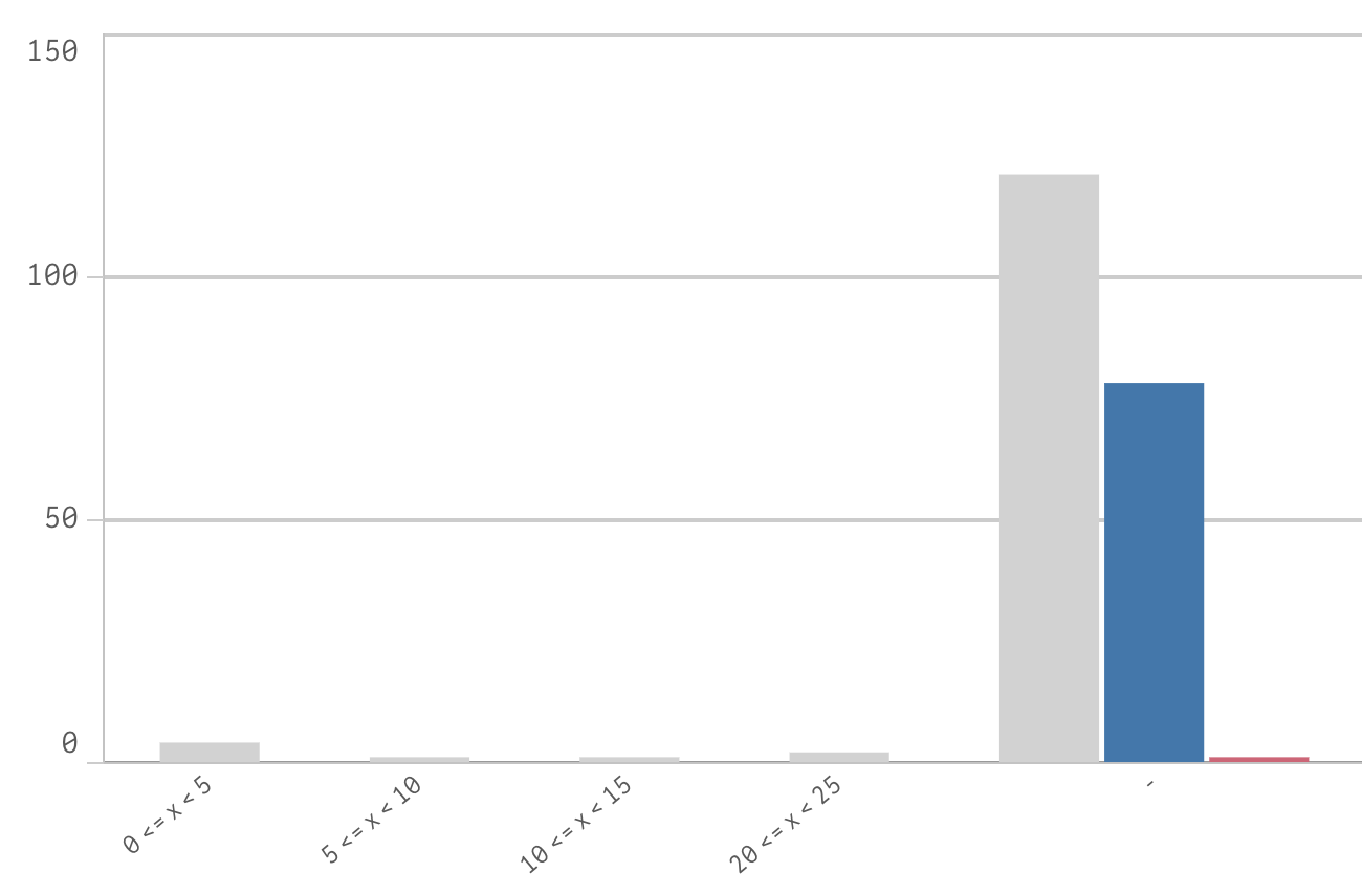
What I would like to see is the two bars from each of the individual charts next to each other.

 swuehl
- Mark as New
- Bookmark
- Subscribe
- Mute
- Subscribe to RSS Feed
- Permalink
- Report Inappropriate Content
Instead of using two fields value and value2, use a CROSSTABLE LOAD approach to create a single value_combined field and value_type field, creating two records for each input record.
Now use a single calculated dimension using the new fields
class(aggr(FirstSortedValue(value_combined, -time), category, value_type), 5)
and two expressions:
=Count({<value_type = {'value'}>}DISTINCT category)
=Count({<value_type = {'value2'}>}DISTINCT category)