Unlock a world of possibilities! Login now and discover the exclusive benefits awaiting you.
Announcements
Now accepting applications for the Qlik Luminary and Partner Ambassador Programs: Apply by July 6!
- Qlik Community
- :
- Forums
- :
- Analytics & AI
- :
- Products & Topics
- :
- Visualization and Usability
- :
- How to have a continuous numeric x-axis?
Options
- Subscribe to RSS Feed
- Mark Topic as New
- Mark Topic as Read
- Float this Topic for Current User
- Bookmark
- Subscribe
- Mute
- Printer Friendly Page
Turn on suggestions
Auto-suggest helps you quickly narrow down your search results by suggesting possible matches as you type.
Showing results for
Not applicable
2016-06-15
03:38 AM
- Mark as New
- Bookmark
- Subscribe
- Mute
- Subscribe to RSS Feed
- Permalink
- Report Inappropriate Content
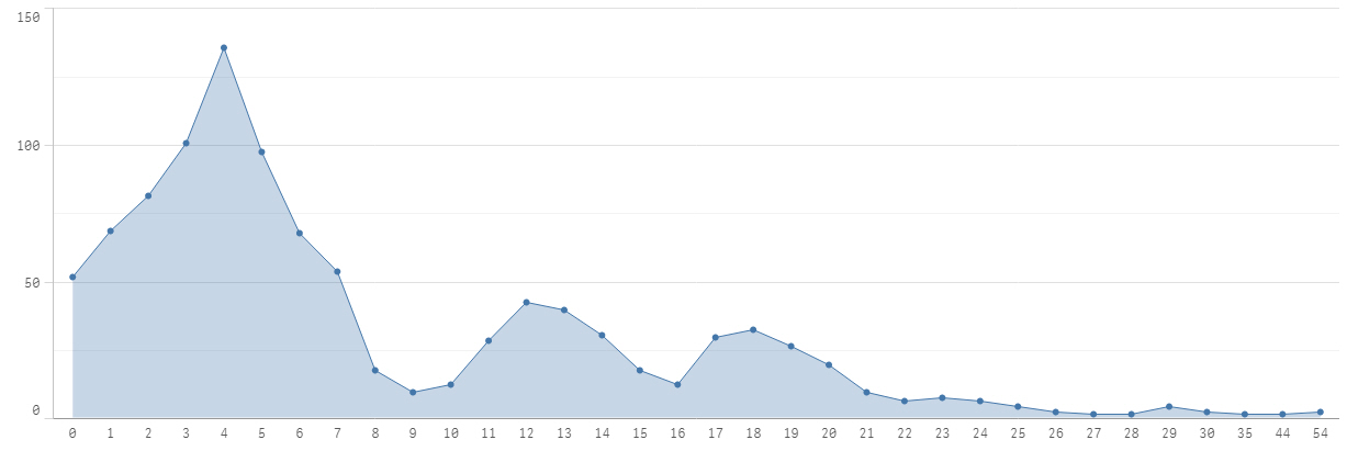
How to have a continuous numeric x-axis?
My data set contains two columns, where the first column should be the x-axis. An short excerpt below: The numbers jump where there exists no records found between 30 and 35 for example.
| 27 | 1 |
| 28 | 1 |
| 29 | 4 |
| 30 | 2 |
| 35 | 1 |
| 44 | 1 |
| 54 | 2 |
I was able to do this chart in Excel where the X-axis respects the gaps in value and showed the numeric in a linear fashion.
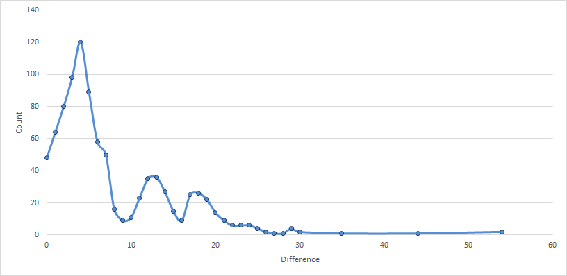
I was unable to achieve the same in Qliksense and the gaps between the dots do not respect the gaps in values. How can i achieve the same as in Excel?
617 Views
0 Replies