Unlock a world of possibilities! Login now and discover the exclusive benefits awaiting you.
- Qlik Community
- :
- Forums
- :
- Analytics & AI
- :
- Products & Topics
- :
- Visualization and Usability
- :
- How to use different filters on X and Y in a scatt...
- Subscribe to RSS Feed
- Mark Topic as New
- Mark Topic as Read
- Float this Topic for Current User
- Bookmark
- Subscribe
- Mute
- Printer Friendly Page
- Mark as New
- Bookmark
- Subscribe
- Mute
- Subscribe to RSS Feed
- Permalink
- Report Inappropriate Content
How to use different filters on X and Y in a scatter plot?
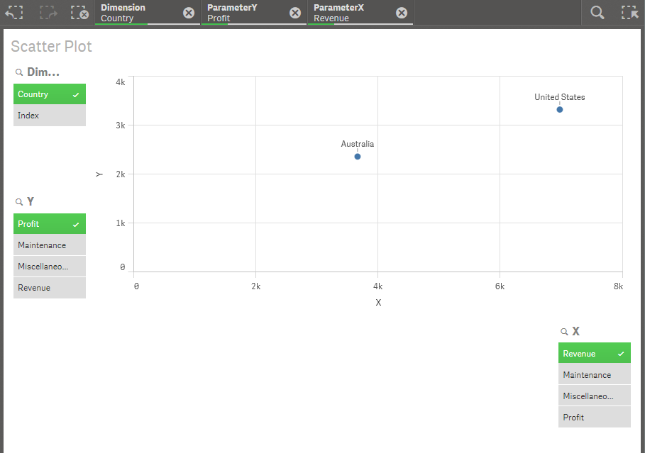
I have my data organised like shown below. I have previously used Excel for this type of evaluation, but am looking at Qlik Sense for another way of evaluating data. I am also looking at QlikView. The table is obviously significantly larger than shown below with a couple of hundred parameters. In Excel I used a slicer and pivot table to select the data and a dynamic scatter chart to display the selected data.
Index | Country | Parameter | Amount ($) |
1 | Australia | Revenue | 3656 |
2 | Australia | Profit | 2365 |
3 | Australia | Maintenance | 500 |
4 | Australia | Miscellaneous Expenses | 632 |
5 | United States | Revenue | 6965 |
6 | United States | Profit | 3326 |
X data could be extracted by: Value in Amount column (Filtered by Parameter)
Y data could be extracted by: Value in Amount column (Filtered by different Parameter to X)
Country could be used as a global filter for both axes.
Is it possible to prepare a Scatter plot for data in this format?
Thanks in advance for your help!
- Tags:
- filter
- scatterchart
- « Previous Replies
-
- 1
- 2
- Next Replies »
- Mark as New
- Bookmark
- Subscribe
- Mute
- Subscribe to RSS Feed
- Permalink
- Report Inappropriate Content
Hang on ... found a solution to also have semi-dynamic dimension selection in Qlik Sense:
- « Previous Replies
-
- 1
- 2
- Next Replies »