Unlock a world of possibilities! Login now and discover the exclusive benefits awaiting you.
Announcements
Qlik and ServiceNow Partner to Bring Trusted Enterprise Context into AI-Powered Workflows. Learn More!
- Qlik Community
- :
- Forums
- :
- Analytics & AI
- :
- Products & Topics
- :
- Visualization and Usability
- :
- How to use stacked
Options
- Subscribe to RSS Feed
- Mark Topic as New
- Mark Topic as Read
- Float this Topic for Current User
- Bookmark
- Subscribe
- Mute
- Printer Friendly Page
Turn on suggestions
Auto-suggest helps you quickly narrow down your search results by suggesting possible matches as you type.
Showing results for
Not applicable
2016-02-05
05:51 AM
- Mark as New
- Bookmark
- Subscribe
- Mute
- Subscribe to RSS Feed
- Permalink
- Report Inappropriate Content
How to use stacked
Hi guys,
could any one help me how to use stacked .
I want to create a chart like Experience and languages.
I want to similar like which one I attached.
Please find the attachment.
Kind Regards,
Abhishek Singh
511 Views
1 Reply
Master
2016-02-05
07:17 AM
- Mark as New
- Bookmark
- Subscribe
- Mute
- Subscribe to RSS Feed
- Permalink
- Report Inappropriate Content
Hi
You must use qlik view for those kind of chart
If you use Qliksense you can make it with Bar chart for experience
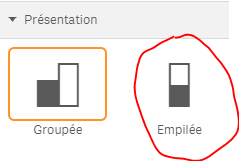
use stacked option in presentation menu :
for language use horizontal gauge with segments
attached value to different kind of language 1 for english 2 for russian etc
hope it helps
Bruno
465 Views