Unlock a world of possibilities! Login now and discover the exclusive benefits awaiting you.
- Qlik Community
- :
- Forums
- :
- Analytics & AI
- :
- Products & Topics
- :
- Visualization and Usability
- :
- Line chart clarification
- Subscribe to RSS Feed
- Mark Topic as New
- Mark Topic as Read
- Float this Topic for Current User
- Bookmark
- Subscribe
- Mute
- Printer Friendly Page
- Mark as New
- Bookmark
- Subscribe
- Mute
- Subscribe to RSS Feed
- Permalink
- Report Inappropriate Content
Line chart clarification
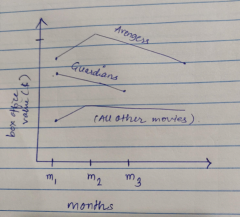
So my question is I want to use the line chart and i have fields like monthnumber, moviename and revenue I have filter for movie I need to compare the first six month revenue for movie so how my visualization has to be means if i dont click any movie name it has to show the average of all movies in seperate line and if i choose single or multiple movies I need each sperate line for all selected movies as well as one for avg of all non selected movies.
- Mark as New
- Bookmark
- Subscribe
- Mute
- Subscribe to RSS Feed
- Permalink
- Report Inappropriate Content
To achieve this in a Qlik Sense line chart, you can follow these steps:
1. Dimension
Use monthnumber as the dimension for the X-axis.
2. Measures
You’ll need two types of measures:
A. Revenue Line for Each Selected Movie
Use this expression to get revenue for selected movies:
Sum({<moviename = P(moviename)>} revenue)This ensures that when movies are selected, each selected movie gets its own line (you should enable the "moviename" field as a second dimension or use a Trellis container to split them).
B. Average Revenue for All Non-Selected Movies (or All Movies if None Selected)
This one is trickier. Use the Alt function with set analysis to detect if a selection exists and return the appropriate result:
Avg(Aggr(
    Sum({<moviename = E(moviename)>} revenue),
    moviename, monthnumber
))
Explanation:
E(moviename) = excludes selected movies → gives you non-selected movies
If no selection is made, E(moviename) returns all → behaves as "average of all"
If you want a fallback that handles the "no selection" case more explicitly, you can use a conditional expression:
Avg(
  Aggr(
    If(GetSelectedCount(moviename) > 0,
       Sum({<moviename = E(moviename)>} revenue),
       Sum(revenue)
    ),
    moviename, monthnumber
  )
)
Final Notes:
Use "Line chart" with monthnumber as X-axis and use two measures: the movie line(s) and the average line.
If you want each movie to show as a separate line when selected, you can use a combo of monthnumber and moviename as dual dimensions or use Trellis.
Make sure the legend is enabled so users can distinguish between selected movies and the average line.
- Mark as New
- Bookmark
- Subscribe
- Mute
- Subscribe to RSS Feed
- Permalink
- Report Inappropriate Content
I have tried this approach but at the end of result I am not getting the average of non-selected movies instead I am getting sperate line for all movies. Is there any alternative chart or approach to achieve this?
- Mark as New
- Bookmark
- Subscribe
- Mute
- Subscribe to RSS Feed
- Permalink
- Report Inappropriate Content
- Mark as New
- Bookmark
- Subscribe
- Mute
- Subscribe to RSS Feed
- Permalink
- Report Inappropriate Content