Unlock a world of possibilities! Login now and discover the exclusive benefits awaiting you.
Announcements
Talend Cloud AWS EU Scheduled Outage: Starting Tues 26 May 21:00 CEST with expected completion Wed 27 May 01:00 CEST
- Qlik Community
- :
- Forums
- :
- Analytics & AI
- :
- Products & Topics
- :
- Visualization and Usability
- :
- Linear graph fields
Options
- Subscribe to RSS Feed
- Mark Topic as New
- Mark Topic as Read
- Float this Topic for Current User
- Bookmark
- Subscribe
- Mute
- Printer Friendly Page
Turn on suggestions
Auto-suggest helps you quickly narrow down your search results by suggesting possible matches as you type.
Showing results for
Anonymous
Not applicable
2018-10-23
12:41 PM
- Mark as New
- Bookmark
- Subscribe
- Mute
- Subscribe to RSS Feed
- Permalink
- Report Inappropriate Content
Linear graph fields
Hello everyone,
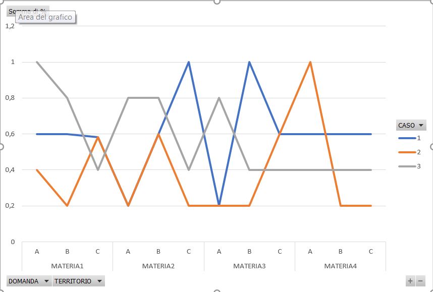
I have a question about the chart attached below.
I would like to make the same excel chart in Qlik sense.
The problem is I can’t visualize two fields at same time in the x axis.
In particular, I can’t visualize jointly “ABC” and "Materia1","Materia2","Materia3","Materia4".
May you explain how can i do that?
Thank you very much for the suggestions
- Tags:
- linear graph
444 Views
1 Reply
MVP
2018-12-13
07:45 AM
- Mark as New
- Bookmark
- Subscribe
- Mute
- Subscribe to RSS Feed
- Permalink
- Report Inappropriate Content
Hi, you can create a dimension using both fields to get similar result, ie:
MaterialField &'-'& ABCField
MaterialField &'-'& ABCField
397 Views