Unlock a world of possibilities! Login now and discover the exclusive benefits awaiting you.
- Qlik Community
- :
- Forums
- :
- Analytics & AI
- :
- Products & Topics
- :
- Visualization and Usability
- :
- Mini chart creation on pivot table in qliksense
- Subscribe to RSS Feed
- Mark Topic as New
- Mark Topic as Read
- Float this Topic for Current User
- Bookmark
- Subscribe
- Mute
- Printer Friendly Page
- Mark as New
- Bookmark
- Subscribe
- Mute
- Subscribe to RSS Feed
- Permalink
- Report Inappropriate Content
Mini chart creation on pivot table in qliksense
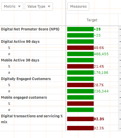
In the above table I have to show %s where the value type is % and also number should be shown where the value type is #
And also should shown the minichart with the values
and I've written the expression like below"
repeat('█', rangemax(rangemin( ceil(((column(1)/column(2))-1)*2.5),10),0)
) &Target
But I could not see any difference in the bars and each bar is constant
Could some one help on this?
- Mark as New
- Bookmark
- Subscribe
- Mute
- Subscribe to RSS Feed
- Permalink
- Report Inappropriate Content
I don't know if it's possible with native table object, I guess no.
anyway take a look at Vizlib extension
Follow me on my LinkedIn | Know Gamma Informatica at gammainformatica.it
- Mark as New
- Bookmark
- Subscribe
- Mute
- Subscribe to RSS Feed
- Permalink
- Report Inappropriate Content
We are not supposed to use Vizlib as its a paid extension
- Mark as New
- Bookmark
- Subscribe
- Mute
- Subscribe to RSS Feed
- Permalink
- Report Inappropriate Content
- Mark as New
- Bookmark
- Subscribe
- Mute
- Subscribe to RSS Feed
- Permalink
- Report Inappropriate Content
Hi,
This feature is available in Qlik Sense starting for June 2020 release
You can take a look at this video that shows you how to work with this feature
- Mark as New
- Bookmark
- Subscribe
- Mute
- Subscribe to RSS Feed
- Permalink
- Report Inappropriate Content
@Giuseppe_Panella This new feature in June 2020 is only available on the table object, not the pivot-table object ... or do I miss something here?
- Mark as New
- Bookmark
- Subscribe
- Mute
- Subscribe to RSS Feed
- Permalink
- Report Inappropriate Content
Hi @stefanwalther , you are right, It's not available in Pivot table!