Unlock a world of possibilities! Login now and discover the exclusive benefits awaiting you.
- Qlik Community
- :
- Forums
- :
- Analytics & AI
- :
- Products & Topics
- :
- Visualization and Usability
- :
- Qlik Sense bar chart
- Subscribe to RSS Feed
- Mark Topic as New
- Mark Topic as Read
- Float this Topic for Current User
- Bookmark
- Subscribe
- Mute
- Printer Friendly Page
- Mark as New
- Bookmark
- Subscribe
- Mute
- Subscribe to RSS Feed
- Permalink
- Report Inappropriate Content
Qlik Sense bar chart
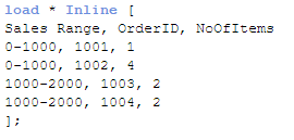
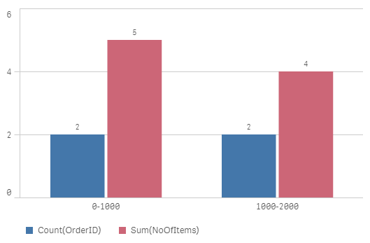
My data has fields: OrderId (Order1, Order2,...), SalesRange (0-1000,1000-2000,...),and NumberOfItem (1,2,...). I want to create a bar chart or whatever with x-axis: SalesRange, y-axis: NumberOfItem and with Count(OrderId) as measure. Is there a chart fits this requirement?
Thank you for helping in advance!
- Mark as New
- Bookmark
- Subscribe
- Mute
- Subscribe to RSS Feed
- Permalink
- Report Inappropriate Content
I think what you want to visualize can be rephrased as "Distribution of OrderID per 2 dimensions: SalesRange and NumberOfItem". If this is the case, then you can plot this distribution in a 2-dimensional heatmap.
Heatmap is not a native visualization object of Qlik Sense. You can use extension "Qlik Sense Extension 2 Dimensional Heatmap" at https://github.com/ralfbecher/QlikSense_Extension_2DimHeatmap
- Mark as New
- Bookmark
- Subscribe
- Mute
- Subscribe to RSS Feed
- Permalink
- Report Inappropriate Content
I'd try scatter plot.
- Mark as New
- Bookmark
- Subscribe
- Mute
- Subscribe to RSS Feed
- Permalink
- Report Inappropriate Content
Don't know what is the problem to do that. Can you please explain a little more?