Unlock a world of possibilities! Login now and discover the exclusive benefits awaiting you.
Announcements
Qlik and ServiceNow Partner to Bring Trusted Enterprise Context into AI-Powered Workflows. Learn More!
- Qlik Community
- :
- Forums
- :
- Analytics & AI
- :
- Products & Topics
- :
- Visualization and Usability
- :
- QlikSense Line Chart X/Y Axis Scales based on expr...
Options
- Subscribe to RSS Feed
- Mark Topic as New
- Mark Topic as Read
- Float this Topic for Current User
- Bookmark
- Subscribe
- Mute
- Printer Friendly Page
Turn on suggestions
Auto-suggest helps you quickly narrow down your search results by suggesting possible matches as you type.
Showing results for
Contributor
2020-03-02
08:32 AM
- Mark as New
- Bookmark
- Subscribe
- Mute
- Subscribe to RSS Feed
- Permalink
- Report Inappropriate Content
QlikSense Line Chart X/Y Axis Scales based on expression
Hi
I have an issue with a line graph in QlikSense.
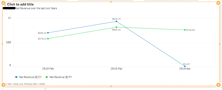
I have a line graph which shows the previous year measure and current year measure by month and year.
There is a measure toggle where the user can select 3 measures.
The Y Axis on the line chart shows the incorrect scale.
Find the image.
If you take your focus to the one for '2019-Apr' which shows the measure for the current year to be 1.1 million, the line is misrepresented.
How do I fix this in the Appearance settings for this graph?
- Tags:
- expression
776 Views
0 Replies
