Unlock a world of possibilities! Login now and discover the exclusive benefits awaiting you.

- Qlik Community
- :
- Forums
- :
- Analytics & AI
- :
- Products & Topics
- :
- Visualization and Usability
- :
- Qliksense line graph
Options
- Subscribe to RSS Feed
- Mark Topic as New
- Mark Topic as Read
- Float this Topic for Current User
- Bookmark
- Subscribe
- Mute
- Printer Friendly Page
Turn on suggestions
Auto-suggest helps you quickly narrow down your search results by suggesting possible matches as you type.
Showing results for

 quentoncarr
Contributor
2018-04-05
08:52 AM
- Mark as New
- Bookmark
- Subscribe
- Mute
- Subscribe to RSS Feed
- Permalink
- Report Inappropriate Content
Qliksense line graph
Hi,
I'm trying to create a line graph which shows (avg lead time) on the x axis and count of order lines which have that lead time on the Y axis. Is there a way to do this in Qliksense?
752 Views
1 Reply

 eliran
Creator III
2018-04-05
09:03 AM
- Mark as New
- Bookmark
- Subscribe
- Mute
- Subscribe to RSS Feed
- Permalink
- Report Inappropriate Content
Hi Quenton,
I'm not sure I fully understand your question, you're asking for avg to serve as a dimension, and count as a measure.
Because there can be only one average, unless you want to split it some how, it doesn't make much sense.
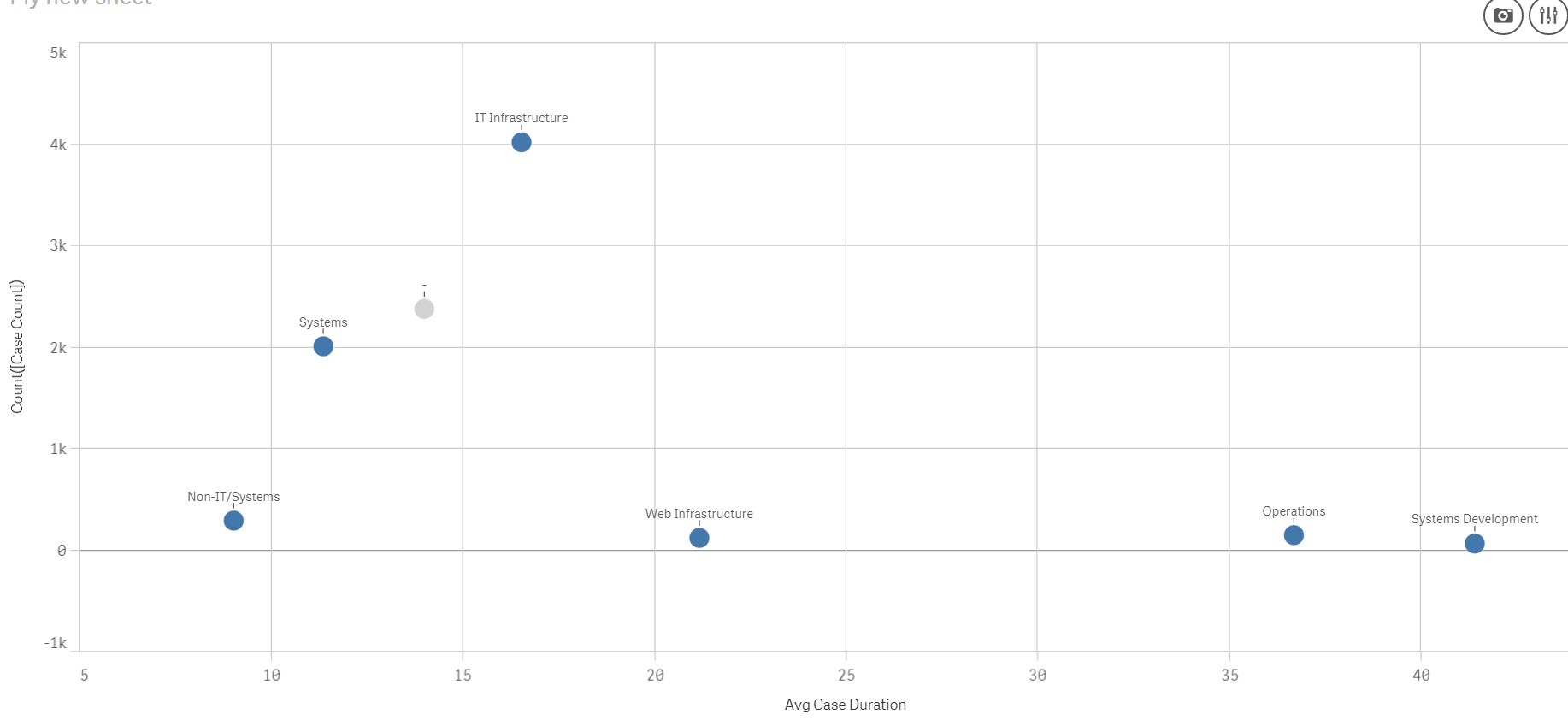
Anyway, I think what you need is a scatter plot, See attached image, from the 'Help-desk management' app:
Dimension- Department
X - Avg Case duration
Y - Count of cases
I hope it makes sense.
BR,
Eliran.
721 Views
