Unlock a world of possibilities! Login now and discover the exclusive benefits awaiting you.

- Qlik Community
- :
- Forums
- :
- Analytics & AI
- :
- Products & Topics
- :
- Visualization and Usability
- :
- Show or hide lines in a chart?
- Subscribe to RSS Feed
- Mark Topic as New
- Mark Topic as Read
- Float this Topic for Current User
- Bookmark
- Subscribe
- Mute
- Printer Friendly Page

 chrisg
- Mark as New
- Bookmark
- Subscribe
- Mute
- Subscribe to RSS Feed
- Permalink
- Report Inappropriate Content
Show or hide lines in a chart?
Hi,
i just want to provide a chart with different calculations and lines - such as average, target value e.g.
How is it possible to show or hide lines in a chart?
many thx
Christoph

- Mark as New
- Bookmark
- Subscribe
- Mute
- Subscribe to RSS Feed
- Permalink
- Report Inappropriate Content
Hi
Yes you can by using calculated condition on expression, which will hide and show the lines according to given condition.
Thanks
Paridhi

 OmarBenSalem
- Mark as New
- Bookmark
- Subscribe
- Mute
- Subscribe to RSS Feed
- Permalink
- Report Inappropriate Content
I would suggest sthing like this:
Create an inline table:
load * inline [
MeasureID, Measure
1, Sales
2, Average
3, Target
];
Then in your presentation, as a selection field, choose your new created Measure field.
Now, in your chart,
choose as a dimension;
if(MeasureID=1, YourSalesExpression,
if(MeasureID=2, YourAvgExpression,
if(MeasureID=3,YourTargetExpression)))
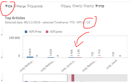
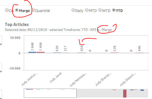
Per analogy, the result would be with my Measure:
sum({<$(vSetPeriodPres)>}if(kpiID='CA',
CA,
if(kpiID='Quantité',
[Quantité] ,
if(kpiID='Marge',
Marge ))))
- Mark as New
- Bookmark
- Subscribe
- Mute
- Subscribe to RSS Feed
- Permalink
- Report Inappropriate Content
Or you could look at using an Alternative Measure
There is a video in the Qlik Sense Help describing this functionality, https://help.qlik.com/en-US/sense/3.2/Content/Videos/Videos-alternative-dimensions-measures.htm
chrisg
- Mark as New
- Bookmark
- Subscribe
- Mute
- Subscribe to RSS Feed
- Permalink
- Report Inappropriate Content
Manymany thx - but how can i handle the labeling of the line?

 EugeniaCastilla
- Mark as New
- Bookmark
- Subscribe
- Mute
- Subscribe to RSS Feed
- Permalink
- Report Inappropriate Content
where did you get those radio buttons?