Unlock a world of possibilities! Login now and discover the exclusive benefits awaiting you.
- Qlik Community
- :
- Forums
- :
- Analytics & AI
- :
- Products & Topics
- :
- Visualization and Usability
- :
- Show values and labels on Stacked bar chart
- Subscribe to RSS Feed
- Mark Topic as New
- Mark Topic as Read
- Float this Topic for Current User
- Bookmark
- Subscribe
- Mute
- Printer Friendly Page
- Mark as New
- Bookmark
- Subscribe
- Mute
- Subscribe to RSS Feed
- Permalink
- Report Inappropriate Content
Show values and labels on Stacked bar chart
Hello All,
Can I show values and labels on a stacked bar chart in QlikSense?
Regards
- Mark as New
- Bookmark
- Subscribe
- Mute
- Subscribe to RSS Feed
- Permalink
- Report Inappropriate Content
- Mark as New
- Bookmark
- Subscribe
- Mute
- Subscribe to RSS Feed
- Permalink
- Report Inappropriate Content
Tried with SenseUI-Bar chart extension and unable to show values & dimension labels with more than one dimension. Could you please share if you have any sample in this regard?
Thank you for your support in advance.
Regards,
Hari
- Mark as New
- Bookmark
- Subscribe
- Mute
- Subscribe to RSS Feed
- Permalink
- Report Inappropriate Content

- Mark as New
- Bookmark
- Subscribe
- Mute
- Subscribe to RSS Feed
- Permalink
- Report Inappropriate Content
i'm also not labels.Can you give setting screen sheet for this extn
- Mark as New
- Bookmark
- Subscribe
- Mute
- Subscribe to RSS Feed
- Permalink
- Report Inappropriate Content
Hi, you could use the bars and area chart, included in the Visualization bundle in Qlik Sense to obtain this. Here you have a video that shows you how to do it.
- Mark as New
- Bookmark
- Subscribe
- Mute
- Subscribe to RSS Feed
- Permalink
- Report Inappropriate Content
Great:) I was solving a similar issue and your suggestions helped a lot. Thanks!
- Mark as New
- Bookmark
- Subscribe
- Mute
- Subscribe to RSS Feed
- Permalink
- Report Inappropriate Content
Hi,
This is almost what I need. However, I have specific requirement.
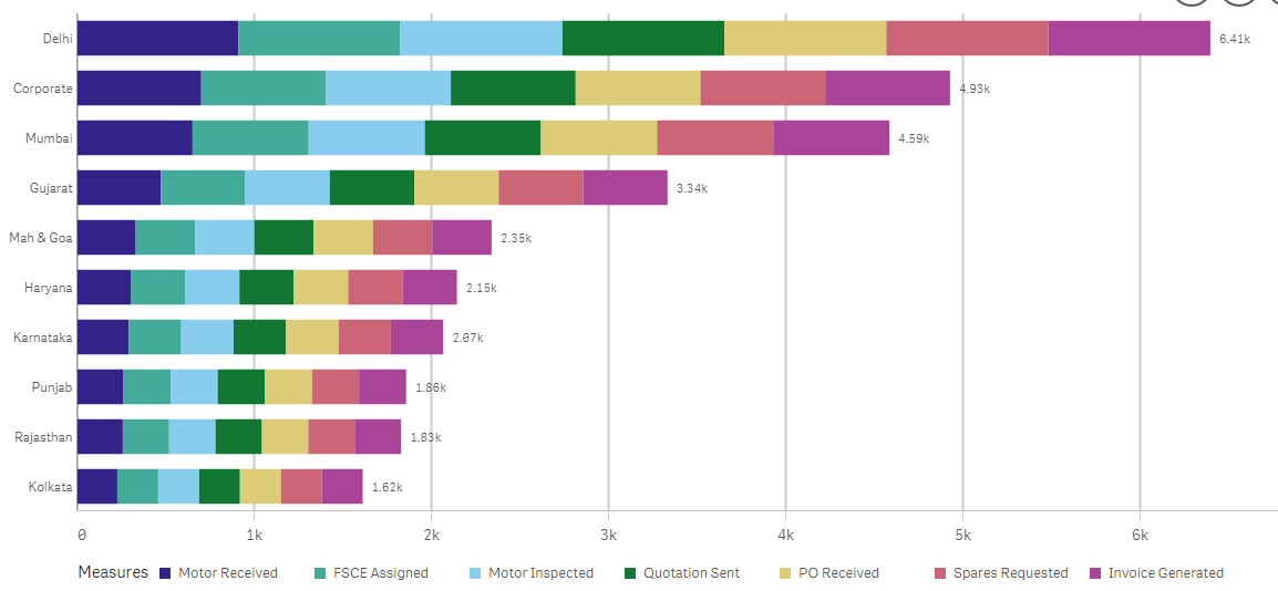
Let's assume I already have this chart

I need to change the values inside every bar by the % they represent of the total. Ex: in FY20, the total is 121. I need to show 33%, 25%, 19%, 16% and 7% plus the 121 at the end if possible.
Any iddea? Is that even possible?
Thanks in advance.
Àlex
- Mark as New
- Bookmark
- Subscribe
- Mute
- Subscribe to RSS Feed
- Permalink
- Report Inappropriate Content
Hi Giuseppe,
It appers that as of the May/21 update, the Bar and Area Chart is no longer available in the Visualization Bundle.

Would you know if there's another way to add labels to each stack of the chart? I could'nt find this option in the normal Bar Chart . There are only two options for labels:
- Automatic
- Disabled
Thanks
- Mark as New
- Bookmark
- Subscribe
- Mute
- Subscribe to RSS Feed
- Permalink
- Report Inappropriate Content
can use this option
