Unlock a world of possibilities! Login now and discover the exclusive benefits awaiting you.
- Qlik Community
- :
- Forums
- :
- Analytics & AI
- :
- Products & Topics
- :
- Visualization and Usability
- :
- Stack Bar Graph with Total
- Subscribe to RSS Feed
- Mark Topic as New
- Mark Topic as Read
- Float this Topic for Current User
- Bookmark
- Subscribe
- Mute
- Printer Friendly Page
- Mark as New
- Bookmark
- Subscribe
- Mute
- Subscribe to RSS Feed
- Permalink
- Report Inappropriate Content
Stack Bar Graph with Total
Hey guys,
I'm new in qlik sense, can anyone help me this one. Sorry if this has been answered before, I couldn't find the answer related.
I want show a stack bar graph with total workers by category, bar show full, and show in percent. Like this :

I try to create a company in one country with many braches on difference state. Total Branches in one State are diferrence, it based on which state we choose..
For example i choose State_A it will be like this:
 (1) _ App overview - Qlik Sense.png)
and if i choose State_B it will be like this :
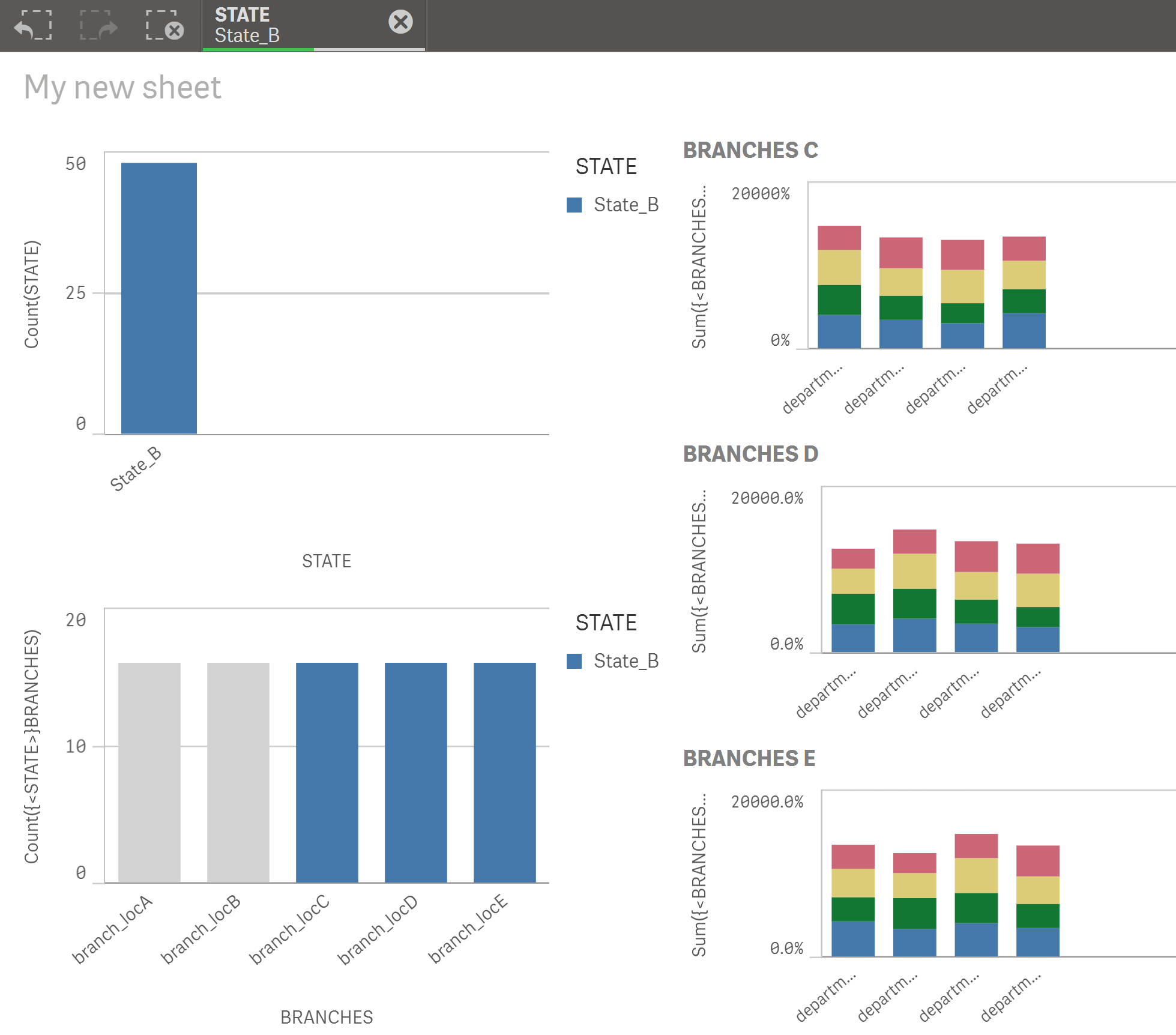
Graph will show based total branches in state which i selected. I tried using this extension, but it don't have stack bar graph.
GitHub - miclae76/trellis-chart: Qlik Sense Trellis Chart Extension
Can anybody help this one?
stalwar1 jpe mto vinieme12 reddys310
This is app that I tried to do : !
- « Previous Replies
-
- 1
- 2
- Next Replies »
Accepted Solutions
- Mark as New
- Bookmark
- Subscribe
- Mute
- Subscribe to RSS Feed
- Permalink
- Report Inappropriate Content
Try a dual expression
example
=DUAL(
'No of Workers:' & sum([TOTAL WORKERS]) & chr(10) &
'%of Workers:' & Num(sum([TOTAL WORKERS]) /sum(TOTAL <DEPARTMENT> [TOTAL WORKERS]),'##.0%')
,
sum([TOTAL WORKERS]) /sum(TOTAL <DEPARTMENT> [TOTAL WORKERS])
)
If a post helps to resolve your issue, please accept it as a Solution.
- Mark as New
- Bookmark
- Subscribe
- Mute
- Subscribe to RSS Feed
- Permalink
- Report Inappropriate Content
check this extension:
GitHub - brianbooden/StackedMultiples: Qlik Sense Stacked Multiples D3 extension
- Mark as New
- Bookmark
- Subscribe
- Mute
- Subscribe to RSS Feed
- Permalink
- Report Inappropriate Content
add a Dummy Dimension as below
DummyDIM:
LOAD RowNo() as DIM
AutoGenerate (2);
inChart
Use Calculated Dimension
=Pick(DIM,'TOTAL',DEPARTMENT)
Expression
sum([TOTAL WORKERS]) /sum(TOTAL <DEPARTMENT> [TOTAL WORKERS])
If a post helps to resolve your issue, please accept it as a Solution.
- Mark as New
- Bookmark
- Subscribe
- Mute
- Subscribe to RSS Feed
- Permalink
- Report Inappropriate Content
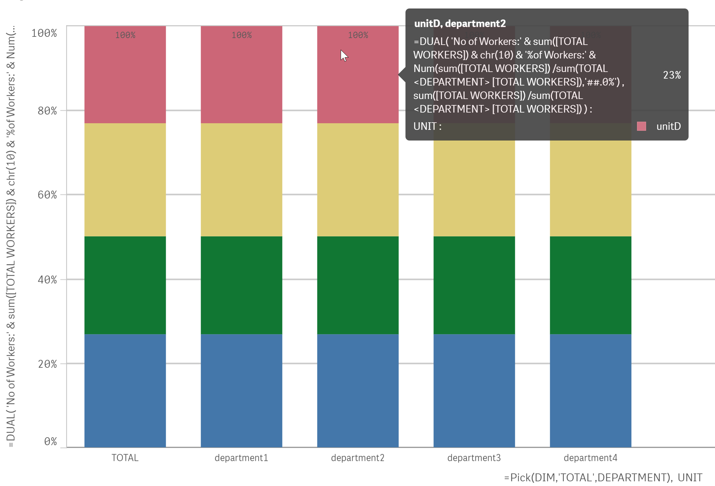
Hi vinieme12,
Thanks for your answer. I tried your solution and it show total, but almost what i wanted. Can you help me.
Here the result with your solution,
 _ Sheets - Qlik Sense.png)
1) TOTAL not show as dimension that i used.
2) Why Count for bar chart not same with real one?
- Mark as New
- Bookmark
- Subscribe
- Mute
- Subscribe to RSS Feed
- Permalink
- Report Inappropriate Content
Your dimensions are not correct, just keep the below two
Dimension1: =Pick(DIM,'TOTAL',DEPARTMENT)
Dimension2: UNIT
<< You don't need pick() for UNIT dimension
If a post helps to resolve your issue, please accept it as a Solution.
- Mark as New
- Bookmark
- Subscribe
- Mute
- Subscribe to RSS Feed
- Permalink
- Report Inappropriate Content
Hi vinieme12,
Thank it works.. But i need you to help me to change a little..
Below is the result after i change dimension.
What I need :
1) When i hover at bar, Can i see in UNIT by percentage and TOTAL WORKERS? each bar show percentage and TOTAL WORKERS
 (1) _ App overview - Qlik Sense.png)
- Mark as New
- Bookmark
- Subscribe
- Mute
- Subscribe to RSS Feed
- Permalink
- Report Inappropriate Content
Try a dual expression
example
=DUAL(
'No of Workers:' & sum([TOTAL WORKERS]) & chr(10) &
'%of Workers:' & Num(sum([TOTAL WORKERS]) /sum(TOTAL <DEPARTMENT> [TOTAL WORKERS]),'##.0%')
,
sum([TOTAL WORKERS]) /sum(TOTAL <DEPARTMENT> [TOTAL WORKERS])
)
If a post helps to resolve your issue, please accept it as a Solution.
- Mark as New
- Bookmark
- Subscribe
- Mute
- Subscribe to RSS Feed
- Permalink
- Report Inappropriate Content
your expression become like this one..
what i really want like this :
unitD : 21%
TOTAL WORKRES : 123
It show two detail in time. Can you help me to show like this?
- Mark as New
- Bookmark
- Subscribe
- Mute
- Subscribe to RSS Feed
- Permalink
- Report Inappropriate Content
Give a name to your measure
If a post helps to resolve your issue, please accept it as a Solution.
- Mark as New
- Bookmark
- Subscribe
- Mute
- Subscribe to RSS Feed
- Permalink
- Report Inappropriate Content
I don't work with Qlik Sense, but after reading other threads for custom popups in sense...this doesn't seem possible at the moment
If a post helps to resolve your issue, please accept it as a Solution.
- « Previous Replies
-
- 1
- 2
- Next Replies »