Unlock a world of possibilities! Login now and discover the exclusive benefits awaiting you.
If you’re new to Qlik Cloud or Qlik Sense, start with this Discussion Board and get up-to-speed quickly.
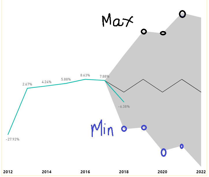
Hello experts,
Can we build this line chart in QlikSense?
From 2018 to 2022 is forecast data. I know that we could create a line chart with 4 measure to display 4 lines, but i want to have the area between min and max colored.