Unlock a world of possibilities! Login now and discover the exclusive benefits awaiting you.
- Qlik Community
- :
- All Forums
- :
- QlikView App Dev
- :
- Can I create multiple dimension report like below ...
- Subscribe to RSS Feed
- Mark Topic as New
- Mark Topic as Read
- Float this Topic for Current User
- Bookmark
- Subscribe
- Mute
- Printer Friendly Page
- Mark as New
- Bookmark
- Subscribe
- Mute
- Subscribe to RSS Feed
- Permalink
- Report Inappropriate Content
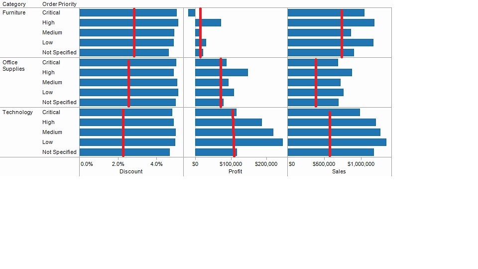
Can I create multiple dimension report like below format?
The red line are average line for each pane window.
great thx in advance.
- Mark as New
- Bookmark
- Subscribe
- Mute
- Subscribe to RSS Feed
- Permalink
- Report Inappropriate Content
Yes, I think so. But it's going to be tricky. You would need to put to pivot tables on top of each other. One pivot table would use linear gauges for representation of the expressions with the indicator set to fill to value. The other would use linear gauges with the indicator set to Show Needle and use Line as style.
talk is cheap, supply exceeds demand
- Mark as New
- Bookmark
- Subscribe
- Mute
- Subscribe to RSS Feed
- Permalink
- Report Inappropriate Content
Use a trellis with a dimension for Discount, Profit and Sales?
- Mark as New
- Bookmark
- Subscribe
- Mute
- Subscribe to RSS Feed
- Permalink
- Report Inappropriate Content
I am new to QV, any way to show me how to do it step by step? or refer to previous posting 
- Mark as New
- Bookmark
- Subscribe
- Mute
- Subscribe to RSS Feed
- Permalink
- Report Inappropriate Content
I cannot add reference line to bar chart with more than one dimension. It just does not show up.
- Mark as New
- Bookmark
- Subscribe
- Mute
- Subscribe to RSS Feed
- Permalink
- Report Inappropriate Content
Hi!
Please see attached possible way to think in solving this issue.
Your task to this issue is operating non QlikView data logic visualisation. It is looks like spreadsheet or similar, nevermind.
In order that you are going to get fine experience from this task, try to imagine QlikView logic for end user, what would he do and how, and get back from this to the current task, try to understand the data and the best way to visualize it. In attached example it is only sketch on how QlikView could solve tasks alike.
Thanks.
- Mark as New
- Bookmark
- Subscribe
- Mute
- Subscribe to RSS Feed
- Permalink
- Report Inappropriate Content
Hi!
Did you try the solution in file? What could you say?