Unlock a world of possibilities! Login now and discover the exclusive benefits awaiting you.
- Qlik Community
- :
- All Forums
- :
- QlikView App Dev
- :
- Need Urgent help - creating weekly RAG dashboard
- Subscribe to RSS Feed
- Mark Topic as New
- Mark Topic as Read
- Float this Topic for Current User
- Bookmark
- Subscribe
- Mute
- Printer Friendly Page
- Mark as New
- Bookmark
- Subscribe
- Mute
- Subscribe to RSS Feed
- Permalink
- Report Inappropriate Content
Need Urgent help - creating weekly RAG dashboard
Hi Guys,
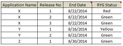
I have below data which I am loading from excel.

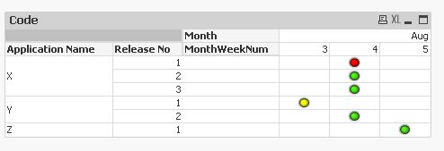
I am looking to create a qlikview report of the below format.

Can you please help here.
Thanks
- Tags:
- new_to_qlikview
- « Previous Replies
-
- 1
- 2
- Next Replies »
Accepted Solutions
- Mark as New
- Bookmark
- Subscribe
- Mute
- Subscribe to RSS Feed
- Permalink
- Report Inappropriate Content
- Mark as New
- Bookmark
- Subscribe
- Mute
- Subscribe to RSS Feed
- Permalink
- Report Inappropriate Content
if you attach a sample dashboard it would have been easier.
anyways, what you can do is first load the original data from excel and link the enddate to the master caledar table (which you need to populate) or simply add two dimension; the first one that will return the month name using the monthname function and the second one will return the week number using the week function, so now in your data model you have all the needed dimensions.
then start the design by creating a pivot table with application name, release no, month and week (add them by this order) as dimensions, and add an expression with is max(RYG status) (if there are more than one value) or only (RYG status) (if it is only one value), then you need to drag in the pivot table the month dimension above the expression tab in order to have the month and week dimension horizontally instead of vertically/
- Mark as New
- Bookmark
- Subscribe
- Mute
- Subscribe to RSS Feed
- Permalink
- Report Inappropriate Content
Use a dimension week(date) and expresion RYG Status
- Mark as New
- Bookmark
- Subscribe
- Mute
- Subscribe to RSS Feed
- Permalink
- Report Inappropriate Content
Hi,
have a look at attached application.
Regards
ASHFAQ
- Mark as New
- Bookmark
- Subscribe
- Mute
- Subscribe to RSS Feed
- Permalink
- Report Inappropriate Content
Hi Ashfaq,
Could not relate this with my requirement. I guess you uploaded the wrong file.
Thanks
- Mark as New
- Bookmark
- Subscribe
- Mute
- Subscribe to RSS Feed
- Permalink
- Report Inappropriate Content
Hi Malek,
i am able to do it successfully.
1 enhancement:
can we replace the RYG texts with RYG Symbols? I mean if its Green, show a circle with Green color and like wise.
Thanks
- Mark as New
- Bookmark
- Subscribe
- Mute
- Subscribe to RSS Feed
- Permalink
- Report Inappropriate Content
Hi,
one possible solution:

hope this helps
regards
Marco
- Mark as New
- Bookmark
- Subscribe
- Mute
- Subscribe to RSS Feed
- Permalink
- Report Inappropriate Content
maybe this helps also:

regards
Marco
- Mark as New
- Bookmark
- Subscribe
- Mute
- Subscribe to RSS Feed
- Permalink
- Report Inappropriate Content
Thanks Marco. This is what I am looking for.
Can I ask you for an enhancement for this request.
I have another field called as 'Comments'
I need to display the values of this field on the icons (Red, Amber, Green) when we move the mouse over it.
Can you guide me please.
Thanks
- Mark as New
- Bookmark
- Subscribe
- Mute
- Subscribe to RSS Feed
- Permalink
- Report Inappropriate Content
A mouse over pop up function does not seem to exist in this chart.
![]()
regards
Marco
- « Previous Replies
-
- 1
- 2
- Next Replies »