Unlock a world of possibilities! Login now and discover the exclusive benefits awaiting you.
- Qlik Community
- :
- Forums
- :
- Analytics & AI
- :
- Products & Topics
- :
- Visualization and Usability
- :
- How to create a Gantt chart in Qlik Sense?
- Subscribe to RSS Feed
- Mark Topic as New
- Mark Topic as Read
- Float this Topic for Current User
- Bookmark
- Subscribe
- Mute
- Printer Friendly Page
- Mark as New
- Bookmark
- Subscribe
- Mute
- Subscribe to RSS Feed
- Permalink
- Report Inappropriate Content
How to create a Gantt chart in Qlik Sense?
Hello All,
I am trying to create a Gantt chart using bar graphs in Qlik Sense and have gotten stuck at a point. Can any one help me with some clues.
Here is the simple dataset I am using form excel -
| Start Date | End Date | Workstream |
| 1/15/2015 | 4/13/2015 | Group A |
| 1/22/2015 | 6/23/2015 | Group B |
| 4/12/2015 | 6/12/2015 | Group C |
When I create a bar graph I use the measures as Workstream and Max([End Date])-Min([Start Date]). The thing next I am trying to solve is how to I set a start date fixed, so that the workstreams which are starting a period after the start date are stacked from the date marker they start? Can this be solved by using a stacked graph?
Thanks for any input.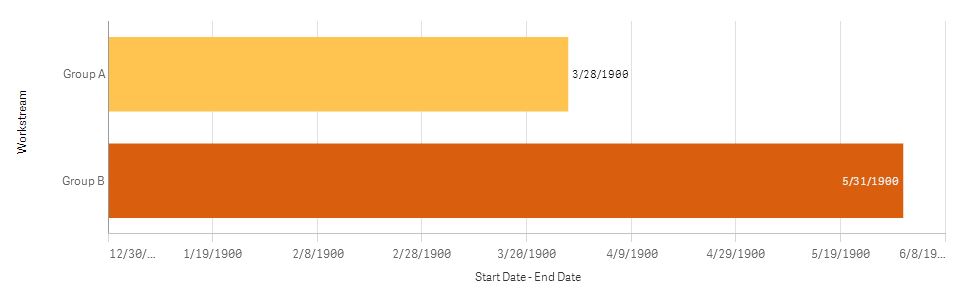
- Mark as New
- Bookmark
- Subscribe
- Mute
- Subscribe to RSS Feed
- Permalink
- Report Inappropriate Content
I haven't heard of this being possible in Qlik Sense to date however keep your eye on Branch.Qlik.Com... the site where many QlikView web developers post and share their projects to extend the out of box visualizations. You may see a Gantt chart there before too long. For example , there is already a pivot table chart and plenty of other less standard visualizations out there.
- Mark as New
- Bookmark
- Subscribe
- Mute
- Subscribe to RSS Feed
- Permalink
- Report Inappropriate Content
vedanta_ any luck on your gantt chart in Sense?
- Mark as New
- Bookmark
- Subscribe
- Mute
- Subscribe to RSS Feed
- Permalink
- Report Inappropriate Content
Hi,
Please have a look at this link there was communication few days back on grant chart in qliksense..
- Mark as New
- Bookmark
- Subscribe
- Mute
- Subscribe to RSS Feed
- Permalink
- Report Inappropriate Content
it may answer to my needed but it does not work.
Despite change the date format, i have this bug 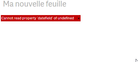
- Mark as New
- Bookmark
- Subscribe
- Mute
- Subscribe to RSS Feed
- Permalink
- Report Inappropriate Content
date([fiel_date],'YYYY-MM-DD')
las dos ultimas medidas deben ser las fechas
- Mark as New
- Bookmark
- Subscribe
- Mute
- Subscribe to RSS Feed
- Permalink
- Report Inappropriate Content
You can redesign the data in below format and plot in a scatter plot with
Y axis -> work stream,
Points -> 'Flag'
X axis -> Date
Color can be given based on the Flag.
| Flag | End Date | Workstream |
| End Date | 4/13/2015 | Group A |
| End Date | 6/23/2015 | Group B |
| End Date | 6/12/2015 | Group C |
| Start Date | 1/15/2015 | Group A |
| Start Date | 1/22/2015 | Group B |
| Start Date | 4/12/2015 | Group C |
Cheers!
Athira
- Mark as New
- Bookmark
- Subscribe
- Mute
- Subscribe to RSS Feed
- Permalink
- Report Inappropriate Content
take a look at Gantt chart here https://qlik.anychart.com/

- Mark as New
- Bookmark
- Subscribe
- Mute
- Subscribe to RSS Feed
- Permalink
- Report Inappropriate Content
Hi, Team,
I'm Facing This issue can anyone help me with Gantt Chart.