Unlock a world of possibilities! Login now and discover the exclusive benefits awaiting you.
- Qlik Community
- :
- All Forums
- :
- QlikView App Dev
- :
- Separate chart for each Dimenson value
- Subscribe to RSS Feed
- Mark Topic as New
- Mark Topic as Read
- Float this Topic for Current User
- Bookmark
- Subscribe
- Mute
- Printer Friendly Page
- Mark as New
- Bookmark
- Subscribe
- Mute
- Subscribe to RSS Feed
- Permalink
- Report Inappropriate Content
Separate chart for each Dimenson value
Hi
I have a Dimenson State
expression as Sales
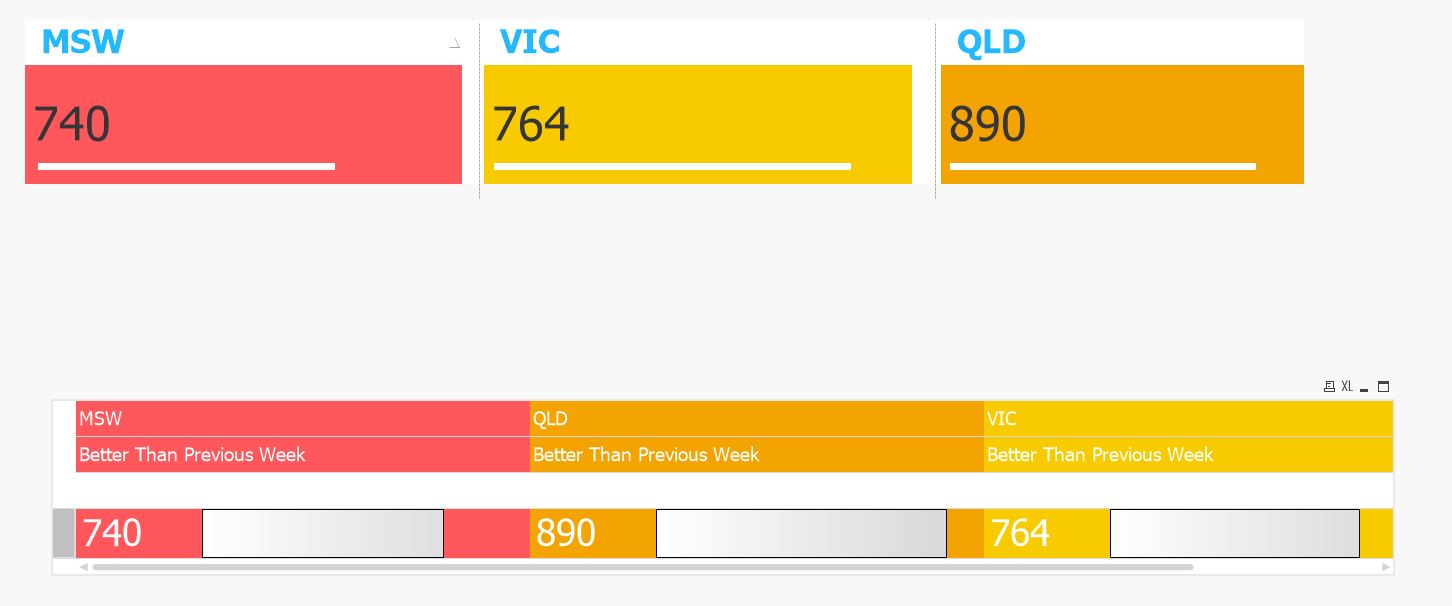
I want to build chart like below showing states along with there sum(sales) and also saying status as per last weel (example higher than last week or better or lower)
I don't want to use Pie chart and do trellies.
Kindly guide
Thanks

- « Previous Replies
-
- 1
- 2
- Next Replies »
Accepted Solutions
- Mark as New
- Bookmark
- Subscribe
- Mute
- Subscribe to RSS Feed
- Permalink
- Report Inappropriate Content
Tried to match as much as possible , if it helps 
Straight table on top with trellis bar chart overlay
second a pivot table with a linear gauge expression
If a post helps to resolve your issue, please accept it as a Solution.
- Mark as New
- Bookmark
- Subscribe
- Mute
- Subscribe to RSS Feed
- Permalink
- Report Inappropriate Content
I guess the only option left is to create three charts with set analysis in them to specify which Dimension State they need to show
- Mark as New
- Bookmark
- Subscribe
- Mute
- Subscribe to RSS Feed
- Permalink
- Report Inappropriate Content
I cannot do that because sometime states can be four or more as per the sales data.
If no sales then that state will not come.
And also what will be chart option for this rectangular box with a line and message(doing comparison with last week)
- Mark as New
- Bookmark
- Subscribe
- Mute
- Subscribe to RSS Feed
- Permalink
- Report Inappropriate Content
You don't want to do trellis and set analysis isn't possible. I guess you need some kind of magic . I am sorry, I am not aware of getting this done, but may be someone else do. In case someone do, I would be keen to know a solution as well.
Best,
Sunny
- Mark as New
- Bookmark
- Subscribe
- Mute
- Subscribe to RSS Feed
- Permalink
- Report Inappropriate Content
There is no out the box solution in qlikview. As Sunny suggested you have to use "Trellis" or "separate charts".
Even if they are seperate charts you can control how many are visible based on your selection. Example create lets say 10 charts with set analysis where you capture your states in variables and use them set analysis. so based on selection/data lets say u have 4 states, then using layout condition of charts you will display first 4 charts and hide rest.
If above doesn't work, you have to build an extension. Look at samples here "branch.qlik.com".
- Mark as New
- Bookmark
- Subscribe
- Mute
- Subscribe to RSS Feed
- Permalink
- Report Inappropriate Content
It may be possible to get close to what you are asking for. Try the following
- Create sufficient instances of the chart and lay them out in a way that makes sense
- Add a conditional display as follows:
- If(FieldValueCount(myDimension) >= 1, 1, 0) (for box 1)
- If(FieldValueCount(myDimension) >= 2, 1, 0) (for box 2)
- ...
- If(FieldValueCount(myDimension) >= n, 1, 0) (for box n)
- Use the following set analysis in the chart expressions
- Sum({<myDimension = {"$(=FieldValue(myDimension, 1)"}>} myValue) (for box 1)
- Sum({<myDimension = {"$(=FieldValue(myDimension, 2)"}>} myValue) (for box 2)
- ...
- Sum({<myDimension = {"$(=FieldValue(myDimension, n)"}>} myValue) (for box n)
If you don't want to create so many objects, then you will either have to do without this visualisation, or you will have to create an extension.
(change the dimension, field names and expression as needed to fit your model)
- Mark as New
- Bookmark
- Subscribe
- Mute
- Subscribe to RSS Feed
- Permalink
- Report Inappropriate Content
Thanks I will go with either of these but want to check do we have any charts like about rectangular box type
- Mark as New
- Bookmark
- Subscribe
- Mute
- Subscribe to RSS Feed
- Permalink
- Report Inappropriate Content
Thanks
I am going to go with threllies or set analysis but was swonderering do w ehave rectangular charts with a scale down in qlikview.
how can I get that layout
- Mark as New
- Bookmark
- Subscribe
- Mute
- Subscribe to RSS Feed
- Permalink
- Report Inappropriate Content
Tried to match as much as possible , if it helps
Straight table on top with trellis bar chart overlay
second a pivot table with a linear gauge expression
If a post helps to resolve your issue, please accept it as a Solution.
- Mark as New
- Bookmark
- Subscribe
- Mute
- Subscribe to RSS Feed
- Permalink
- Report Inappropriate Content
This is perfect. Can you share your sample application where you have created this.
Thanks In Advance
- « Previous Replies
-
- 1
- 2
- Next Replies »