Unlock a world of possibilities! Login now and discover the exclusive benefits awaiting you.
- Qlik Community
- :
- All Forums
- :
- QlikView
- :
- Displaying Employee Schedules in Chart Format
- Subscribe to RSS Feed
- Mark Topic as New
- Mark Topic as Read
- Float this Topic for Current User
- Bookmark
- Subscribe
- Mute
- Printer Friendly Page
- Mark as New
- Bookmark
- Subscribe
- Mute
- Subscribe to RSS Feed
- Permalink
- Report Inappropriate Content
Displaying Employee Schedules in Chart Format
QV Community,
I was wondering if anyone may have any suggestions on the best way to display employee schedules in a chart format. I played around with a few looks but I am almost certain that there maybe better ways. My data consists of a table containing the employee name, event name, start time and end time. I then created and inline table with all of the minutes of operation and a description. I then used IntervalMatch and a left join to my schedule.
My first attemp is marginal at best. I created a pivot table with the employee name and the interval grouping as my dimensions. My interval name is show as columns and employee names down the left side of the table. In my expression I used a count distinct on the employee id and based on the activity name I dynamiclly changed the background color.
I have include an excel file that shows what I have so far. Please excuse the colors but I plan on changing them next.
Any suggestions or reference material would be greatly appreciated.
Thanks
- « Previous Replies
-
- 1
- 2
- Next Replies »
Accepted Solutions
- Mark as New
- Bookmark
- Subscribe
- Mute
- Subscribe to RSS Feed
- Permalink
- Report Inappropriate Content
- Mark as New
- Bookmark
- Subscribe
- Mute
- Subscribe to RSS Feed
- Permalink
- Report Inappropriate Content
Are you asking how to achieve your Excel file's look in QlikView, or if anyone has a better way?
- Mark as New
- Bookmark
- Subscribe
- Mute
- Subscribe to RSS Feed
- Permalink
- Report Inappropriate Content
Yes that is correct. I was thinking about a way to maybe show a timeline at the x axis and employee names on the y axis. Then I could show the data in a stacked bar graph where ever there is an event. Any Ideas?
- Mark as New
- Bookmark
- Subscribe
- Mute
- Subscribe to RSS Feed
- Permalink
- Report Inappropriate Content
Could a single employee have more than one event at any one time?
- Mark as New
- Bookmark
- Subscribe
- Mute
- Subscribe to RSS Feed
- Permalink
- Report Inappropriate Content
haven't gotten to it yet .. I was just thinking of doing something like this myself .. but here are my thoughts
- you have 52 15 minute time periods
- you appear to have working, break and ? other time categories? (based on colour of grid field?)
- so record original data in table with one row per employee per day
-> col1 = date
-> col2 = emp name
-> col3 = work start time
-> col4 = work end time
- when loading create dummy value of "1" for each of 52 minute time periods using IF to test if that particular time period is within the start and end times
If (StartTime >= 800 and EndTime <= 815, "1") as 0800-0815,
If (StartTime <= 815 and EndTime >= 830, "1") as 0815-0830,
etc for 52 15 min time periods ....
- do pivot table of 52 time periods and do sum or avg (which will be one for each employee)
- conditionally shade grid if 1 to
- use date field to filter show day by day schedule
- to shade grid diff colours eg for breaks etc, do extra comparison on load to check if that time period is break of not and make it say "2", then conditionally shade differently...you'd have to add extra columns for those in orig data and do nested IFs
-> col5 = break start time
-> col6 = break end time
If(BreakTime is present for that emp, check it instead to see if it is in time period and if it is then that is "2", else ... check StartTime
..
- Mark as New
- Bookmark
- Subscribe
- Mute
- Subscribe to RSS Feed
- Permalink
- Report Inappropriate Content
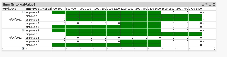
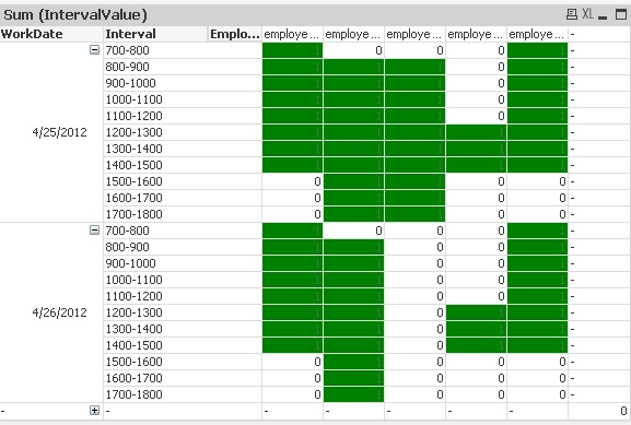
This is table to setup to record data:
WorkDate | Employee | DayStart | DayEnd | BreakStart | BreakEnd |
| 25-Apr-12 | employee 1 | 700 | 1500 | 1100 | 1200 |
| 25-Apr-12 | employee 2 | 800 | 1800 | 1300 | 1400 |
| 25-Apr-12 | employee 3 | 800 | 1800 | 1300 | 1400 |
| 25-Apr-12 | employee 4 | 1200 | 1500 | ||
| 25-Apr-12 | employee 5 | 700 | 1500 | 1100 | 1200 |
| 26-Apr-12 | employee 1 | 700 | 1500 | 1100 | 1200 |
| 26-Apr-12 | employee 2 | 800 | 1800 | 1300 | 1400 |
| 26-Apr-12 | employee 3 | ||||
| 26-Apr-12 | employee 4 | 1200 | 1500 | ||
| 26-Apr-12 | employee 5 | 700 | 1500 | 1100 | 1200 |
Load the table into Qlikview:
Original:
Load WorkDate,
Employee
From
(biff, embedded labels);
Set IntervalStart = 700;
Set IntervalEnd = 800;
//Loop through each employee record to get hour intervals
For i = 1 to 11
Original2:
Load $(i) as rowNum,
WorkDate,
Employee,
DayStart,
DayEnd,
$(IntervalStart) & '-' & $(IntervalEnd) as Interval,
//Check if hour interval is within emp start<> end and give it "1" (so it can be conditionally formatted later")
//I didn't do the extra check to see if the interval is break interval but you could just add add'l If to IntervalValue
If($(IntervalStart) >= DayStart and $(IntervalEnd) <= DayEnd, 1, 0) as IntervalValue
From
(biff, embedded labels);
Let IntervalStart = IntervalStart + 100;
Let IntervalEnd = IntervalEnd + 100;
Next i
In Qlikview make a pivot table from data, use WorkDate, Employee & Interval as dimensions and IntervalValue as Expression. Then conditionally format for fill with Expression so if 1 then it green.. you could do conditional text format on 0 and 1 also to turn them white and green respectively.
Could also put Event into original table which you could use to slice and dice in pivot table.
- Mark as New
- Bookmark
- Subscribe
- Mute
- Subscribe to RSS Feed
- Permalink
- Report Inappropriate Content
You could also make a Gantt chart from a bar chart...
HIC
- Mark as New
- Bookmark
- Subscribe
- Mute
- Subscribe to RSS Feed
- Permalink
- Report Inappropriate Content
cpokrant and Henric,
Sorry for the delay in response. I wanted to test this out as much as possible to make sure it worked with my data. Everything looks great. I ended up using both ideas. I used the Gantt Chart from a bar chart to display the current days scheduled and used the Pivot table idea to show schedules for the week. Thank you to everyone that assisted!
- Mark as New
- Bookmark
- Subscribe
- Mute
- Subscribe to RSS Feed
- Permalink
- Report Inappropriate Content
Hi Henric, do you happen to have the excel file that you used for the Employee schedule.qvw.?
- Mark as New
- Bookmark
- Subscribe
- Mute
- Subscribe to RSS Feed
- Permalink
- Report Inappropriate Content
Here you go!
- « Previous Replies
-
- 1
- 2
- Next Replies »