Unlock a world of possibilities! Login now and discover the exclusive benefits awaiting you.
- Qlik Community
- :
- All Forums
- :
- QlikView App Dev
- :
- How to change colour in gauge chart
- Subscribe to RSS Feed
- Mark Topic as New
- Mark Topic as Read
- Float this Topic for Current User
- Bookmark
- Subscribe
- Mute
- Printer Friendly Page
- Mark as New
- Bookmark
- Subscribe
- Mute
- Subscribe to RSS Feed
- Permalink
- Report Inappropriate Content
How to change colour in gauge chart
Can any one give some idea on how to change colour in gauge chart according to requirement?
Means can we change manually ?
Accepted Solutions
- Mark as New
- Bookmark
- Subscribe
- Mute
- Subscribe to RSS Feed
- Permalink
- Report Inappropriate Content
hi
PFA
Please close the thread by marking correct answer & give likes if you like the post.
- Mark as New
- Bookmark
- Subscribe
- Mute
- Subscribe to RSS Feed
- Permalink
- Report Inappropriate Content
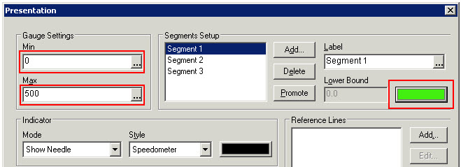
Hi
in the presentation tab change the segment colors
check in presentation tab-option is there
- Mark as New
- Bookmark
- Subscribe
- Mute
- Subscribe to RSS Feed
- Permalink
- Report Inappropriate Content
I want to take data by percentage wise if it below 30% then it will show in red color in gauge , if data is more then 30% then it will show in green color. For me now green color is coming 50% and red color is coming 50% in presentation.
First 30% should come as red and next 70% should come as green.
Do you have any idea how to do this ?
Can we add some more color with percentage manually from properties.
- Mark as New
- Bookmark
- Subscribe
- Mute
- Subscribe to RSS Feed
- Permalink
- Report Inappropriate Content
Hi Biswajeet,
In the Guage properties on the Presentation tab. You could select the segment for which you want to change the colour. The colour is shown below the segment label. These will reflect as the segment colours in the Dials.You could also use variables that would have the colours configured.
thanks,
Rajesh Vaswani
- Mark as New
- Bookmark
- Subscribe
- Mute
- Subscribe to RSS Feed
- Permalink
- Report Inappropriate Content
Hi,
Please set the min and maximum values for each segments and change the color for segments.
1. 0 (Min) - 30 (Max) - Segment 1 - Red
2. 31(Min) - 50 (Max) - Segment 2 - Amber
3. 51(Min) - 100 (Max) - Segment 3 - Green
Regards,
Prasath
- Mark as New
- Bookmark
- Subscribe
- Mute
- Subscribe to RSS Feed
- Permalink
- Report Inappropriate Content
for this u have to change the segments settings
gauge setting min,max value for segment1 and segment2
- Mark as New
- Bookmark
- Subscribe
- Mute
- Subscribe to RSS Feed
- Permalink
- Report Inappropriate Content
Hi ,
Could you please give steps for that?
- Mark as New
- Bookmark
- Subscribe
- Mute
- Subscribe to RSS Feed
- Permalink
- Report Inappropriate Content
HI
Check the attached file..
Hope it helps
Please close the thread by marking correct answer & give likes if you like the post.
- Mark as New
- Bookmark
- Subscribe
- Mute
- Subscribe to RSS Feed
- Permalink
- Report Inappropriate Content
It is not able to open could you please give in any other way so that i can get some idea...
- Mark as New
- Bookmark
- Subscribe
- Mute
- Subscribe to RSS Feed
- Permalink
- Report Inappropriate Content
hi
PFA
Please close the thread by marking correct answer & give likes if you like the post.