Unlock a world of possibilities! Login now and discover the exclusive benefits awaiting you.
- Qlik Community
- :
- All Forums
- :
- QlikView App Dev
- :
- How to create a XR-Chart?
- Subscribe to RSS Feed
- Mark Topic as New
- Mark Topic as Read
- Float this Topic for Current User
- Bookmark
- Subscribe
- Mute
- Printer Friendly Page
- Mark as New
- Bookmark
- Subscribe
- Mute
- Subscribe to RSS Feed
- Permalink
- Report Inappropriate Content
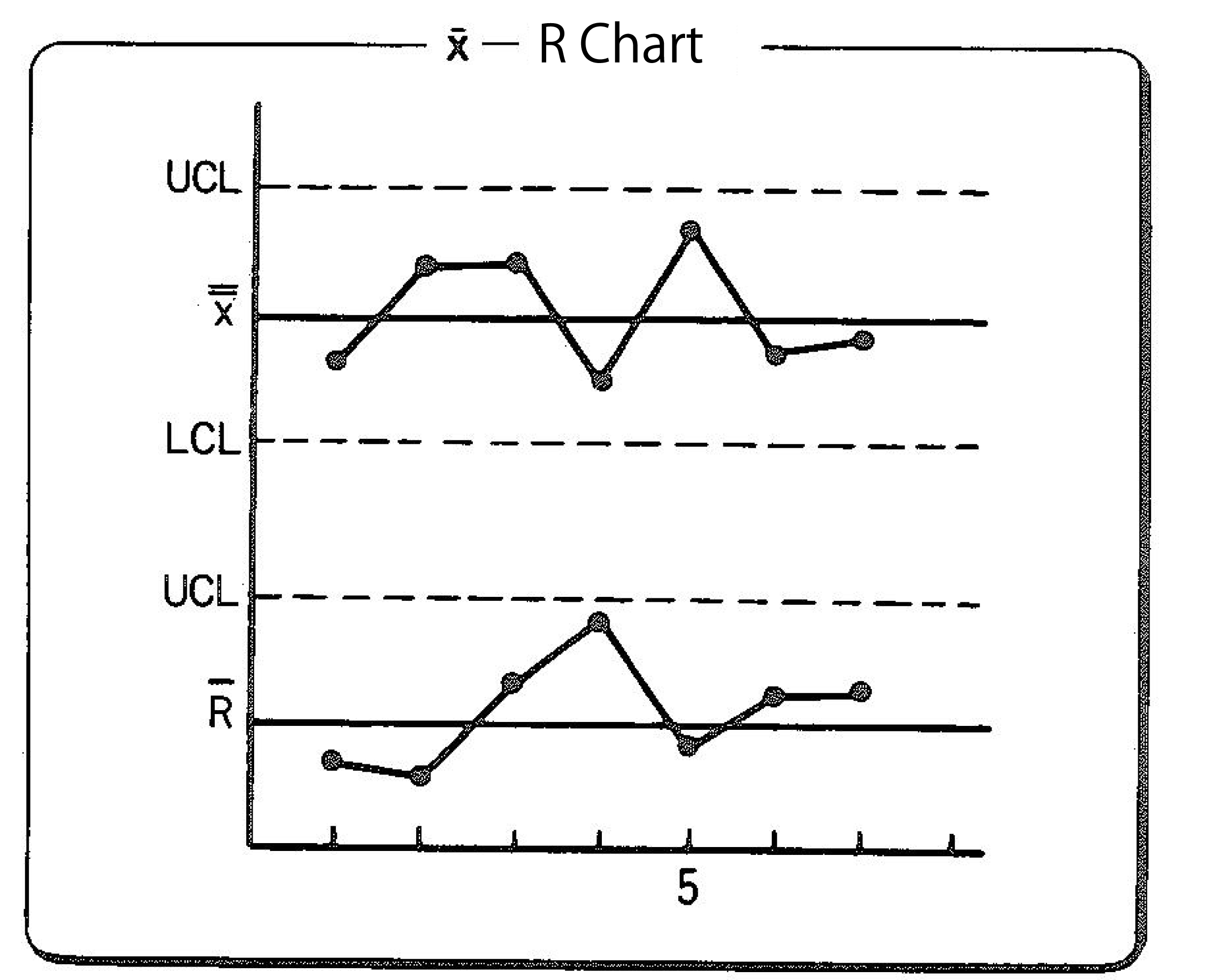
How to create a XR-Chart?
Hello everybody,
I'm trying to create a XR-chart in QlikView but I have not been very succesfull so far.
Anyone who tried this before or has any idea how to do this?
A example of XR chart is: measureing the outside diameter of a piece 3 times and plotting this average on a chart.
So far this is easy with qlikview offcourse.
But we do this piece after piece. And between the averages I want to see the range.
Meaning that I want to plot the difference between the average diameter of part 1 and part 2. (this is one new value again.)
And then the next is the difference between the average of part 2 and part 3... and so on.
Thus creating some chart like the one below:
rgds,
Brecht