Unlock a world of possibilities! Login now and discover the exclusive benefits awaiting you.
Welcome to
Qlik Community!
Recent Discussions
-
Visualization of Graph Data
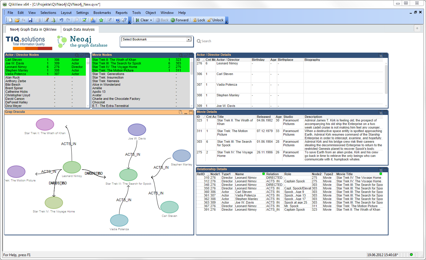
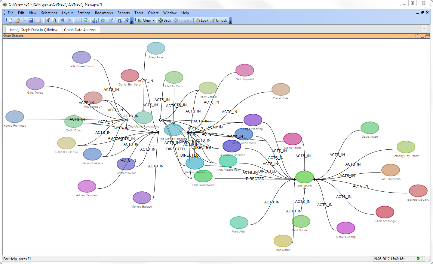
Hi all,I started to develop an extension for graph visualization based on the Graph Dracula Library, using Raphael: http://www.graphdracula.netThis se... Show MoreHi all,
I started to develop an extension for graph visualization based on the Graph Dracula Library, using Raphael: http://www.graphdracula.net
This seems to be an interesting topic. First of all, what is the best data representation of graph data in a relational QlikView world? Second, there are a lot of limitations using those JavaScript libs. I've tried some before (D3.js etc.) but Dracula seems to have the simplest interface for my use case.
What is your opinion?
- Ralf
-
Qlik Compose for Data Warehouses
how to read pdf file which contain text and tables also but i want only load tab...
how to read pdf file which contain text, graph and tables also but i want only load table data into database, what should i do? which custom component... Show Morehow to read pdf file which contain text, graph and tables also but i want only load table data into database, what should i do? which custom component used?
-
Qlik Sense Cloud Filter Based on Multiple Columns
I have a table that I need to filter based on multiple columns. The scenario is that I need to look up a worker's name and filter the table if the wo... Show MoreI have a table that I need to filter based on multiple columns. The scenario is that I need to look up a worker's name and filter the table if the worker's name shows up in ANY of the columns below:
Worker
Level 1 Manager
Level 2 Manager
Level 3 Manager
Level 4 Manager
Thank you for any assistance you can provide.
-
Display last transactions with multiple rows
How to display the last transaction that has multiple rows. Example here is my data transaction_id transaction_date account_name items amount 98... Show MoreHow to display the last transaction that has multiple rows. Example here is my data
transaction_id transaction_date account_name items amount 9850840 5/10/2004 Mikey A 10 9850840 5/10/2004 Mikey B 15 9850840 5/10/2004 Mikey C 20 4536281 5/11/2004 Mikey D 10 4536281 5/11/2004 Mikey E 15 4536281 5/11/2004 Mikey F 20 7653428 5/12/2004 Mikey
G 10 7653428 5/12/2004 Mikey H 15 7653428 5/12/2004 Mikey I 20 7894566 5/11/2004 James A 15 7894566 5/11/2004 James C 20 7894566 5/12/2004 James D 10 8664523 5/12/2004 James E 20 8664523 5/12/2004 James E 20 8664523 5/12/2004 James K 30 I want to display in a chart table
account_name items amount Mikey G 10 Mikey H 15 Mikey I 20 James E 20 James E 20 James K 30
The Example I saw mostly sum up the amount, so it will only have 1 rec per account name, but i want to display the details.
master item last_transaction_id = FirstSortedValue(transaction_id,-transaction_date,account_name) will give me the last transaction_id per account name. How do I display all records associated with this transaction_id if I dont want to display the transaction_id. I can't get the set analysis syntax correctly, something like {<transaction_id = last_transaction_id>} account_name, {<transaction_id = last_transaction_id>} item, {<transaction_id = last_transaction_id>} Amount. i appreciate any help on this. Thanks. -
select the previous month directly
Hello, I have a dimension called ''Exercice période'' in French which mean Period exercice. I want to systematically select the previous month of the ... Show MoreHello,
I have a dimension called ''Exercice période'' in French which mean Period exercice. I want to systematically select the previous month of the period, as an example, we're in May, I want to select April.
Any expression for that please?
Thank you so much
-
How to pass authentication token to websocket call
I am creating a simple mashup and it generates below config -- var config = {host: window.location.hostname,prefix: prefix,port: window.location.port... Show MoreI am creating a simple mashup and it generates below config --
var config = {
host: window.location.hostname,
prefix: prefix,
port: window.location.port,
isSecure: window.location.protocol === "https:"
};This is then used to make websocket calls , like https://<host>:<port>/<prefix>/app/engineData?reloadUri=....
I am exposing the dashboard through a different domain. I need to authenticate separately and pass a 'token' to this websocket call.
Like https://<host>:<port>/<prefix>/app/engineData?reloadUri=....&token=<TOKEN>
How to configure the config options to pass this token in every websocket call?
This question is for Qlik Sense enterprise edition.
-
Colors quality differs based on method of using them
Why don't these two example charts show the same colors (see example image)? Top chart: I first created this one. Appearance settings is custom colors... Show MoreWhy don't these two example charts show the same colors (see example image)?
Top chart: I first created this one. Appearance settings is custom colors by dimension Dim2, and I have chosen a color scheme from my custom theme.
Bottom chart: I duplicated the first chart, and the only thing I changed is the appearance color setting. Here I have chosen colors by expression, and the colors that the expression defines are the same color codes as in the custom theme palette used in the top chart.
Why are the colors in the topmost chart "faded"?
The hex codes for the colors are exactly the same in the expression as in the custom theme definition. I don't understand why the colors are faded in the top chart.
Qlik Sense Enterprise on Windows February 2024 patch 3.

-
Cannot POST form data using upgraded 'API Key - Raw API Request' - HTTP 500 Inte...
I upgraded a 'API Key - Raw API Request' block today that was posting raw form data. After the upgrade, Qlik does not send the request to the remote s... Show MoreI upgraded a 'API Key - Raw API Request' block today that was posting raw form data. After the upgrade, Qlik does not send the request to the remote server and returns a HTTP 500 error.
When upgrading, Qlik prompted me that the Form encoded body field was removed. I was already sending a raw body like 'field1=value1&field2=value2' with the 'Content-Type' header set as 'application/x-www-form-urlencoded'. In the previous version of the 'API Key - Raw API Request' it was working fine.
I have tested this with a remote server and with the old and the upgraded block, the request of the upgraded block not arrive at the remote server. The error also indicates something fails on Qlik's side. I would like to know how I can POST form data using the new 'API Key - Raw API Request' block. -
Special character in database password
I want to connect a postgresql database to a job talend but database password contain special character ù and talend send me this error Caused by: jav... Show MoreI want to connect a postgresql database to a job talend but database password contain special character ù and talend send me this error
Caused by: java.lang.IllegalArgumentException: value contains character 'ù' which is non US-ASCII
I search on forum but i never find solution to this problem.Thank you for your help.
-
How to compute a correct moving average in Nprinting ?
Hi there, I am trying to compute a 5-weeks moving average correctly to display it in a graph in a Nprinting report. Basically my data looks like the a... Show MoreHi there,
I am trying to compute a 5-weeks moving average correctly to display it in a graph in a Nprinting report.
Basically my data looks like the attached example :
- week id
- Nb is my measure
- Moving average 5 weeks : the 5-week moving average of the measure "Nb"
I want to display "Nb" and its "Moving average 5 weeks" only over the last 10 weeks, so between week 202411 and 202420 in my example.
But for weeks 202411 to 202415, I need older data points to be able to compute properly the 5 weeks rolling average, example :
Moving average 5 weeks for week 202411 = (120 + 200 + 27 + 128 + 625 )/5 = 220
Problem : if I filter on the last 10 weeks only, I miss older data required to compute properly the 5-weeks rolling average. For 202411, I will only get 120/5 = 24 which is wrong.
How can I do to compute properly the moving average for each point and only then, filter to display only the 10-week period of my interest ?
What I have already tried without success :
- compute the moving average in QlikSense and then filter on 10 last weeks in Nprinting graph : FAILED
- filter on 20 last weeks in Nprinting graph to get correct moving average value and then apply an additional filter on 10 last weeks at task level (hoping the aggregation would be performed before the final filter on period) : FAILED
Thanks for your help


Lots of Qlik Talend Data Integration Sessions!
Wondering about Qlik Talend Data Integration Sessions? There are 11, in addition to all of the Data & Analytics. So meet us in Orlando, June 3 -5.
Qlik Community Office Hours
Join us on May 15th at 11 AM ET to discuss the Qlik Ideation Process. Bring your questions.

Qlik Community How To's
Browse our helpful how-to's to learn more about navigating Qlik Community and updating your profile.

Your journey awaits! Join us by Logging in and let the adventure begin.


Customer Story
Qlik Data Integration & Qlik Replicate story
Qlik enables a frictionless migration to AWS cloud by Empresas SB, a group of Chilean health and beauty retail companies employing 10,000 people with 600 points of sale.
Customer Story
Building a Collaborative Analytics Space
Qlik Luminary Stephanie Robinson of JBS USA, the US arm of the global food company employing 70,000 in the US, and over 270,000 people worldwide.
Location and Language Groups
Choose a Group
Join one of our Location and Language groups. Find one that suits you today!
Healthcare User Group
Healthcare User Group
A private group is for healthcare organizations, partners, and Qlik healthcare staff to collaborate and share insights..
Japan Group
Japan
Qlik Communityの日本語のグループです。 Qlik製品に関する日本語資料のダウンロードや質問を日本語で投稿することができます。
Brasil Group
Brazil
Welcome to the group for Brazil users. .All discussions will be in Portuguese.
Blogs
Community News
Hear from your Community team as they tell you about updates to the Qlik Community Platform and more!