Unlock a world of possibilities! Login now and discover the exclusive benefits awaiting you.
- Qlik Community
- :
- All Forums
- :
- QlikView
- :
- Re: Creating a Pie Chart from Straight Table
- Subscribe to RSS Feed
- Mark Topic as New
- Mark Topic as Read
- Float this Topic for Current User
- Bookmark
- Subscribe
- Mute
- Printer Friendly Page
- Mark as New
- Bookmark
- Subscribe
- Mute
- Subscribe to RSS Feed
- Permalink
- Report Inappropriate Content
Creating a Pie Chart from Straight Table
I would like to create a Pie Chart from some data I prepared in a Straight Table. However, I would only like to chart a portion of the data.
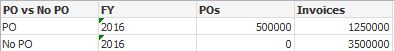
I only want to chart the ratio between the values on the PO row. How can I limit the data in this straight table and turn it into a Pie Chart? I had to create a calculated Dimension for the Po vs No PO field.
=If(Len([PO]) = 0,'No PO','PO')
- Mark as New
- Bookmark
- Subscribe
- Mute
- Subscribe to RSS Feed
- Permalink
- Report Inappropriate Content
=If(Len([PO]) = 0,'No PO','PO')
That is how. If the PO field is blank or essentially = 0, then there is No PO.
- Mark as New
- Bookmark
- Subscribe
- Mute
- Subscribe to RSS Feed
- Permalink
- Report Inappropriate Content
Can you share sample application as Talwar asked
QlikCommunity Tip: How to get answers to your post?
- Mark as New
- Bookmark
- Subscribe
- Mute
- Subscribe to RSS Feed
- Permalink
- Report Inappropriate Content
May be a set analysis like this:
{<[PO] = {"=Len(Trim(PO)) > 0"}>}
- Mark as New
- Bookmark
- Subscribe
- Mute
- Subscribe to RSS Feed
- Permalink
- Report Inappropriate Content
Where do I put this?
- Mark as New
- Bookmark
- Subscribe
- Mute
- Subscribe to RSS Feed
- Permalink
- Report Inappropriate Content
In your expression so that you only get the PO line.
- Mark as New
- Bookmark
- Subscribe
- Mute
- Subscribe to RSS Feed
- Permalink
- Report Inappropriate Content
Something is wrong with the syntax...Garbage after expression: '='
- Mark as New
- Bookmark
- Subscribe
- Mute
- Subscribe to RSS Feed
- Permalink
- Report Inappropriate Content
What is your expression?
- Mark as New
- Bookmark
- Subscribe
- Mute
- Subscribe to RSS Feed
- Permalink
- Report Inappropriate Content
I just used the Set Analysis you provided. Is it to be added to an existing expression? Here is my expression for PO:
=Count(DISTINCT [PO])
- Mark as New
- Bookmark
- Subscribe
- Mute
- Subscribe to RSS Feed
- Permalink
- Report Inappropriate Content
Might be sunny suggestion is this?
Count( {<[PO] = {"=Len(Trim(PO)) > 0"}>} <Target-Value>)Re: Creating a Pie Chart from Straight Table
- Mark as New
- Bookmark
- Subscribe
- Mute
- Subscribe to RSS Feed
- Permalink
- Report Inappropriate Content
Anil -
This -> =Count(DISTINCT {<[PO] = {"=Len(Trim(PO)) > 0"}>} [PO])