Unlock a world of possibilities! Login now and discover the exclusive benefits awaiting you.
- Qlik Community
- :
- All Forums
- :
- QlikView App Dev
- :
- Re: Heat Map Extension issue
- Subscribe to RSS Feed
- Mark Topic as New
- Mark Topic as Read
- Float this Topic for Current User
- Bookmark
- Subscribe
- Mute
- Printer Friendly Page
- Mark as New
- Bookmark
- Subscribe
- Mute
- Subscribe to RSS Feed
- Permalink
- Report Inappropriate Content
Heat Map Extension issue
Hi Team,
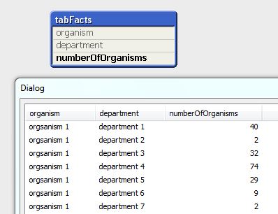
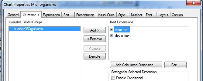
I require a heat map extension objet which works similar to that of pivot table heat map.
Regards,
Aniket
Accepted Solutions
- Mark as New
- Bookmark
- Subscribe
- Mute
- Subscribe to RSS Feed
- Permalink
- Report Inappropriate Content
Hi,
You can do something like below
Go to your expression-> click on'+' and put below expression in your background colour
Expression:
=colormix1(sum(Amount) / $(=max(aggr(sum(Amount), YourDimension))), white(), Green())
You need to modify your expression as per the need
- Mark as New
- Bookmark
- Subscribe
- Mute
- Subscribe to RSS Feed
- Permalink
- Report Inappropriate Content
any help on pivot chart heat map would also work
- Mark as New
- Bookmark
- Subscribe
- Mute
- Subscribe to RSS Feed
- Permalink
- Report Inappropriate Content
Hi Aniket,
Usually what I do with a heat make is:
1. Go to expressions
2. create your expresssion that you want to use with your heat map.
3. Once the expression is created, expand the expression and go to background colour.
4. In the Definition for the Background colour, try this formula:
=rgb((rank((set Analysis you want to use),1,1)
/max(TOTAL aggr(rank((set Analysis you want to use),1,1),<Group By Dimension>))*255),
255-(rank((set Analysis you want to use),1,1)
/max(TOTAL aggr(rank((set Analysis you want to use),1,1),<Group By Dimension>))*255),
0)
- Mark as New
- Bookmark
- Subscribe
- Mute
- Subscribe to RSS Feed
- Permalink
- Report Inappropriate Content
- Mark as New
- Bookmark
- Subscribe
- Mute
- Subscribe to RSS Feed
- Permalink
- Report Inappropriate Content
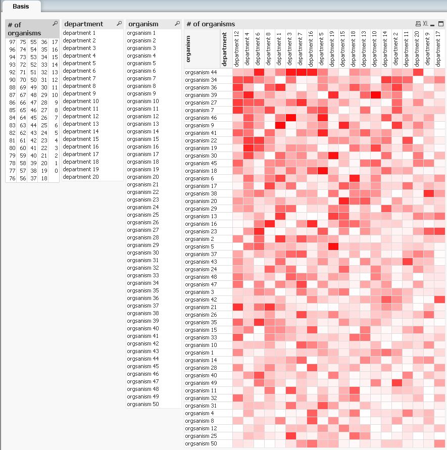
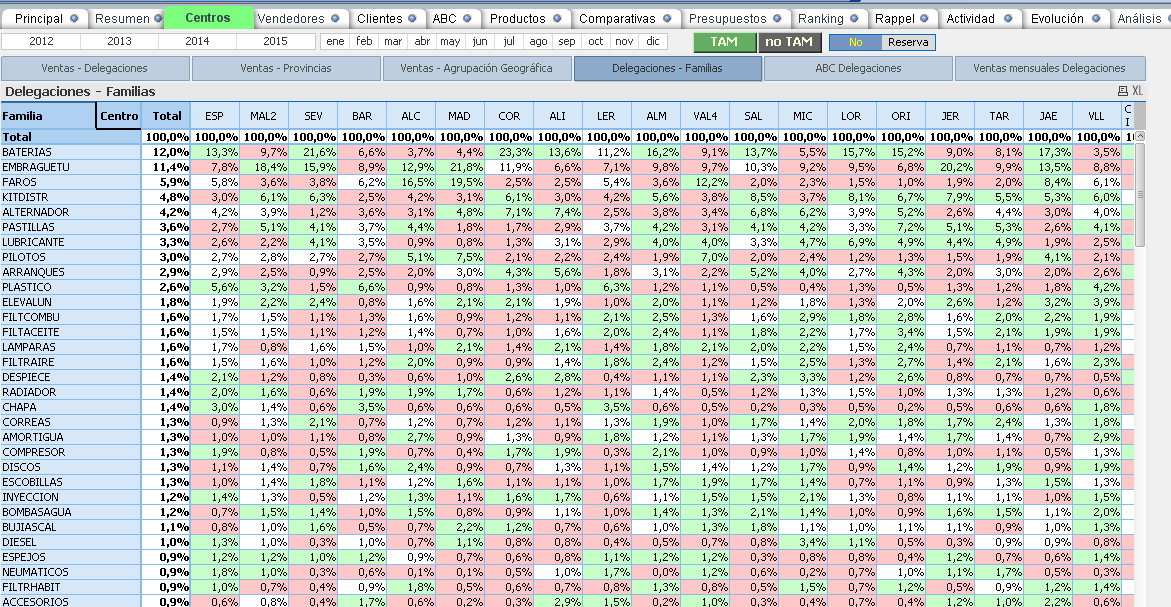
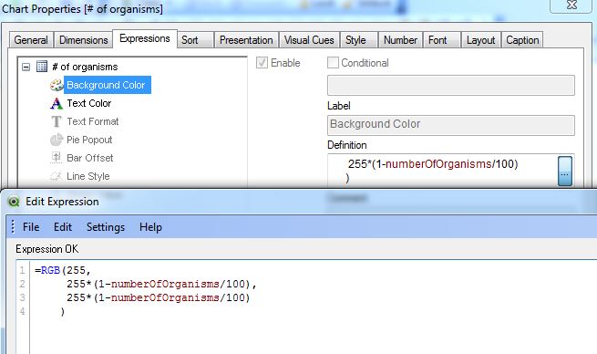
Similar that?
- Mark as New
- Bookmark
- Subscribe
- Mute
- Subscribe to RSS Feed
- Permalink
- Report Inappropriate Content
Hey Macro,
I have the similar requirement can you please send me the expression or suggest me an extension for the same.
Regards,
Aniket
- Mark as New
- Bookmark
- Subscribe
- Mute
- Subscribe to RSS Feed
- Permalink
- Report Inappropriate Content
Hey Thabang,
Thanks for the expression but iam getting only green colour in the chart .
Regards
Aniket.
- Mark as New
- Bookmark
- Subscribe
- Mute
- Subscribe to RSS Feed
- Permalink
- Report Inappropriate Content
Hi Aniket,
You might need to change the formula a bit depending on your requirements.
- Mark as New
- Bookmark
- Subscribe
- Mute
- Subscribe to RSS Feed
- Permalink
- Report Inappropriate Content
Hi,
You can do something like below
Go to your expression-> click on'+' and put below expression in your background colour
Expression:
=colormix1(sum(Amount) / $(=max(aggr(sum(Amount), YourDimension))), white(), Green())
You need to modify your expression as per the need
- Mark as New
- Bookmark
- Subscribe
- Mute
- Subscribe to RSS Feed
- Permalink
- Report Inappropriate Content
Hi,
hope this helps
regards
Marco