Unlock a world of possibilities! Login now and discover the exclusive benefits awaiting you.
- Qlik Community
- :
- Forums
- :
- Analytics
- :
- App Development
- :
- Re: Bar Chart Color by Expression
- Subscribe to RSS Feed
- Mark Topic as New
- Mark Topic as Read
- Float this Topic for Current User
- Bookmark
- Subscribe
- Mute
- Printer Friendly Page
- Mark as New
- Bookmark
- Subscribe
- Mute
- Subscribe to RSS Feed
- Permalink
- Report Inappropriate Content
Bar Chart Color by Expression
Hi,
I'm using 'color by expression' over 'bar chart' to add a measure, this measure needs to be a percentage.
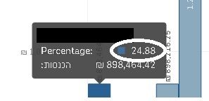
In the image below for example, I would like to have a percentage sign beside the number.
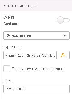
This is where the code located:
I've tried using the num function:
=num(((Sum(Invoice_Sum)/(Sum(Income_Target)))-1)*100, '#,##0%' )
But it doesn't work, any suggestions?
Thanks!
- Mark as New
- Bookmark
- Subscribe
- Mute
- Subscribe to RSS Feed
- Permalink
- Report Inappropriate Content
Override the Tooltip with your own Custom Tooltip.
- Mark as New
- Bookmark
- Subscribe
- Mute
- Subscribe to RSS Feed
- Permalink
- Report Inappropriate Content
Could you explain furthermore please?
- Mark as New
- Bookmark
- Subscribe
- Mute
- Subscribe to RSS Feed
- Permalink
- Report Inappropriate Content
Without any modification the tooltip you get when you hover is based on your measures and color expressions as you saw.
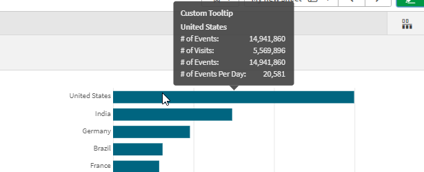
In my example I have a single measure for the # of Events.
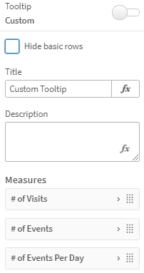
But if you turn off the basic tooltip you can add additional measures to what would be shown or in my case you can say "don't even show the basic rows I will give you everything I want you to show"
And the result is:
- Mark as New
- Bookmark
- Subscribe
- Mute
- Subscribe to RSS Feed
- Permalink
- Report Inappropriate Content
I see,
Any chance that your suggestion is available only in the 2021 Qlik edition?
I'm using June 2019...
- Mark as New
- Bookmark
- Subscribe
- Mute
- Subscribe to RSS Feed
- Permalink
- Report Inappropriate Content
It is newer than June 2019.
- Mark as New
- Bookmark
- Subscribe
- Mute
- Subscribe to RSS Feed
- Permalink
- Report Inappropriate Content
Yep, that's my problem.
Thank you for your help.


