Unlock a world of possibilities! Login now and discover the exclusive benefits awaiting you.
- Qlik Community
- :
- Forums
- :
- Analytics & AI
- :
- Products & Topics
- :
- App Development
- :
- Bar Chart background color definition for each exp...
- Subscribe to RSS Feed
- Mark Topic as New
- Mark Topic as Read
- Float this Topic for Current User
- Bookmark
- Subscribe
- Mute
- Printer Friendly Page
- Mark as New
- Bookmark
- Subscribe
- Mute
- Subscribe to RSS Feed
- Permalink
- Report Inappropriate Content
Bar Chart background color definition for each expression
Hi,
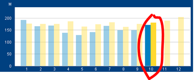
I'm trying to replicate a bar chart from QlikView into QlikSense. This is what I have in QlikView:
The chart uses 1 dimension: months of the year, and 2 expressions:
SalesCYear (blue bars): sales from this year
SalesPyear (yellow bars): sales from the prior year
For each of these I defined the color, setting the background color attribute:
The formula is:
if(Only({<Month=>}MONTH_NUM)=$(vYtdMaxdMonth),RGB(0,128,192),ARGB(100,0,128,192))
And in this case, vYtdMaxMonth = 10
The idea is that for the current month of the year (in the example is October) the color of the bar is RGB() and for the rest of the months the color is lighter (ARGB()), so the current month looks highlighted.
I haven't been able to figure out how to do this in QlikSense, any ideas?
Accepted Solutions
- Mark as New
- Bookmark
- Subscribe
- Mute
- Subscribe to RSS Feed
- Permalink
- Report Inappropriate Content
I was able to (kind of) solve the problem using the solution posted here:
This is the result:
The only thing I would like to change is that I only want to show the number of the month and not that second label. Any idea on how to remove it?
- Mark as New
- Bookmark
- Subscribe
- Mute
- Subscribe to RSS Feed
- Permalink
- Report Inappropriate Content
Use the exression as a master measure. Use the desired RGB expression there for color.
- Mark as New
- Bookmark
- Subscribe
- Mute
- Subscribe to RSS Feed
- Permalink
- Report Inappropriate Content
Hi Pradosh,
Could you please share with me an example?, when you say "there" is where exactly?
Thanks
- Mark as New
- Bookmark
- Subscribe
- Mute
- Subscribe to RSS Feed
- Permalink
- Report Inappropriate Content
I was able to (kind of) solve the problem using the solution posted here:
This is the result:
The only thing I would like to change is that I only want to show the number of the month and not that second label. Any idea on how to remove it?


