Unlock a world of possibilities! Login now and discover the exclusive benefits awaiting you.
- Qlik Community
- :
- Forums
- :
- Analytics & AI
- :
- Products & Topics
- :
- App Development
- :
- Re: Bar chart help with Aggr Function
- Subscribe to RSS Feed
- Mark Topic as New
- Mark Topic as Read
- Float this Topic for Current User
- Bookmark
- Subscribe
- Mute
- Printer Friendly Page
- Mark as New
- Bookmark
- Subscribe
- Mute
- Subscribe to RSS Feed
- Permalink
- Report Inappropriate Content
Bar chart help with Aggr Function
HI All,
Need help in resolving issue of Bar Chart.
I have stacked bar chart with Dimension as Country and measure as
Count({<[KPI ID]={"=$(PercentKPI)>=0.08"},[NUMBER FORMAT]={'Percentage'},[MONTH NUMBER]= {"$(vMaxMonth)"}>}Distinct [KPI ID]) AS RED
Count({<[KPI ID]={"=$(PercentKPI) < 0.08"},[NUMBER FORMAT]={'Percentage'},[MONTH NUMBER]= {"$(vMaxMonth)"}>}Distinct [KPI ID]) AS GREEN
where variable percetnKPI is SUM(Passed)/ Sum(Failed)
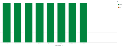
BArchart show all values as same 2 for all bar for all country as I have only 2 KPI count and all for GREEN but what I want as breakup by Countries which comes after sleection
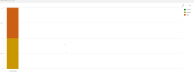
for eg:- in above chart Luxemberg show default value as 2 for green but when click on it it shows 1 Amber and 1 Red and that's what I need as default value o bar
- Mark as New
- Bookmark
- Subscribe
- Mute
- Subscribe to RSS Feed
- Permalink
- Report Inappropriate Content
@manojciti,
Did you try to represent it as " stacked bar chart"?
Can you, at least, share your application?
/joseph
- Mark as New
- Bookmark
- Subscribe
- Mute
- Subscribe to RSS Feed
- Permalink
- Report Inappropriate Content
HI Joseph,
Its stacked bar chart only with 3 measures as GREEN,AMBER & RED .so in second image you can see when i click on country it giving me correct color as 1 for AMBER and 1 for RED but when nothing selected its showing overall green instead of breakup by 3 Color(measure ) .
- Mark as New
- Bookmark
- Subscribe
- Mute
- Subscribe to RSS Feed
- Permalink
- Report Inappropriate Content
Can you share the sample qliksense app with the data to work out
- Mark as New
- Bookmark
- Subscribe
- Mute
- Subscribe to RSS Feed
- Permalink
- Report Inappropriate Content
Attached Sample Data file
- Mark as New
- Bookmark
- Subscribe
- Mute
- Subscribe to RSS Feed
- Permalink
- Report Inappropriate Content
Attached as requested
- Mark as New
- Bookmark
- Subscribe
- Mute
- Subscribe to RSS Feed
- Permalink
- Report Inappropriate Content
Variable returns single value. Instead use if condition for each measure
Ex: for Green
if(
(sum([NO. OF FAIELD])
/(sum([NO. OF FAIELD])
+sum([NO. OF PASSED])))<.05,
Count({<[NUMBER FORMAT]={'Percentage'},[MONTH NUMBER]= {'44621'} >}Distinct [KPI ID]),0)
- Mark as New
- Bookmark
- Subscribe
- Mute
- Subscribe to RSS Feed
- Permalink
- Report Inappropriate Content
HI Abhijith,
I tried but its not working as expected,
can you please update attached qliksense app and share .that will be helpful.
Regards
Manoj
- Mark as New
- Bookmark
- Subscribe
- Mute
- Subscribe to RSS Feed
- Permalink
- Report Inappropriate Content
Hi,
The count of KPI ID is not available for Amber and red. The data itself is not available
As a result you won't see stacked bar chart.
- Mark as New
- Bookmark
- Subscribe
- Mute
- Subscribe to RSS Feed
- Permalink
- Report Inappropriate Content
Hi @manojciti,
Can you check https://help.qlik.com/en-US/sense/February2020/Subsystems/Hub/Content/Sense_Hub/Visualizations/Bar-C... for bar chart vs Stacked style?
Normally, what you are doing should work but you need to check the data model. See for example this simple example using one dimension and 3 measures (similar to what you want to achieve)
/joseph

