Unlock a world of possibilities! Login now and discover the exclusive benefits awaiting you.
- Qlik Community
- :
- Forums
- :
- Analytics & AI
- :
- Products & Topics
- :
- App Development
- :
- Re: Color a Pivot Table
- Subscribe to RSS Feed
- Mark Topic as New
- Mark Topic as Read
- Float this Topic for Current User
- Bookmark
- Subscribe
- Mute
- Printer Friendly Page
- Mark as New
- Bookmark
- Subscribe
- Mute
- Subscribe to RSS Feed
- Permalink
- Report Inappropriate Content
Color a Pivot Table
Hello Guys.
I need your help.
I have one pivot table where DATA_BASE is my Dimension, and some rows.
Each row has your specific expression to calc.
I'm trying to find a way to color the values in the row, where highers in red,medium yellow and lowers in green. Making a gradient among them.
My app is attached to understand my view.
Thank you so much guys!!!
- « Previous Replies
-
- 1
- 2
- Next Replies »
Accepted Solutions
- Mark as New
- Bookmark
- Subscribe
- Mute
- Subscribe to RSS Feed
- Permalink
- Report Inappropriate Content
Hi Antonio,
If you want to colored the values every row separately. You can use the expression below for all measures on pivot table.
ColorMix2( (hrank(total
{{Measure Expression}}
)/(NoOfColumns(TOTAL)/2))-1 ,red(), green(),Yellow())
With that expression, every row color value calculated individually. Highest value is red, lowest value is green and the other values in the row is gradient over yellow.
- Mark as New
- Bookmark
- Subscribe
- Mute
- Subscribe to RSS Feed
- Permalink
- Report Inappropriate Content
A couple notes:
1. This is a continuation of a discussion from over here in the extensions streams. I suggested moving it over because it probably can be solved with traditional pivot tables.
https://community.qlik.com/message/1472624
2. Antonio really want to color based upon the range in the column. So, a low value in a column might get a red color, a medium value might get yellow, and a high value might get green. However, this is a challenge because it's the rows that are measures in this case. It's easier to base the color of a cell on its range within the measure. Not sure how this can be done across different measures.
3. One more complication. Antonio is using the "before" function to look up the value in the prior column. This seems to make it hard to calculate a max and min to base a color range upon. Here's an example of one of his measures (representing a row).
(SUM(RISCO_C_11_14)+SUM(RISCO_D_15_30)) / before(sum({1}RISCO_A_EM_DIA))
- Mark as New
- Bookmark
- Subscribe
- Mute
- Subscribe to RSS Feed
- Permalink
- Report Inappropriate Content
Antonio,
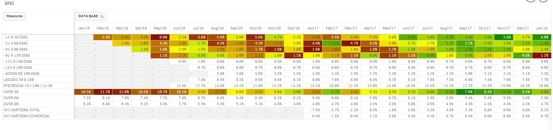
I had a little time to work on this. I came up with a solution that I think should work for you. It is not very elegant, but it works. Here's what the table looks like (part of it is cut off).
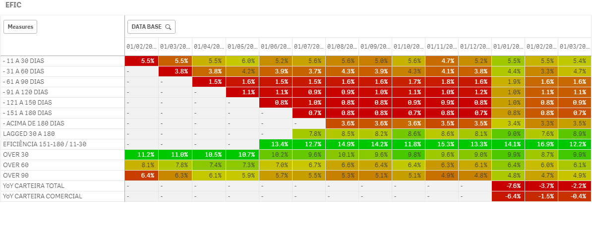
Notice that the color ranges over the columns. So, the lowest value in a column will be red, while the highest will be green. Here's how I did it:
1. Create a variable for each of your measures in the table. Each one of these variables, M1 through M14 is an exact copy-and-paste of the measure you wrote in the table.
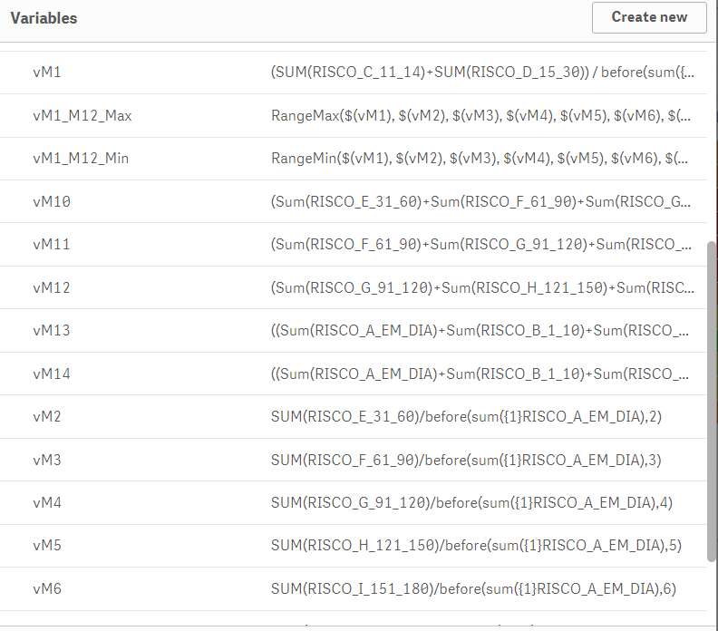
2. Create vM1_M12_Max and vM1_M12_Min, which are the max and min value for each of the 12 measures. You can see how they are defined in the image above. Note: If you want to include or remove a measure, you'll have to update these variable definitions.
3. Write a background color expression for each measure that finds the relative value of the measure (on the given day) compared to the min and max of all other measures. To get the red-yellow-green color scale I had to split the ColorMix1 expression into two haves: red-to-yellow for low (< 0.5) and yellow-to-green for high (>= 0.5). The colors are defined in variables so they can be easily adjusted. Here's the code for the first measure, all other measures only replace the vM1 part:
If ( ($(vM1) - $(vM1_M12_Min)) / ($(vM1_M12_Max) - $(vM1_M12_Min)) < 0.5,
ColorMix1(
($(vM1) - $(vM1_M12_Min)) / ($(vM1_M12_Max) - $(vM1_M12_Min)) * 2
        , $(vColor_Low), $(vColor_Mid)
    ),
    ColorMix1(
(($(vM1) - $(vM1_M12_Min)) / ($(vM1_M12_Max) - $(vM1_M12_Min)) - 0.5) * 2
        , $(vColor_Mid), $(vColor_High)
    )
)
Hopefully, this is everything you need. It took some work. Good luck.
- Mark as New
- Bookmark
- Subscribe
- Mute
- Subscribe to RSS Feed
- Permalink
- Report Inappropriate Content
Hi Jonathan!!!
Man, you worked hard here, thank you so much for your help, I understand everything you created.
One question, I see the gradient between highers and lowers is for the columns but the correct is for the row.
It's complicated to apply by rows not columns?
Thanks again!!!
- Mark as New
- Bookmark
- Subscribe
- Mute
- Subscribe to RSS Feed
- Permalink
- Report Inappropriate Content
Oh man, I really thought that what I did was what you were asking for. It's unfortunate that we didn't understand each other - that was a lot of work.
I don't think you could take the same approach for the rows to create a min and max value for a color range. It's too complicated for me to explain, but the "before" function would make it very difficult, if not impossible.
My one suggestion is somehow to change the data model with the data load editor so that you somehow "move up" the data that is needed at a given time point to the current time point. So instead of calling before(..) you'd have a field with the same information like "previous_data". If you have that it will be much easier to find the min/max.
If you get that, let me know and I'll help.
- Mark as New
- Bookmark
- Subscribe
- Mute
- Subscribe to RSS Feed
- Permalink
- Report Inappropriate Content
Hi Jonathan! I'm trying to find a solution to not use before.
Can you think Can I use something :
sum({$<DATA_BASE={"$(=DATE(MAX(DATA_BASE,2)))"} >} RISCO_A_EM_DIA))
Actually I tried with no sucess.
Tks
- Mark as New
- Bookmark
- Subscribe
- Mute
- Subscribe to RSS Feed
- Permalink
- Report Inappropriate Content
Hi Jonathan!
I found one way to remove the BEFORE, I created a new field that brings me what I want.
Follow the app attached.
Do you think is better to solve?
Thanks a lot!!!
- Mark as New
- Bookmark
- Subscribe
- Mute
- Subscribe to RSS Feed
- Permalink
- Report Inappropriate Content
Great,
Can you update the version that I uploaded, which has the measures as variables? It will be a lot easier to work with.
Jonathan
- Mark as New
- Bookmark
- Subscribe
- Mute
- Subscribe to RSS Feed
- Permalink
- Report Inappropriate Content
Hi Jonathan,
Here it go!!!
Only the ninth row and last 2 I couldn't find a way to remove before.
Maybe to color them I can force the values and colors.
Thank you so much!!
- Mark as New
- Bookmark
- Subscribe
- Mute
- Subscribe to RSS Feed
- Permalink
- Report Inappropriate Content
Hi Antonio,
If you want to colored the values every row separately. You can use the expression below for all measures on pivot table.
ColorMix2( (hrank(total
{{Measure Expression}}
)/(NoOfColumns(TOTAL)/2))-1 ,red(), green(),Yellow())
With that expression, every row color value calculated individually. Highest value is red, lowest value is green and the other values in the row is gradient over yellow.
- « Previous Replies
-
- 1
- 2
- Next Replies »