Unlock a world of possibilities! Login now and discover the exclusive benefits awaiting you.
- Qlik Community
- :
- Forums
- :
- Analytics & AI
- :
- Products & Topics
- :
- App Development
- :
- Re: Colour a graph by a second parameter which is ...
- Subscribe to RSS Feed
- Mark Topic as New
- Mark Topic as Read
- Float this Topic for Current User
- Bookmark
- Subscribe
- Mute
- Printer Friendly Page
- Mark as New
- Bookmark
- Subscribe
- Mute
- Subscribe to RSS Feed
- Permalink
- Report Inappropriate Content
Colour a graph by a second parameter which is selected by filter
Hello,
How do you plot a graph with one parameter coloured by a second parameter?
I know it is possible with a quantitative parameter as I did it previously but cannot get it to work now! The parameters are selected by two filters, the graph is currently coloured by the same parameter which is plotted - what is the function i should enter to select the second instead? The two parameters are selected from the same column in the same table, do I need to duplicate the column?
Is there any way to do the same thing but with a qualitative parameter with categories (by the user in app, not in script)?
Thank you for any suggestions 🙂
Carly
- Mark as New
- Bookmark
- Subscribe
- Mute
- Subscribe to RSS Feed
- Permalink
- Report Inappropriate Content
Hi @CarlyPharma
If I understand what you are after you should be able to create a second Master Measure with a colour range set and then drag that onto the chart. You will have the option to replace the existing measure, or colour by the new measure - you want the second option.
If you want the measure to be selected by the user then you may struggle to use master measure colours for this (though I haven't tried having colour ranges set on a variable measure). In this case you may need to use the Colour By Expression option and code the colours yourself. For discrete colours you will want a nested IF statement, for ranges you will want ColorMix and/or ColorMix2 functions.
Post back if you need more pointers.
Steve
- Mark as New
- Bookmark
- Subscribe
- Mute
- Subscribe to RSS Feed
- Permalink
- Report Inappropriate Content
Hello Steve,
The issue is that the selection I want to use are two different values from the same field (parameter) - one for the plot and one for the colour. As the two filters use the same field (parameter), they are linked and automatically change eachother to be the same - how can i separate them so that Qlik recognizes the second selection as a different field?
Parameter | Value |
Param a | Value a |
Param b | Value b |
Param c | Value c |
Thank you!
Carly
- Mark as New
- Bookmark
- Subscribe
- Mute
- Subscribe to RSS Feed
- Permalink
- Report Inappropriate Content
Hi @CarlyPharma
I see the problem now. We should be able to deal with this using Set Analysis. Do you have Only One Selected turned on for the Parameter filter? Would you ideally have a second filter for the second parameter so that they can be selected independently?
If so, the first thing is to create a data island in the load script, after your existing script, like this:
Param2:
LOAD DISTINCT
   Parameter as Parameter2
RESIDENT YourTableNameHere;
You can then create a second filter on the new field.
You then need set analysis so that the expression for the colour is based on the second parameter rather than the first, to get the value it would be something like:
sum({<Parameter={'$(=minstring(Parameter2))'}>}Value)
This will ignore the selection in the first Parameter filter and apply the selection from the second. You then need to apply that to the ColorMix function.
So, ColorMix requires a value between 0 and 1, so you want the highest batch to be 1 and everything else to be somewhere down from that. You can do that with AGGR to get the max value for any batch:
sum({<Parameter={'$(=minstring(Parameter2))'}>}Value) /
$(=max(aggr(sum({<Parameter={'$(=minstring(Parameter2))'}>}Value), Batch)))
Then that sits within the ColorMix function, like this:
colormix1(
sum({<Parameter={'$(=minstring(Parameter2))'}>}Value) /
$(=max(aggr(sum({<Parameter={'$(=minstring(Parameter2))'}>}Value), Batch))),
red(),blue())
Another approach is not to have the data island, and just use the first parameter from the drop down as the chart and the second as the colour. This blog post describes how that might work for you:
https://www.quickintelligence.co.uk/instant-qlik-sense-application/
Hope that helps.
Steve
- Mark as New
- Bookmark
- Subscribe
- Mute
- Subscribe to RSS Feed
- Permalink
- Report Inappropriate Content
Hi Steve,
The data island is working but the colormix function is not. The graph does not show any colour and selecting the filter changes nothing, I don't know what's wrong?
Thank you for your help!
Carly
- Mark as New
- Bookmark
- Subscribe
- Mute
- Subscribe to RSS Feed
- Permalink
- Report Inappropriate Content
Hi @CarlyPharma
The thing to do is to break it down and test each of the parts in turn.
I notice I had a typo in the load script above, with Paramter2 rather than Parameter2, I hope that hasn't tripped you up?
Suggest adding another measure to the chart with the expression selected by Parameter 2, this should give you a second line. If not, please post the expression from both the first and second measure.
If that works, try adding a measure with the expression inside the colormix function (the first parameter) and that should give you another line - you may want to put this on a second axis to test it.
Finally, change the colour expression to just a single colour (e.g. =Red()) to check that this works.
Hopefully breaking it down like that will allow you to find the problem.
Cheers,
Steve
- Mark as New
- Bookmark
- Subscribe
- Mute
- Subscribe to RSS Feed
- Permalink
- Report Inappropriate Content
Hello Steve,
Can you please explain the use of the sum and minstring functions in the expression above?
I think the issue is that my data needs to be pivoted. The parameters are all currently in one column:

How can I pivot data in QlikSense?
Thank you for your time!
Carly
- Mark as New
- Bookmark
- Subscribe
- Mute
- Subscribe to RSS Feed
- Permalink
- Report Inappropriate Content
Hi @CarlyPharma
To do the pivot, and make the value selectable, you would need to do a group by in the load script. That would look something like this:
LOAD
  PARAMETER_TYPE,
  PS_DATE,
  PS_NAME,
  sum(if(PARAMETER = 'Cell Harvest..', NUMBER_VALE, 0)) as [Cell Harvest],
  sum(if(PARAMETER = 'DSP INFO...', NUMBER_VALE, 0)) as [DSP Info]
FROM [lib://YourLibrary/YourData.qvd] (qvd)
GROUP BY
  PARAMETER_TYPE,
  PS_DATE,
  PS_NAME
;
That might seem like a good idea, but it most likely isn't. You need to specify in the load script all of the possible parameters and if you mistype one all the values go. You end up with loads of fields , your load script will take longer and the app may not perform so well.
Having all the values in a single column and then picking the one you want to look at actually makes things quite nice to work with. For example, if you wanted a line chart that plotted all of your different parameters against each other you just add PARAMETER as a dimension. You have already seen also how you can pick a parameter to have that plotted.
The downside of that approach is that you can have values for multiple parameters aggregated together.
This is why we need to ensure we only have one parameter in an expression at a time, and this is where we can use Set Analysis. Set analysis is quite a big topic, so I suggest Googling for more information on it, but in short you can get a total for all of your Cell Harvest values by doing this:
sum({<PARAMETER={'Cell Harvest, WCW HAR (%)'}>}NUMBER_VALUE)
So, you see your standard sum expression with the set doing it's magic in the middle of it, basically only adding up values where the parameter is of the right type.
What we want to do in the case where we get the different colour to the line being shown is to apply a different parameter to the expression based on the selection in the data island.
The code above does that in a number of steps;
minstring(Parameter2) gives the name of the selected parameter from the data island (or an arbitrary one if no selection is made).
$(= ) allows you to execute an expression in the middle of another expression.
{<PARAMETER={' '}>} is the Set Analysis I have just explained above.
sum( NUMBER_VALUE) is what you will already be doing in Sense.
So, if you put all of those bits together you get the expression in my previous post;
sum({<PARAMETER={'$(=minstring(Parameter2))'}>}NUMBER_VALUE)
Hope that makes sense? Happy to explain further if not.
Cheers,
Steve
- Mark as New
- Bookmark
- Subscribe
- Mute
- Subscribe to RSS Feed
- Permalink
- Report Inappropriate Content
Hi Steve,
Yes, there are too many parameters in order to load that way.
I don't want to aggregate the values in any way, I just want to select the value. Set analysis only works with aggregation no?
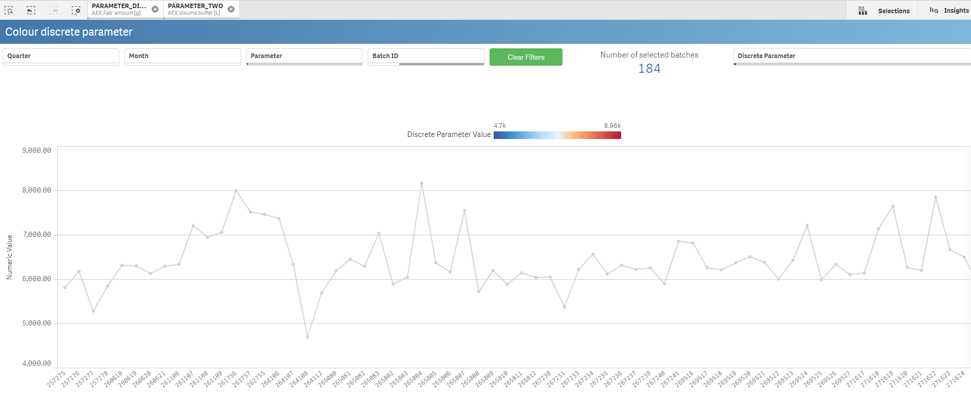
=colormix1(sum({<PARAMETER_DISCRETE={'$(=minstring(PARAMETER_DISCRETE2))'}>}[NUMBER_VALUE_DISCRETE2]) /$(=max(aggr(sum({<PARAMETER_DISCRETE={'$(=minstring(PARAMETER_DISCRETE2))'}>}[NUMBER_VALUE_DISCRETE2]), PS_NAME))), red(),blue())
In this expression, it is taking the sum of the values, so it is always the same right? The colour currently doesn't change on my graph. I want the colour of each point to be evaluated individually based on it's value for the second parameter:[NUMBER_VALUE_DISCRETE2], from hot to cold e.g. yield 100 = red, yield 0 = blue
The user wants to colour parameter 1 by parameter 2 in order to see the relationship between the two, if you have a better idea for how to display this (aside from a scatterplot, which is already done) I am open to suggestions 🙂
Thank you for your help!
Carly
- Mark as New
- Bookmark
- Subscribe
- Mute
- Subscribe to RSS Feed
- Permalink
- Report Inappropriate Content
In the expression you have posted it has NUMBER_VALUE_DISCRETE2. This value should not come from the data island, as this will always be calculated separate to the chart dimension and will then give the same value at every point on the chart. I expect that this should just be NUMBER_VALUE or NUMBER_VALUE_DISCRETE?
The second table only needs a distinct list of parameter values, rather than one row per value. This can be loaded with a DISTINCT statement:
LOAD DISTINCT
  NUMBER_VALUE_DISCRETE as NUMBER_VALUE_DISCRETE2
RESIDENT ExistingTableName;
The Aggr parameter must match the parameter for the time series on your chart, from your screenshots it looks like PS_NAME is therefore correct.
It is often worth creating a table with all of the values in to check what is going on, so have the same dimension as the line chart, the value of the line, the value of the colour expression and that as a percentage of the max. This table will be invaluable for debugging and can then be deleted when you have it working.
Good luck.
Steve