Unlock a world of possibilities! Login now and discover the exclusive benefits awaiting you.

- Qlik Community
- :
- Forums
- :
- Analytics & AI
- :
- Products & Topics
- :
- App Development
- :
- Re: Compare 2 selected items in one linechart
- Subscribe to RSS Feed
- Mark Topic as New
- Mark Topic as Read
- Float this Topic for Current User
- Bookmark
- Subscribe
- Mute
- Printer Friendly Page

- Mark as New
- Bookmark
- Subscribe
- Mute
- Subscribe to RSS Feed
- Permalink
- Report Inappropriate Content
Compare 2 selected items in one linechart
Hello to all,
I'm looking for a way to display 2 lines in one linechart to show up the differences between two items e.g. 2 Groups of persons or just 2 persons.
One example:
I want to select 2 persons out of a listbox. these two Persons should be my focus for the visualizations so the linechart should show me 2 lines, where I can see the progress of the expenses over the last months for each of them. This way i can see directly the differences between these two persons. Is this possible, because, if I choose 2 persons out of a listbox, the linechart will normally present the cummulation of the values.
Thx
Accepted Solutions

 sunny_talwar
- Mark as New
- Bookmark
- Subscribe
- Mute
- Subscribe to RSS Feed
- Permalink
- Report Inappropriate Content
sunny_talwar
- Mark as New
- Bookmark
- Subscribe
- Mute
- Subscribe to RSS Feed
- Permalink
- Report Inappropriate Content
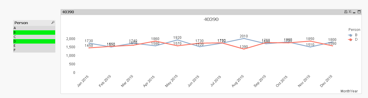
Something like this?
- Mark as New
- Bookmark
- Subscribe
- Mute
- Subscribe to RSS Feed
- Permalink
- Report Inappropriate Content
Exactly 😉
Edit:
I just realized, that you have uploaded a file. Unfortunately, if i copy it into my Qlik SenseDesktop folder I can open the app including the loading script, but there are no worksheets, where i can see formulars or such things. Could you please tell me, what you pick as dimension and what as a measure (including necessary Formulars)?!
Thanks a lot.
Michael
sunny_talwar
- Mark as New
- Bookmark
- Subscribe
- Mute
- Subscribe to RSS Feed
- Permalink
- Report Inappropriate Content
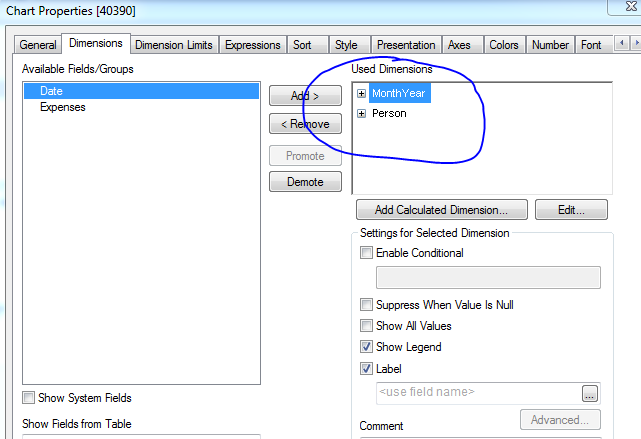
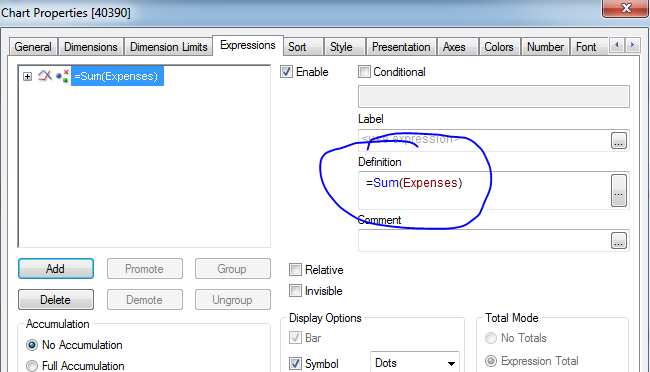
I guess the reason you were not able to open my attachment was because I did this in QlikView. I did not notice that this was Qlik Sense. But my guess is that it should work the same way in Qlik Sense. This is what I have:
Dimension: MonthYear, Person
Expression: =Sum(Expenses)
- Mark as New
- Bookmark
- Subscribe
- Mute
- Subscribe to RSS Feed
- Permalink
- Report Inappropriate Content
Oh my god...I'am so stupid 🙂
I forgot, that I can add another dimension (<person>) to the chart. Really big thanks to you. Now it works. 