Unlock a world of possibilities! Login now and discover the exclusive benefits awaiting you.
- Qlik Community
- :
- Forums
- :
- Analytics & AI
- :
- Products & Topics
- :
- App Development
- :
- Extracting Data from a Bell Curve
- Subscribe to RSS Feed
- Mark Topic as New
- Mark Topic as Read
- Float this Topic for Current User
- Bookmark
- Subscribe
- Mute
- Printer Friendly Page
- Mark as New
- Bookmark
- Subscribe
- Mute
- Subscribe to RSS Feed
- Permalink
- Report Inappropriate Content
Extracting Data from a Bell Curve
Hi,
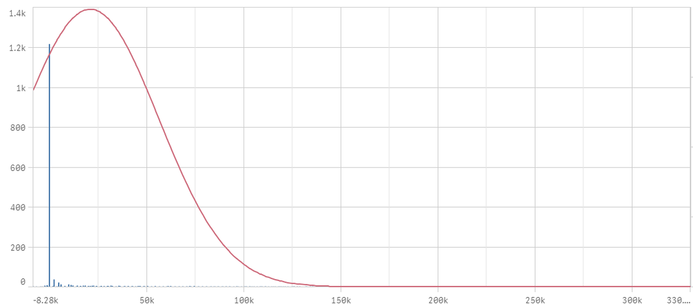
I have created a bell curve graph for performance of sales persons (listed in the x-axis). I have to create 3 dashboards, one dashboard showing the sales performance of the top 20% of salesmen, another showing the performance of the middle 60%, and the last one the bottom 20%.
How do I retrieve and display the list of sales men in the top 20% , middle 60%, and bottom 20% of the salesmen into another dashboard?
Many thanks

- Mark as New
- Bookmark
- Subscribe
- Mute
- Subscribe to RSS Feed
- Permalink
- Report Inappropriate Content
Hi Loocm,
You want to display the list of sales men in the top 20% , middle 60%, and bottom 20% of the salesmen into single table(chart) or all three category in different table(charts)
- Mark as New
- Bookmark
- Subscribe
- Mute
- Subscribe to RSS Feed
- Permalink
- Report Inappropriate Content
Hi,
I want to display the three categories into 3 different charts and tables. TQ.
- Mark as New
- Bookmark
- Subscribe
- Mute
- Subscribe to RSS Feed
- Permalink
- Report Inappropriate Content
Then I think Its very simple Create different table for each category and each category add dimension you want to display and each table add the respected measure (expression) in the measure text box ,you will see restricted data in the each table
if you dint get let me know ,