Unlock a world of possibilities! Login now and discover the exclusive benefits awaiting you.
- Qlik Community
- :
- Forums
- :
- Analytics & AI
- :
- Products & Topics
- :
- App Development
- :
- Formatting Color Measure in Scatter Chart
- Subscribe to RSS Feed
- Mark Topic as New
- Mark Topic as Read
- Float this Topic for Current User
- Bookmark
- Subscribe
- Mute
- Printer Friendly Page
- Mark as New
- Bookmark
- Subscribe
- Mute
- Subscribe to RSS Feed
- Permalink
- Report Inappropriate Content
Formatting Color Measure in Scatter Chart
Hello all,
I am trying to use some fancy color coding in my scatter chart. Here is what I have initially:
Regular chart, Counts and Time on axis, and Single Color:
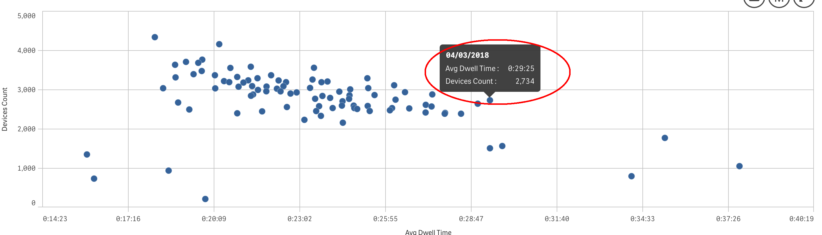
All looks good, both measures are displaying the correctly formatted values.
I've added the Color by Expression and it's added the extra line into pop-up:
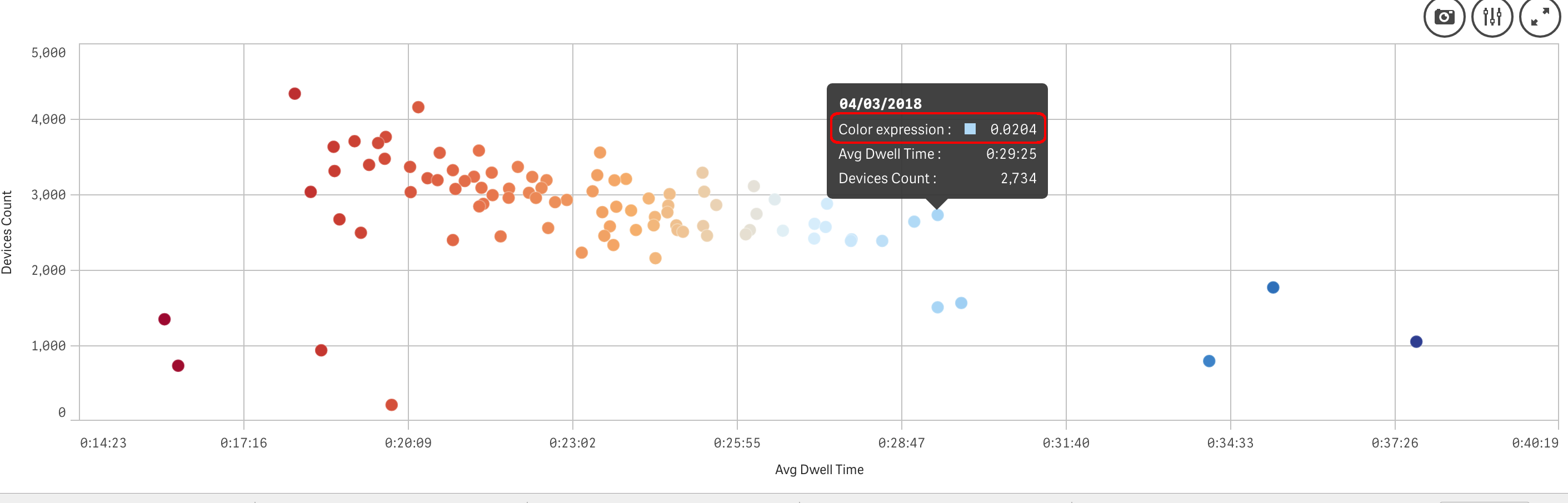
First Q: why?? I have two measures there already, I do not need an extra one...
But the biggest problem is that I cannot change the format of numbers displayed on that line!
I am trying to color points based on the Dwell time.
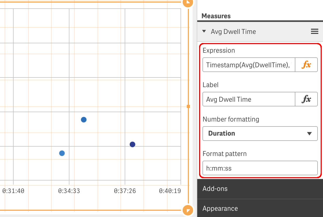
Here is the formatting in measure itself:
And in Colors section:
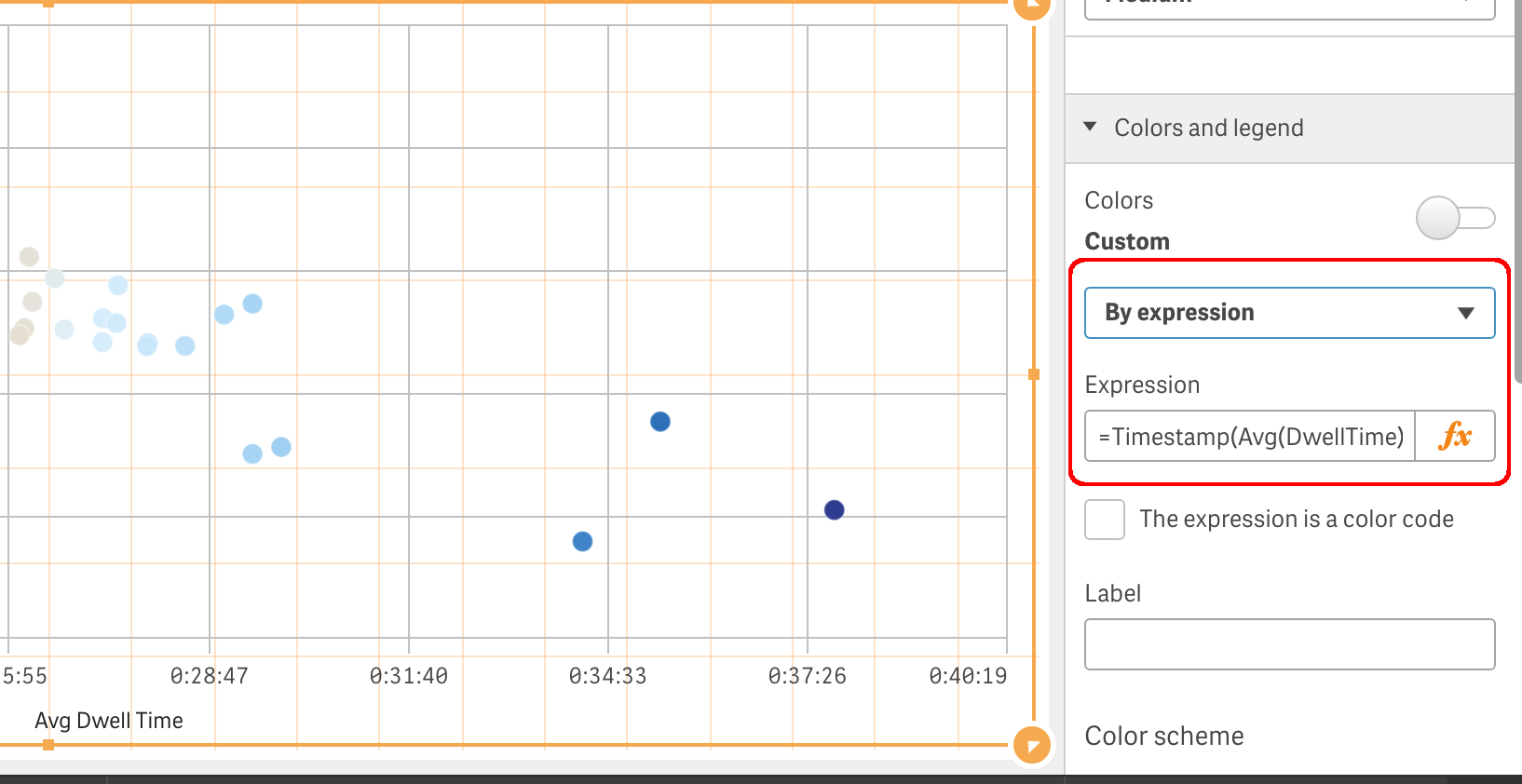
I've tried "Color by Measure", but no formatting available there as well.
Any suggestions how to resolve formatting issue or remove this line from pop-up, at least?
Regards,
Vlad
- Mark as New
- Bookmark
- Subscribe
- Mute
- Subscribe to RSS Feed
- Permalink
- Report Inappropriate Content
Unfortunately is an old and broad bug, not yet resolved, that involves all charts when colouring by measure at least until Feb2019 version.