Unlock a world of possibilities! Login now and discover the exclusive benefits awaiting you.
- Qlik Community
- :
- Forums
- :
- Analytics & AI
- :
- Products & Topics
- :
- App Development
- :
- Re: Grouped bar aggregation by month & year
- Subscribe to RSS Feed
- Mark Topic as New
- Mark Topic as Read
- Float this Topic for Current User
- Bookmark
- Subscribe
- Mute
- Printer Friendly Page
- Mark as New
- Bookmark
- Subscribe
- Mute
- Subscribe to RSS Feed
- Permalink
- Report Inappropriate Content
Grouped bar aggregation by month & year
I have been away from Qlik for a few years and my skills have gotten really rusty. I am trying to create a grouped bar chart that shows the sums by month and compares the current year and last year.
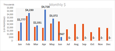
It should like this from Excel:
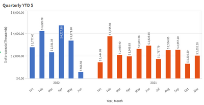
However, this is the best I can do in Qlik.
My Expression is below: Aggr(sum ( Amount/1000), Year, Month)
What am I doing wrong?
Thank you in advance for your help.
Accepted Solutions
- Mark as New
- Bookmark
- Subscribe
- Mute
- Subscribe to RSS Feed
- Permalink
- Report Inappropriate Content
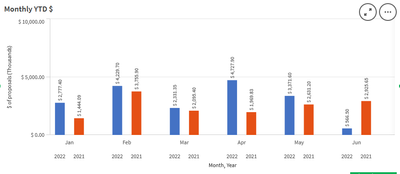
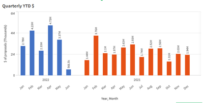
After taking a few days away from this, I was able to see things more clearly. Here's the result, and my expression.
If(Year = Year(vToday)-1, Aggr(sum ( Amount/1000), Year, Month), If(Year = Year(vToday), Aggr(sum ( Amount/1000), Year, Month)))
- Mark as New
- Bookmark
- Subscribe
- Mute
- Subscribe to RSS Feed
- Permalink
- Report Inappropriate Content
Hi @gshockxc
You have over complicated the expression, as the Aggr is not required, as the dimensions are shown on the chart. You can also remove the /1000 if you set the number format to Auto as that will then automatically put K on the legend if a number is over a certain amount (but show to the dollar if a single small transaction is selected).
Change the expression to just be sum(Amount) and then change the order of the dimensions under the Data properties. Do this simply by clicking and holding on Month and drag it above Year (or vice versa).
Hope that helps,
Steve
- Mark as New
- Bookmark
- Subscribe
- Mute
- Subscribe to RSS Feed
- Permalink
- Report Inappropriate Content
Thanks for the quick reply. I agree that your suggestions should work, and I've done similar in Qlikview (as I recall), but it's not working the same in Qliksense, or I'm doing something wrong. I tried your suggestions to change the number formatting to Auto, and I'm not really happy with the result. The Y-axis values go higher than necessary for the range of data that I'm looking at. Is there a way to change the formatting so that I can get something like $2M, $4M, etc?
I modified the Measure to be sum(Amount)
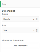
Here's the chart result, note that I have limited the range of values to 4, and the dimensions are shown below. Otherwise the chart displays all past years, which have '$0' values.
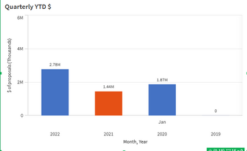
I have expanded the number of values to 20, and reversed Month and Year, I get this:
The Auto formatting works better here, but I'd still like to get the scale showing $2M, $4M, etc, if possible.
Thanks in advance.
- Mark as New
- Bookmark
- Subscribe
- Mute
- Subscribe to RSS Feed
- Permalink
- Report Inappropriate Content
Hi @gshockxc
You may be able to lose the empty years by unticking Include Zero Values under the Add Ons / Data Handling menu.
Another approach for this is to exclude non zero values in Set Analysis in the expression:
sum(Amount)
To show the dollar sign on the axis and have it scale appropriately takes a bit of work, but it is possible. You need to find the max value for any month and then decide how to divide the value.
=num(sum(Amount) /
if(max(aggr(sum(Amount), Month, Year)) < 1000, 1,
if(max(aggr(sum(Amount), Month, Year)) < 1000000, 1000,
1000000))
, '$#,##0' &
if(max(aggr(sum(Amount), Month, Year)) < 1000, '',
if(max(aggr(sum(Amount), Month, Year)) < 1000000, '.0 $K',
'.0 $M')))
You would then need to leave the number format to Auto for the denominator to show.
Regarding the scale on the Y axis, it is best to leave this to auto size. You can make the gaps narrower, and make the bars reach higher to the top of the chart by selecting Narrow under Appearance and Y-Axis and Scale. Sometimes it can still end up wider than you might like and not near enough the top, but setting a manual scale (using a similar aggr statement to above) is fiddly and can give odd results.
Hope that helps.
Steve
- Mark as New
- Bookmark
- Subscribe
- Mute
- Subscribe to RSS Feed
- Permalink
- Report Inappropriate Content
After taking a few days away from this, I was able to see things more clearly. Here's the result, and my expression.
If(Year = Year(vToday)-1, Aggr(sum ( Amount/1000), Year, Month), If(Year = Year(vToday), Aggr(sum ( Amount/1000), Year, Month)))
