Unlock a world of possibilities! Login now and discover the exclusive benefits awaiting you.
Announcements
Qlik and ServiceNow Partner to Bring Trusted Enterprise Context into AI-Powered Workflows. Learn More!
- Qlik Community
- :
- Forums
- :
- Analytics & AI
- :
- Products & Topics
- :
- App Development
- :
- How can I plot multiple prognosis versions in one...
Options
- Subscribe to RSS Feed
- Mark Topic as New
- Mark Topic as Read
- Float this Topic for Current User
- Bookmark
- Subscribe
- Mute
- Printer Friendly Page
Turn on suggestions
Auto-suggest helps you quickly narrow down your search results by suggesting possible matches as you type.
Showing results for
Partner - Contributor
2020-01-14
06:59 AM
- Mark as New
- Bookmark
- Subscribe
- Mute
- Subscribe to RSS Feed
- Permalink
- Report Inappropriate Content
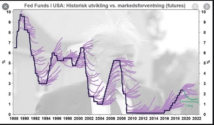
How can I plot multiple prognosis versions in one plot ("bad hair day graph")?
Hi,
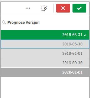
I have a model that makes new prognosis of various parameters every quarter of a year (see list of prognosis versions below). I would like to plot the prognosis versions that are selected by user together with the real data like shown in the lower figure. This should result in one line per selection in the list. When a new prognosis version occurs (2020-03-31) it should automatically appear on the list when reloading the data, and be possible to select. Does anybody have an idea if this can be done? Any help is appreciated.
Thanks
Anders
0 Replies

