Unlock a world of possibilities! Login now and discover the exclusive benefits awaiting you.
- Qlik Community
- :
- Forums
- :
- Analytics & AI
- :
- Products & Topics
- :
- App Development
- :
- How to color by expression a multi dimension bar g...
- Subscribe to RSS Feed
- Mark Topic as New
- Mark Topic as Read
- Float this Topic for Current User
- Bookmark
- Subscribe
- Mute
- Printer Friendly Page
- Mark as New
- Bookmark
- Subscribe
- Mute
- Subscribe to RSS Feed
- Permalink
- Report Inappropriate Content
How to color by expression a multi dimension bar graph?
Hello,
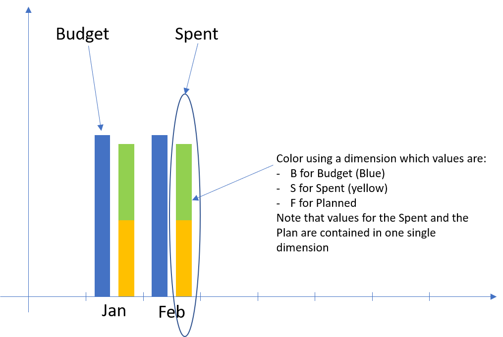
I haven't found the way to do in Qlik Sense what is shown in the picture below. Can you please help on how to color by expression using a different dimension than the ones in the graph for a bar chart?
Thanks in advance
- Mark as New
- Bookmark
- Subscribe
- Mute
- Subscribe to RSS Feed
- Permalink
- Report Inappropriate Content
Create master measures and assign colors.
- Mark as New
- Bookmark
- Subscribe
- Mute
- Subscribe to RSS Feed
- Permalink
- Report Inappropriate Content
Hello,
Thank you for your answer.
I must admit I did not find how to set the expressions regarding the colors when setting the Master Measures.
Should this be something like a conditional expression or an if based on the TAG dimension for the condition?
Can you please elaborate?
Thank you in advance
- Mark as New
- Bookmark
- Subscribe
- Mute
- Subscribe to RSS Feed
- Permalink
- Report Inappropriate Content
Watch this video: Assigning colors to master items - Qlik Sense - YouTube 
- Mark as New
- Bookmark
- Subscribe
- Mute
- Subscribe to RSS Feed
- Permalink
- Report Inappropriate Content
Hello,
Thank you for the time you take on this.
Sorry but I still do not manage. Let me give sample data:
| Product | Quarter | Budget | Spent | Tag |
| A | 1 | 34 | 0 | B |
| B | 1 | 233 | 0 | B |
| C | 1 | 45 | 0 | B |
| A | 2 | 34 | 0 | B |
| B | 2 | 56 | 0 | B |
| C | 2 | 45 | 0 | B |
| A | 3 | 34 | 0 | B |
| B | 3 | 23 | 0 | B |
| C | 3 | 45 | 0 | B |
| A | 4 | 56 | 0 | B |
| B | 4 | 67 | 0 | B |
| C | 4 | 56 | 0 | B |
| A | 1 | 0 | 34 | S |
| B | 1 | 0 | 233 | S |
| C | 1 | 0 | 45 | S |
| A | 2 | 0 | 34 | S |
| B | 2 | 0 | 56 | S |
| C | 2 | 0 | 45 | S |
| A | 3 | 0 | 33 | F |
| B | 3 | 0 | 21 | F |
| C | 3 | 0 | 46 | F |
| A | 4 | 0 | 55 | F |
| B | 4 | 0 | 68 | F |
| C | 4 | 0 | 56 | F |
I woul like to plot in a Bar Graph:
X axis: Product
In a grouped Bar Chart, I'd like to see Sum(Budget) and Sum(Spent) and I would like to use the Tag column to define the colors: one for B, one for S and one for F.
Can you please help me implement this?
Btw, I am using Qlik Sense Enterprise
Thank you in advance
- Mark as New
- Bookmark
- Subscribe
- Mute
- Subscribe to RSS Feed
- Permalink
- Report Inappropriate Content
I see what you mean, but I don't think you can do this. The reason is that you want to have a bar chart with two dimensions - Product displayed on the x-axis and Tag to control the stacks and their color - and two measures - Sum(Budget) and Sum(Spent). However, a bar chart allows you to use one of the following scenarios:
1 dimension + 1 measure
2 dimensions + 1 measure
1 dimension + up to 15 measures
You can either create two separate charts, or the best that comes to my mind that will allow you to keep things in one graph is to use an alternative measure:
Dimension 1: Product
Dimension 2: Tag (create this as master item and assign the colors you want)
Measure 1: Sum(Budget)
Alternative measure: Sum(Spent)