Unlock a world of possibilities! Login now and discover the exclusive benefits awaiting you.
- Qlik Community
- :
- Forums
- :
- Analytics & AI
- :
- Products & Topics
- :
- App Development
- :
- How to create a box plot ?
- Subscribe to RSS Feed
- Mark Topic as New
- Mark Topic as Read
- Float this Topic for Current User
- Bookmark
- Subscribe
- Mute
- Printer Friendly Page
- Mark as New
- Bookmark
- Subscribe
- Mute
- Subscribe to RSS Feed
- Permalink
- Report Inappropriate Content
How to create a box plot ?
Hi All
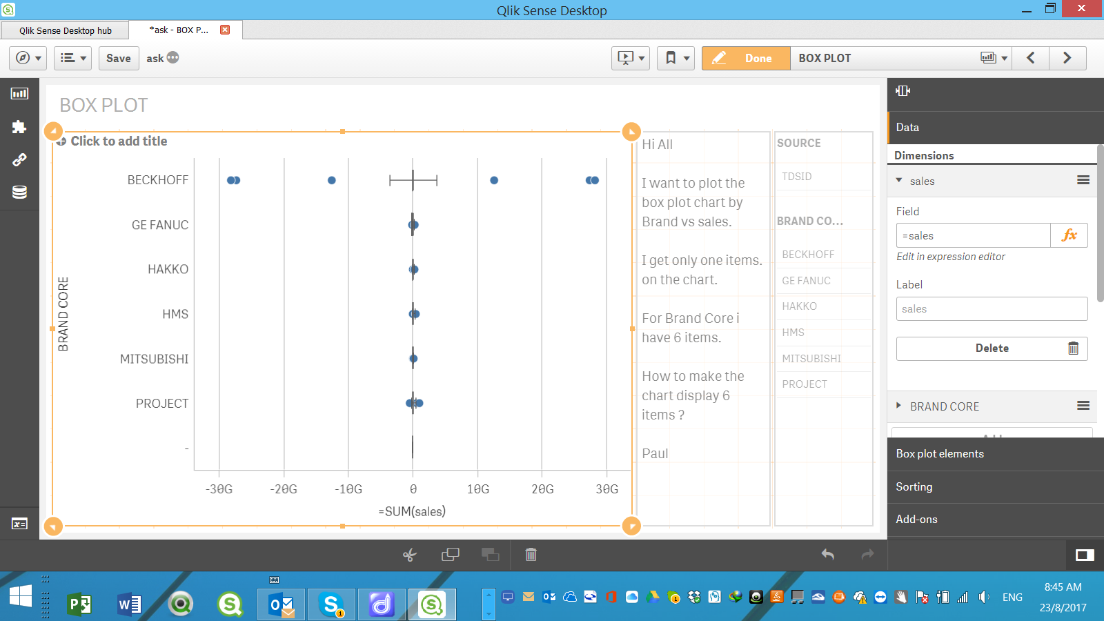
I want to plot the box plot chart by Brand vs sales.
I get only one items. on the chart.
For Brand Core i have 6 items.
How to make the chart display 6 items ?
Paul
- « Previous Replies
-
- 1
- 2
- Next Replies »
Accepted Solutions
- Mark as New
- Bookmark
- Subscribe
- Mute
- Subscribe to RSS Feed
- Permalink
- Report Inappropriate Content
Hi Paul!
When I plotted the box plot at the atomic sales value level I also got the same result as you showed. This is because the sales column has many extreme values (positive and negative) and these possible outliers are limiting the range of the box plot.
I was able to get reasonable results when the sales was plotted by brand at the annual sales level (dim = year).
Please find attached the changed qvf. Please let me know in case of questions.
- Mark as New
- Bookmark
- Subscribe
- Mute
- Subscribe to RSS Feed
- Permalink
- Report Inappropriate Content
Hello Paul!
The Box Plot needs a minimum of one dimension and one measure. In your case you have Brand - a clear dimension and then 'Sales' - which is your measure.So Qlik Sense first aggregates the Sales by the 6 Brands and plots a single Box Plot for the six aggregated sales.
If you want to view a box for each brand then you will need to add another dimension (first dimension) which depends on how you wish to aggregate your sales.Brand will be your second dimension
For example I included the 'Year ' field and what is does is it calculates the Sales by Year for each brand and the box plot is plotted for each brand according to its yearly sales values (you may see it by daily sales, monthly sales or at any another level)
If you wish to look at the box plot for the atomic sales values (ie at each record level ) by brand you will need to include the 'sales' as the first dimension followed by brand and then you will have to include sum(sales) in the measure. (Thus sales is added in both dimension and measure)
This will give you the box plot based on each sale value by brand. However this can consume large cpu resources if the data is huge.
- Mark as New
- Bookmark
- Subscribe
- Mute
- Subscribe to RSS Feed
- Permalink
- Report Inappropriate Content
- Mark as New
- Bookmark
- Subscribe
- Mute
- Subscribe to RSS Feed
- Permalink
- Report Inappropriate Content
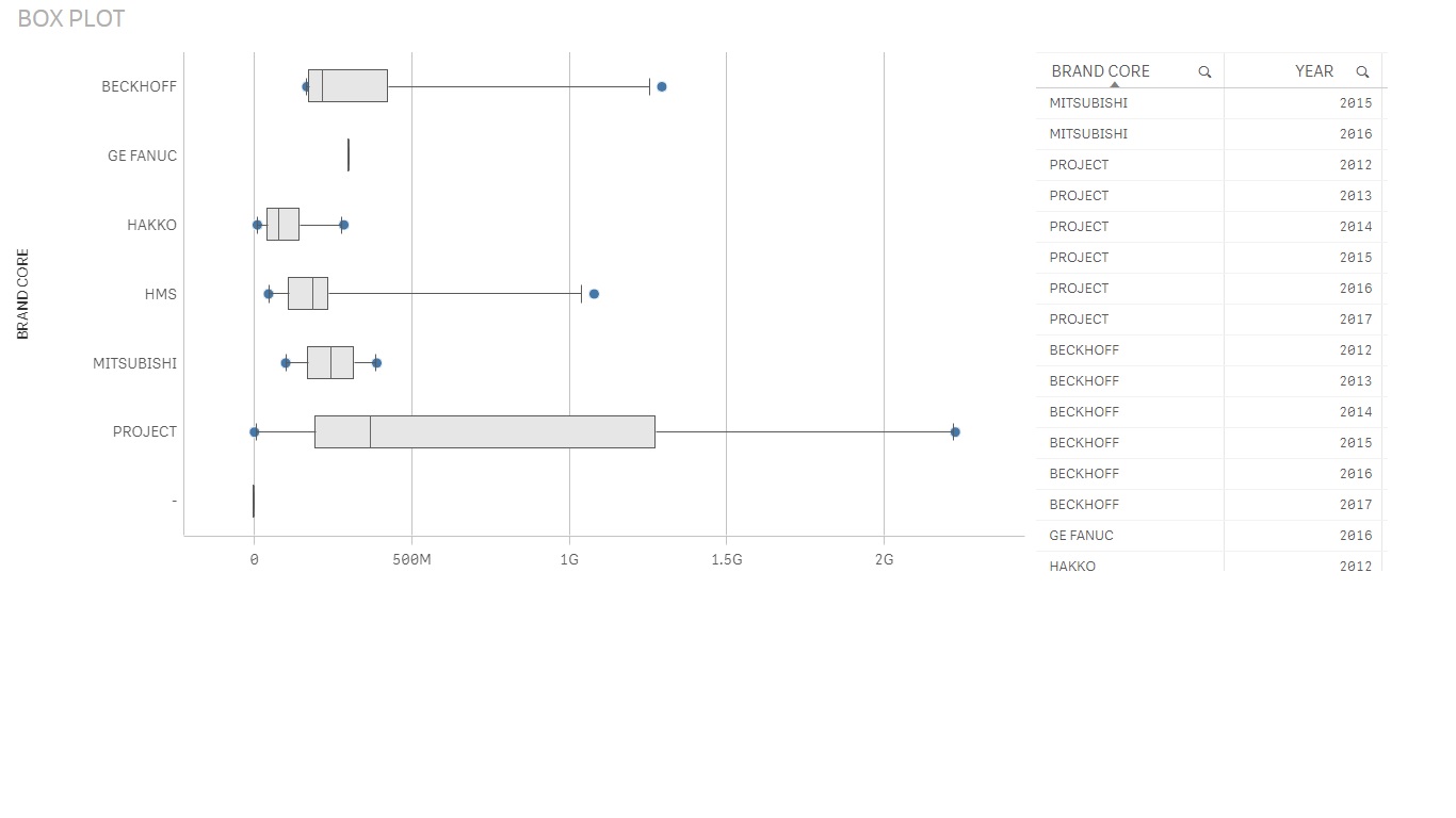
The above chart shows the box plot of Annual Sales by Brand.
- Mark as New
- Bookmark
- Subscribe
- Mute
- Subscribe to RSS Feed
- Permalink
- Report Inappropriate Content
Hi Aushik
Appreciate very much you look into my question. I have follow your instruction , add sales into 2nd dimension , but the chart does not display same as you. it is possible you send me your QVF ?
- Mark as New
- Bookmark
- Subscribe
- Mute
- Subscribe to RSS Feed
- Permalink
- Report Inappropriate Content
Hi Paul!
When I plotted the box plot at the atomic sales value level I also got the same result as you showed. This is because the sales column has many extreme values (positive and negative) and these possible outliers are limiting the range of the box plot.
I was able to get reasonable results when the sales was plotted by brand at the annual sales level (dim = year).
Please find attached the changed qvf. Please let me know in case of questions.
- Mark as New
- Bookmark
- Subscribe
- Mute
- Subscribe to RSS Feed
- Permalink
- Report Inappropriate Content
Hi Aushik
Thank you very much , it work fine now.
May i know why must put =year at 1st dimension , instead of sales ?
Paul Yeo
- Mark as New
- Bookmark
- Subscribe
- Mute
- Subscribe to RSS Feed
- Permalink
- Report Inappropriate Content
Hello Paul,
You can put the dimension as sales as well. Assuming you have 20 years of data and each year has 1000 values..so you have a total of 20000 values.
If you use the 'sales' as a dimension then all the 20,000 values are plotted in the bar. If you use 'year' as dimension then the values are aggregated for the 20 years and the 20 aggregated points are plotted in the bars.
Please let me know if you need more details.
- Mark as New
- Bookmark
- Subscribe
- Mute
- Subscribe to RSS Feed
- Permalink
- Report Inappropriate Content
Hi Aushik
i use the QVF file you send me . Why when I click year =2016 , it does not able display the box chart ?
and why I need to select year 2016 and 2017 then it able plot the box chart ? The reasons is i want to compare the box plot chart for 2017 and 2016.
HOpe you can can share with me .
paul
- Mark as New
- Bookmark
- Subscribe
- Mute
- Subscribe to RSS Feed
- Permalink
- Report Inappropriate Content
Hi Yeo!
Greetings!
The Box plot in Qlik Sense accepts only two dimensions and one measure. So in our earlier case I have already aggregated it the two dimension level (Year and Brand)
Year - Agggregation dimension
Brand - Plotting dimension
Sales - Measure
In case you want to look at the box plot at both the Year and Brand level then one option I can think of is to combine the Brand and Year into a single dimension (plotting dimension). You may have the values at basic transaction level (Aggregation dime = 'Sales') or you may have them aggregated at a different level.
I will try to come back with a changed qvf doc later if you need it.
Best Regards
Aushik
- « Previous Replies
-
- 1
- 2
- Next Replies »