Unlock a world of possibilities! Login now and discover the exclusive benefits awaiting you.
- Qlik Community
- :
- Forums
- :
- Analytics & AI
- :
- Products & Topics
- :
- App Development
- :
- Re: How to group dimension based on criteria
- Subscribe to RSS Feed
- Mark Topic as New
- Mark Topic as Read
- Float this Topic for Current User
- Bookmark
- Subscribe
- Mute
- Printer Friendly Page
- Mark as New
- Bookmark
- Subscribe
- Mute
- Subscribe to RSS Feed
- Permalink
- Report Inappropriate Content
How to group dimension based on criteria
Hello gyes,
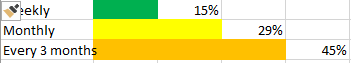
In a dashboard, I was asked to make a bar chart where to calculate the percentage of clients who visited my our stores at least once a week, monthly, or once every 3 months.
Something like this:
Basically, in terms of data, I have a table with all my clients (ID, Name, Subscribtion_date,...) and a table with all the transaction (TransID, Store, Client_ID, Product, Quantity, Value, Date).
Maybe the title of this question is not correct but I dont know exactly what to ask.
Can you please help me how to build the chart I want?
Thanks in advance,
Miguel Cunha
Accepted Solutions
- Mark as New
- Bookmark
- Subscribe
- Mute
- Subscribe to RSS Feed
- Permalink
- Report Inappropriate Content
In Dimension,
Valuelist('Weekly','Monthly','Every 3 Months')
In Expression,
Pick(Wildmatch(Valuelist('Weekly','Monthly','Every 3 Months'),'Weekly','Monthly','Every 3 Months'),
Expression for Weekly,
Expression for Monthly,
Expression for Every 3 Months
)
In Color by Expression,
Pick(Valuelist('Weekly','Monthly','Every 3 Months'),'Weekly','Monthly','Every 3 Months'),
green(),
yellow(),
red()
)
- Mark as New
- Bookmark
- Subscribe
- Mute
- Subscribe to RSS Feed
- Permalink
- Report Inappropriate Content
Create a Synthetic dimension using Valuelist()
or you can create a inline table in script with these values and use that field as dimension in chart.
For any issues share a sample data so that can help you in better way.
- Mark as New
- Bookmark
- Subscribe
- Mute
- Subscribe to RSS Feed
- Permalink
- Report Inappropriate Content
First of all, thanks for your answer.
I searched some discussions about Synthetic Dimensions but I dont understand how to aplly it in my case.
Can you please help me out a little more? What extra information do you need?
Thank you once again!
- Mark as New
- Bookmark
- Subscribe
- Mute
- Subscribe to RSS Feed
- Permalink
- Report Inappropriate Content
In Dimension,
Valuelist('Weekly','Monthly','Every 3 Months')
In Expression,
Pick(Wildmatch(Valuelist('Weekly','Monthly','Every 3 Months'),'Weekly','Monthly','Every 3 Months'),
Expression for Weekly,
Expression for Monthly,
Expression for Every 3 Months
)
In Color by Expression,
Pick(Valuelist('Weekly','Monthly','Every 3 Months'),'Weekly','Monthly','Every 3 Months'),
green(),
yellow(),
red()
)
- Mark as New
- Bookmark
- Subscribe
- Mute
- Subscribe to RSS Feed
- Permalink
- Report Inappropriate Content
Thank you very much Shraddha!
You saved my day