Unlock a world of possibilities! Login now and discover the exclusive benefits awaiting you.
- Qlik Community
- :
- Forums
- :
- Analytics & AI
- :
- Products & Topics
- :
- App Development
- :
- Re: How to present both the % label for each secti...
- Subscribe to RSS Feed
- Mark Topic as New
- Mark Topic as Read
- Float this Topic for Current User
- Bookmark
- Subscribe
- Mute
- Printer Friendly Page
- Mark as New
- Bookmark
- Subscribe
- Mute
- Subscribe to RSS Feed
- Permalink
- Report Inappropriate Content
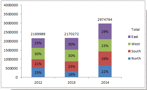
How to present both the % label for each section and the label for total number in the Stacked Bar Chart
Hey there,
I currently have a stacked bar chart. The x-axis is the different quarters and the y-axis the the percentage of total patients. Each bar contains patients from different channels.
I am wondering if there is anyway i can present the % of each channel in the bar chart, while presenting the total patients number on top of each bar.
something like below, only difference is the y-axis is %.
Accepted Solutions
- Mark as New
- Bookmark
- Subscribe
- Mute
- Subscribe to RSS Feed
- Permalink
- Report Inappropriate Content
The standard bar chart can\t do that unfortunately.
However if you can live with a horisontal bar chart this extension might be what you are looking for:
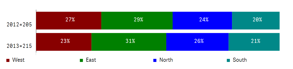
You can find it here: Qlik Branch
- Mark as New
- Bookmark
- Subscribe
- Mute
- Subscribe to RSS Feed
- Permalink
- Report Inappropriate Content
The standard bar chart can\t do that unfortunately.
However if you can live with a horisontal bar chart this extension might be what you are looking for:
You can find it here: Qlik Branch
- Mark as New
- Bookmark
- Subscribe
- Mute
- Subscribe to RSS Feed
- Permalink
- Report Inappropriate Content
Thanks peter.
- Mark as New
- Bookmark
- Subscribe
- Mute
- Subscribe to RSS Feed
- Permalink
- Report Inappropriate Content
If you found that what I proposed is a correct or valid solution please mark it as correct (answered) so the thread is closed. 
- Mark as New
- Bookmark
- Subscribe
- Mute
- Subscribe to RSS Feed
- Permalink
- Report Inappropriate Content
You'll have to tweak the properties a bit so I include my Qlik Sense app that I took the screenshots from...
- Mark as New
- Bookmark
- Subscribe
- Mute
- Subscribe to RSS Feed
- Permalink
- Report Inappropriate Content
i am using the cloud.. would you mind post it out, so that I can have a look?
- Mark as New
- Bookmark
- Subscribe
- Mute
- Subscribe to RSS Feed
- Permalink
- Report Inappropriate Content
I cant open it with cloud.