Unlock a world of possibilities! Login now and discover the exclusive benefits awaiting you.
- Qlik Community
- :
- Forums
- :
- Analytics & AI
- :
- Products & Topics
- :
- App Development
- :
- How to use both grouped and stacked measures with ...
- Subscribe to RSS Feed
- Mark Topic as New
- Mark Topic as Read
- Float this Topic for Current User
- Bookmark
- Subscribe
- Mute
- Printer Friendly Page
- Mark as New
- Bookmark
- Subscribe
- Mute
- Subscribe to RSS Feed
- Permalink
- Report Inappropriate Content
How to use both grouped and stacked measures with bar charts?
Hi everyone, I'm struggling with a bar chart, I need to use both grouped and stacked aggregation, is there any estension that allows it?
I need to show a planned VS actual measure with a grouped presentation, but the planned one must be detailed in its components..
Also I need to show with an icon if there is an over or under absorption of the measure.
Can you help me please?
Accepted Solutions
- Mark as New
- Bookmark
- Subscribe
- Mute
- Subscribe to RSS Feed
- Permalink
- Report Inappropriate Content
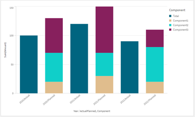
Assuming that you also want an additional time dimension and not only two bars for actual/planned, you could also use the standard Bar Chart with two dimensions combined into one to circumvent the dimension limitation:
=Aggr(Year&'/'&ActualPlanned,Year,ActualPlanned)
hope this helps
Marco
- Mark as New
- Bookmark
- Subscribe
- Mute
- Subscribe to RSS Feed
- Permalink
- Report Inappropriate Content
Thank you so much!

