Unlock a world of possibilities! Login now and discover the exclusive benefits awaiting you.
- Qlik Community
- :
- Forums
- :
- Analytics & AI
- :
- Products & Topics
- :
- App Development
- :
- Re: Idea! Qlik Sense Responsive Settings
- Subscribe to RSS Feed
- Mark Topic as New
- Mark Topic as Read
- Float this Topic for Current User
- Bookmark
- Subscribe
- Mute
- Printer Friendly Page
- Mark as New
- Bookmark
- Subscribe
- Mute
- Subscribe to RSS Feed
- Permalink
- Report Inappropriate Content
Idea! Qlik Sense Responsive Settings
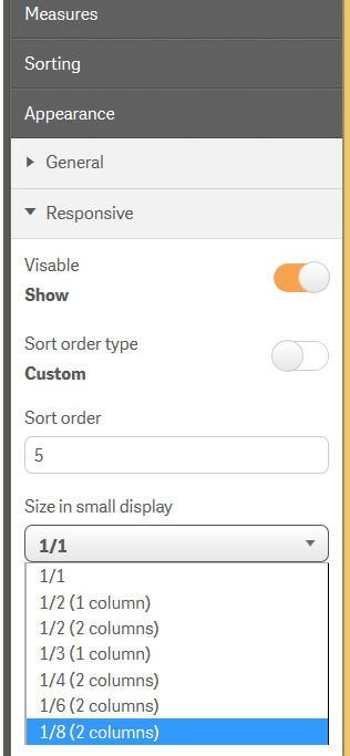
I have an idea, that you should be able to control the responsive flow of your Qlik Sense app in a better way. To do this I propose some new settings, something like this.

1. Visability
Some visualization, like listboxes, are not that useful on a small device and the user should be able to hide them.
2. Sort order
Today the visualizations are stacked upon each other in order from top/left to bottom/right. I want to be able to manually control in what order they appear
3.Size on small device
When in "small device mode" all visalization take up the same size. I would like to be able to change that to a fraction of the whole size instead and have some layout alternatives.
Example.
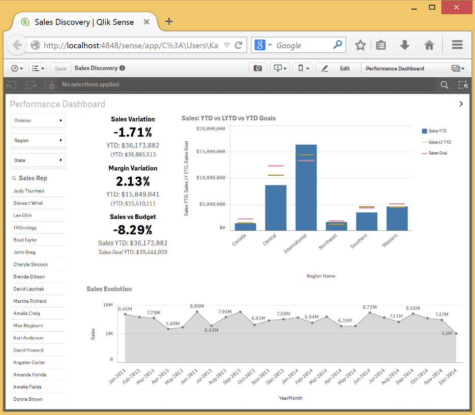
Take the Sales Discovery app with the sheet Performance Dashboard. This is how it looks like in "desktop mode". Very nice and user friendly.

And in "small device mode"

Not a very good user experience.
This is how I imagine my idea to handle the same sheet.
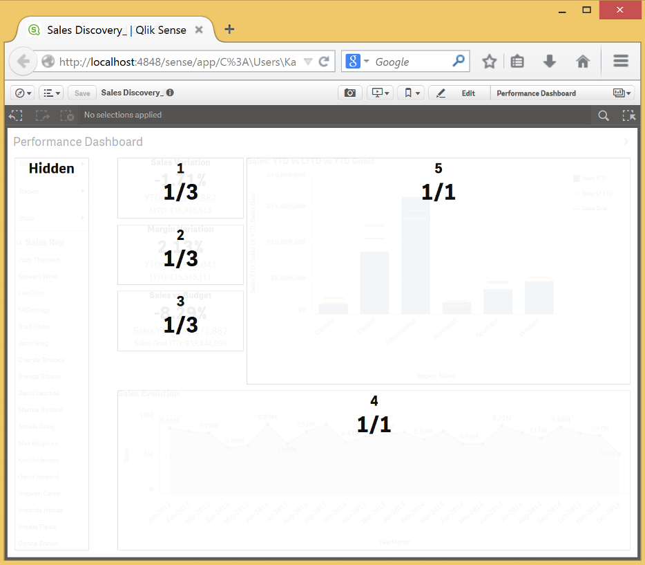
Hide the listbox. The 3 text and image only need a third of the size and could be displayed at the same time, in one column. And I would like to show the bottom visualization before the top. These would then be the settings I use. The number is the sort order.

And this is what the result would look like.

Cheers
Karl
- Mark as New
- Bookmark
- Subscribe
- Mute
- Subscribe to RSS Feed
- Permalink
- Report Inappropriate Content
Thanks Karl, we appreciate your interest and your desire to help improve the product - I will make sure our R&D team sees this. They may be working on something similar to this already.
Regards,
Mike T
Qlik
Mike Tarallo
Qlik
- Mark as New
- Bookmark
- Subscribe
- Mute
- Subscribe to RSS Feed
- Permalink
- Report Inappropriate Content
I like the idea Karl!
- Mark as New
- Bookmark
- Subscribe
- Mute
- Subscribe to RSS Feed
- Permalink
- Report Inappropriate Content
Thanks Michael, that's great news. Hope the next release will be with some added content and updates.