Unlock a world of possibilities! Login now and discover the exclusive benefits awaiting you.
- Qlik Community
- :
- Forums
- :
- Analytics & AI
- :
- Products & Topics
- :
- App Development
- :
- Re: Leader board
- Subscribe to RSS Feed
- Mark Topic as New
- Mark Topic as Read
- Float this Topic for Current User
- Bookmark
- Subscribe
- Mute
- Printer Friendly Page
- Mark as New
- Bookmark
- Subscribe
- Mute
- Subscribe to RSS Feed
- Permalink
- Report Inappropriate Content
Leader board
Hi All,
i need some ideas on developing leader board dashboard.. for eg:
we have 4 divivsions
revenue for year, quarter, month
divisions revenue
abc 20000
bcd 30000
efd 40000
der 10000
now in my dashboard i need to show in some new kind of visualization, may be kind of leader board.. Kind of ranking to encarage the division operational team to complete the task soon..
may be in a race track with car showing names of division from 1 st rank to last one by one
or bubbles at floating higher based on the ranking of revenue closed by them.
is there any extension available or any other way..? in Qlikview above the chart we could have put transparent images to make some new visualisation, how to do it in Qlik Sense...
- Tags:
- leader board
- Mark as New
- Bookmark
- Subscribe
- Mute
- Subscribe to RSS Feed
- Permalink
- Report Inappropriate Content
Guys please let me know, if anyone worked on this kind of requirement..
- Mark as New
- Bookmark
- Subscribe
- Mute
- Subscribe to RSS Feed
- Permalink
- Report Inappropriate Content
Hi Vinay Kumar,
Thats a brilliant requirement. If i was give such a requirement I would have built an extension like this:
A Force diagram which has circles, each circles size would be the measure(in your case revenue). So the ones with highest revenues would be the circles which are big. Now the top 5 big circles will be having the Images of the respective individual or divisions with a ranking badge attached to it.
Doing so as soon as you look at the visualisation you will be able to figure out the leader in a glance and obviously standout from others.
As this being a force layout, I can't tell you how much you they would love to play with it.
Let me know if you need help in building it.
Note: Make use of D3 to build it as this makes your life easier.
Thanks,
Sangram.
- Mark as New
- Bookmark
- Subscribe
- Mute
- Subscribe to RSS Feed
- Permalink
- Report Inappropriate Content
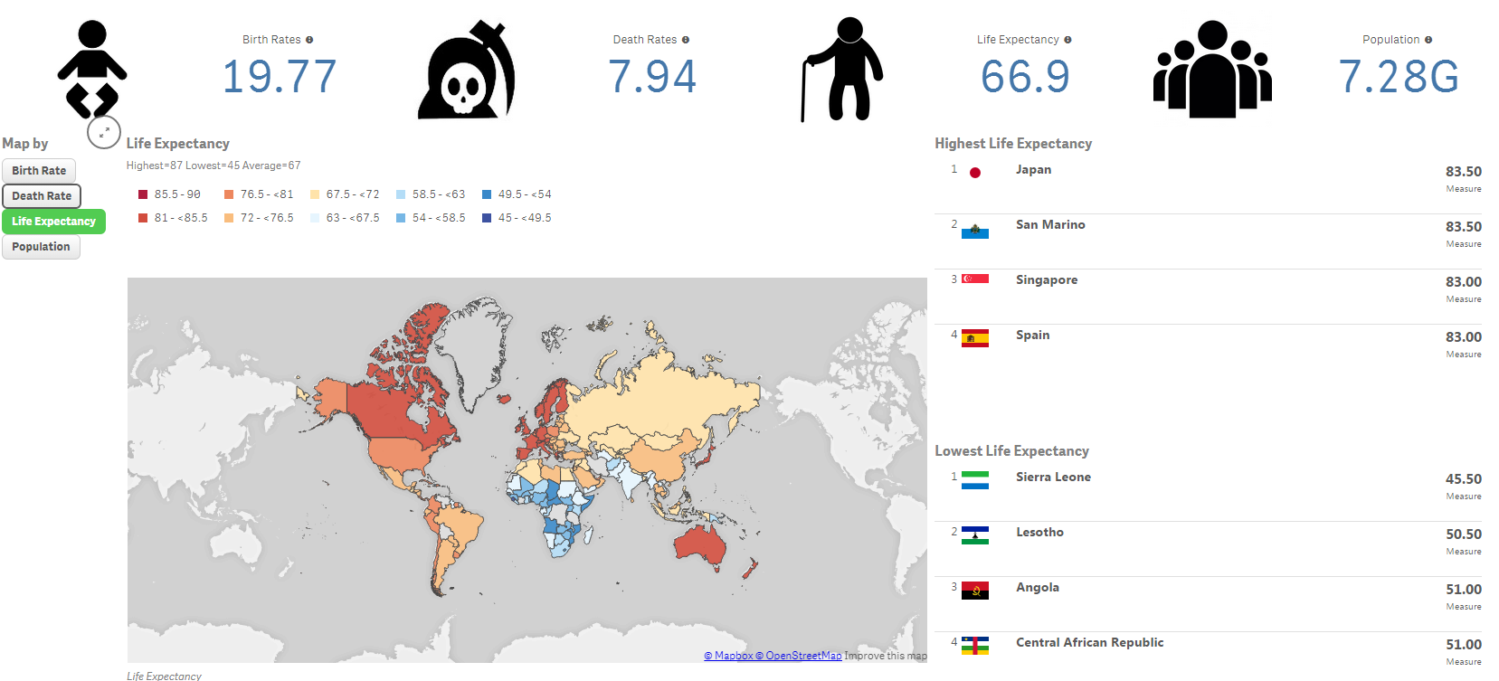
have a look at the card visualisation on qlik branch. I've used it for top 5 top 10 country ranking which looks great with flags. If you have some diVision n icons it could work nice to.
- Mark as New
- Bookmark
- Subscribe
- Mute
- Subscribe to RSS Feed
- Permalink
- Report Inappropriate Content
Here's an example of how I used card extension in my example app.
