Unlock a world of possibilities! Login now and discover the exclusive benefits awaiting you.
- Qlik Community
- :
- Forums
- :
- Analytics & AI
- :
- Products & Topics
- :
- App Development
- :
- Re: Line Chart Colour: line/area colour by Value
- Subscribe to RSS Feed
- Mark Topic as New
- Mark Topic as Read
- Float this Topic for Current User
- Bookmark
- Subscribe
- Mute
- Printer Friendly Page
- Mark as New
- Bookmark
- Subscribe
- Mute
- Subscribe to RSS Feed
- Permalink
- Report Inappropriate Content
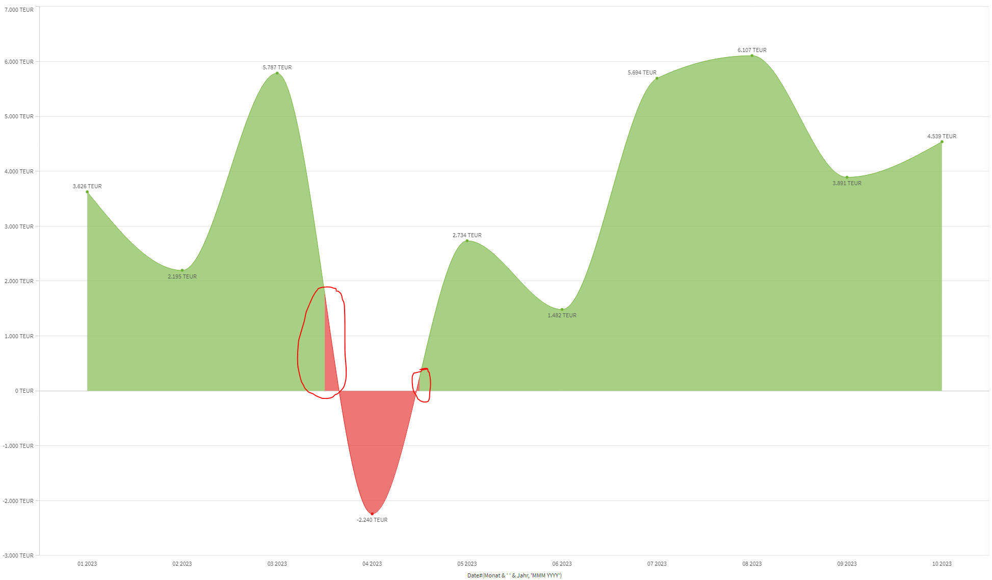
Line Chart Colour: line/area colour by Value
Hi everyone,
could anyone please help me getting the colour correctly.
At the moment i colour the area by expression. If value is posivite - area is green, else , area is red.
What am i doing wrong here? 😞
The Formula i use to get the colour is:
if(
num(Aggr(
RangeSum(Above(Sum(WertKumuliert ),0,12))
, Jahr, Monat)/1000,'#.##0 TEUR')
>=0, '#6db133', '#e31c18')
Accepted Solutions
- Mark as New
- Bookmark
- Subscribe
- Mute
- Subscribe to RSS Feed
- Permalink
- Report Inappropriate Content
Hi, I believe this is how line chart works and unfortunately colors so, because chart colors not just area part below 0, but each period. In your case, '04 2023' is minus, so red in specific period interval, all other is green. To test that, you can color your measure by date (period). You'll see, that each period will be colored in equal intervals:

One way to avoid this positive area coloring with 'wrong' color is just to use bar chart.
- Mark as New
- Bookmark
- Subscribe
- Mute
- Subscribe to RSS Feed
- Permalink
- Report Inappropriate Content
Hi, I believe this is how line chart works and unfortunately colors so, because chart colors not just area part below 0, but each period. In your case, '04 2023' is minus, so red in specific period interval, all other is green. To test that, you can color your measure by date (period). You'll see, that each period will be colored in equal intervals:
One way to avoid this positive area coloring with 'wrong' color is just to use bar chart.
- Mark as New
- Bookmark
- Subscribe
- Mute
- Subscribe to RSS Feed
- Permalink
- Report Inappropriate Content
Hi JustISO,
Thank you very much for your help and advice. I also thought about bar chart in order to avoid this misunderstanding, but was hoping i was wrong. Thank you once again. 🙂
- Mark as New
- Bookmark
- Subscribe
- Mute
- Subscribe to RSS Feed
- Permalink
- Report Inappropriate Content
Just adding to the above, which is correct - the chart as you want to display it is actually actively misleading. It suggests that the point in which the area crossed into the red is around April 4th, and by the end of April it was back into the green, even though it appears to show a singular value for the entire month of April. Perhaps a better representation here would be a combo chart, with color-coded bars showing the actual value and a line to show the trend?
- Mark as New
- Bookmark
- Subscribe
- Mute
- Subscribe to RSS Feed
- Permalink
- Report Inappropriate Content
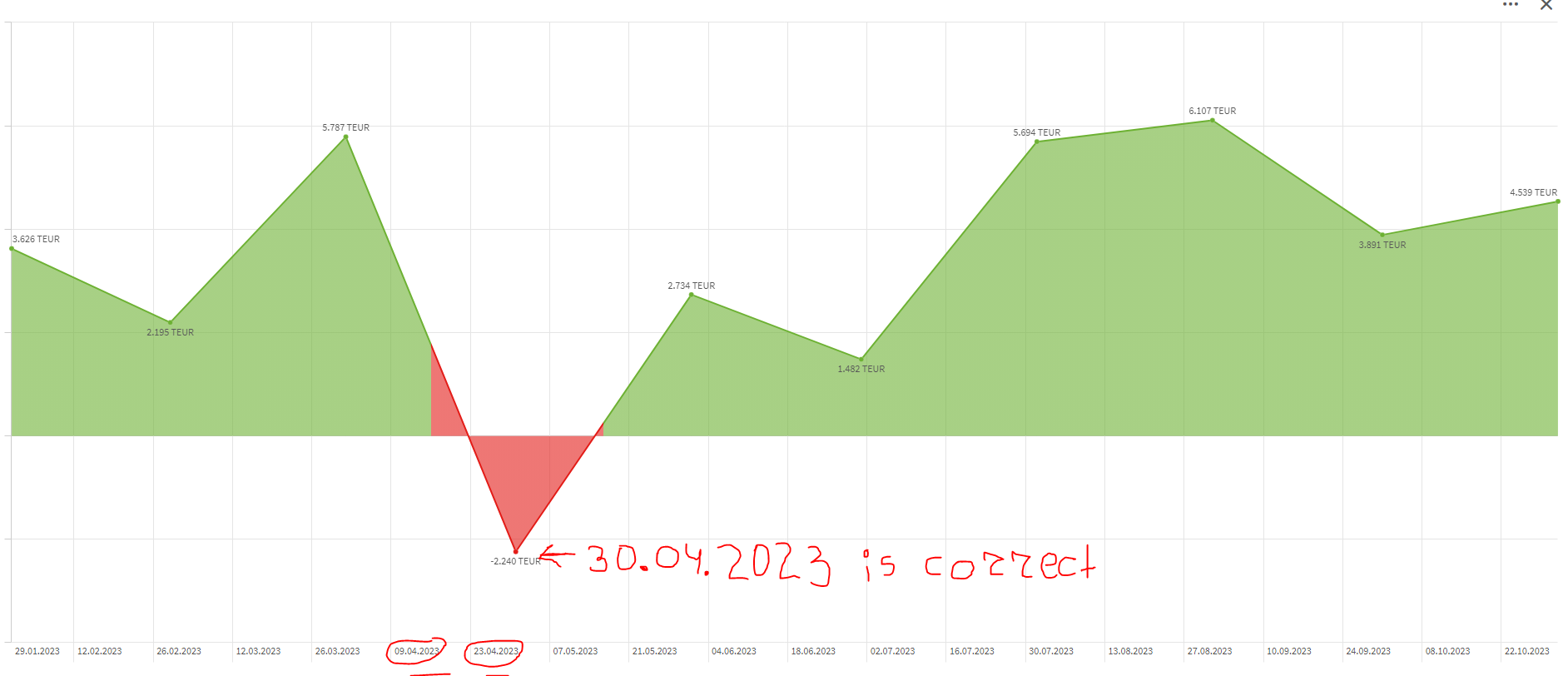
Hi Or,
there can only be one singular value for each month, this is why i could also not understand why, when i just use period in format ('MM.YYYY'), i am getting, for example for April, the dates 09.04.2023 and 23.04.2023. This is a bit confusing 😞
- Mark as New
- Bookmark
- Subscribe
- Mute
- Subscribe to RSS Feed
- Permalink
- Report Inappropriate Content
This is typical when using a continuous axis - the labels are automatically generated based on what fits, rather than on the actual values. If you're sure you have data for every month (no missing/blanks), you can disable the continuous axis and use a discrete one.