Unlock a world of possibilities! Login now and discover the exclusive benefits awaiting you.
- Qlik Community
- :
- Forums
- :
- Analytics & AI
- :
- Products & Topics
- :
- App Development
- :
- Re: Line chart sorting for legend dimension
- Subscribe to RSS Feed
- Mark Topic as New
- Mark Topic as Read
- Float this Topic for Current User
- Bookmark
- Subscribe
- Mute
- Printer Friendly Page
- Mark as New
- Bookmark
- Subscribe
- Mute
- Subscribe to RSS Feed
- Permalink
- Report Inappropriate Content
Line chart sorting for legend dimension
The issue I am facing is trying to sort the legend dimension in a line chart alphabetically without upsetting the X-axis sorting, in a context where some legend dimensions start later on the X axis than others.
Sample data:
Load * INLINE [
Currency, Month, Value, Filter
EUR, 1, 100, A
EUR, 2, 300, A
EUR, 3, 400, A
USD, 1, 200, A
USD, 3, 500, B
GBP, 2, 250, B
GBP, 3, 600, A
];
My line chart is composed of Month as the X-axis dimension, Currency as the legend dimension, and the measure expression:
Sum({< Filter = {"A"} >} Value)
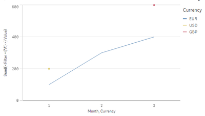
When sorting by Month and then by Currency (alphabetically), instead of getting EUR-GBP-USD, I get this chart with USD ahead of GBP:
The reason being, presumably, that GBP has no values for Months 1 or 2 whereas USD and EUR do, so they are getting sorted ahead of GBP.
I'm looking for any sort of workaround or method where the values would get sorted correctly - first by month (so the X-axis remains correct) and then by currency (alphabetically). This is a simplistic example - the actual formula used has multiple aggregations and more complex set analysis.
Solutions already attempted without success:
Move the currency to first on the sort list (breaks the sorting by months on the X axis)
Sorting the second dimension by e.g. Only({1} Currency)
Sorting by load order
Would appreciate any insights or ideas... thanks in advance!
[Edit]
Attached is the app used to generate this sample
Accepted Solutions
- Mark as New
- Bookmark
- Subscribe
- Mute
- Subscribe to RSS Feed
- Permalink
- Report Inappropriate Content
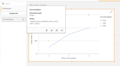
Try creating a master dimension with dual(), something like:
=Dual(Currency, Match(Currency, 'EUR', 'GBP', 'USD'))
Then use this dimension for chart coloring. You might want to set your colors in master dimension if anything specific.
Credit: Patrik Lundblad
- Mark as New
- Bookmark
- Subscribe
- Mute
- Subscribe to RSS Feed
- Permalink
- Report Inappropriate Content
@tresB Unfortunately, this doesn't help at all. This issue here isn't to set a specific order for currencies - I'm looking for a simple alphabetical sort - but to have Qlik sort them in a consistent manner that doesn't change based on the values of the actual measure.
Near as I can tell, the issue appears to be that Qlik is sorting first based on month, and since GBP has no value for Month = 1, it's getting sorted behind the other currencies. Changing the currency dimension itself doesn't seem to modify this behavior in any way, including adding dual().
- Mark as New
- Bookmark
- Subscribe
- Mute
- Subscribe to RSS Feed
- Permalink
- Report Inappropriate Content
I didn't go much deep into it. I saw :
- Mark as New
- Bookmark
- Subscribe
- Mute
- Subscribe to RSS Feed
- Permalink
- Report Inappropriate Content
@tresB I'm not sure how you arrived at that chart - using the exact formula you posted, I am not getting any change in the sort order on my end... it's still putting USD ahead of GBP. I've tried doing this both at the script level and as a master dimension and neither has resulted in any change to the sort order.
Since your object looks different than mine, perhaps this is a cross-version issue? I'm looking at this on Qlik Sense April 2020 SR11 here.
- Mark as New
- Bookmark
- Subscribe
- Mute
- Subscribe to RSS Feed
- Permalink
- Report Inappropriate Content
It seems that you are using your master dimension as second dimension. Instead, use your actual Currency as second dimension and then drag your master dimension (CurrencyDual) for just coloring it (Color By :). That should work.
- Mark as New
- Bookmark
- Subscribe
- Mute
- Subscribe to RSS Feed
- Permalink
- Report Inappropriate Content
Oops, missed that part of your response - I think it's so counter-intuitive that the sort order of a dimension would be determined by the colors option being set to a dimension that's numeric that I just didn't pick up on it.
Sadly, I'm working with Vizlib Line Chart rather than the native object, and this option doesn't seem to exist in the Vizlib extension, and it also breaks down in the more complex scenario used in my formulas and set analysis (where the values displayed are excluded by the selection and then made available through set analysis) - all the lines are showing up gray. Back to the drawing board for me... but at least now I know how to get it done with the native version and simple case. Thanks!
- Mark as New
- Bookmark
- Subscribe
- Mute
- Subscribe to RSS Feed
- Permalink
- Report Inappropriate Content
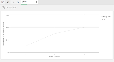
Just in case anyone comes across this again, for further information, here's what happens when a month is selected and the expression is modified with a set analysis of:
Month =
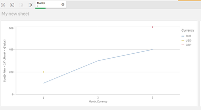
When the coloring is removed, it goes back to showing the list of currencies, but again, the order is not correct:
So this seems to be a case where the workaround applies only to a relatively simple use case but not more complex ones. Still, it is a good workaround when appropriate!


