Unlock a world of possibilities! Login now and discover the exclusive benefits awaiting you.
- Qlik Community
- :
- Forums
- :
- Analytics & AI
- :
- Products & Topics
- :
- App Development
- :
- Re: Master calendar granularity
- Subscribe to RSS Feed
- Mark Topic as New
- Mark Topic as Read
- Float this Topic for Current User
- Bookmark
- Subscribe
- Mute
- Printer Friendly Page
- Mark as New
- Bookmark
- Subscribe
- Mute
- Subscribe to RSS Feed
- Permalink
- Report Inappropriate Content
Master calendar granularity
Hi everybody,
I have found a cool tutorial on how to build a master calendar by Micheal Tarallo (Understanding the Master Calendar - Qlik Sense and QlikView - YouTube)
Its very useful, however, I'm trying to apply that concept in one of my dashboards but failing to find the right way. I have tried to build on top of the tutorial dashboard (attached) but I've observed the same behaviour. I have notice that if I pull the your PRODUCT_ID into the dashboard as a filter (that's basically what I'm trying to implement on my dashboard) the calendar doesn't really keeps doing what its suppose to (fill gaps with the empty date) when you filter it by product. Instead, it only plots the days that contains data, which is exactly what the master calendar tries to avoid.
Would anybody be so kind to share some wisdom and save me from insanity please ?
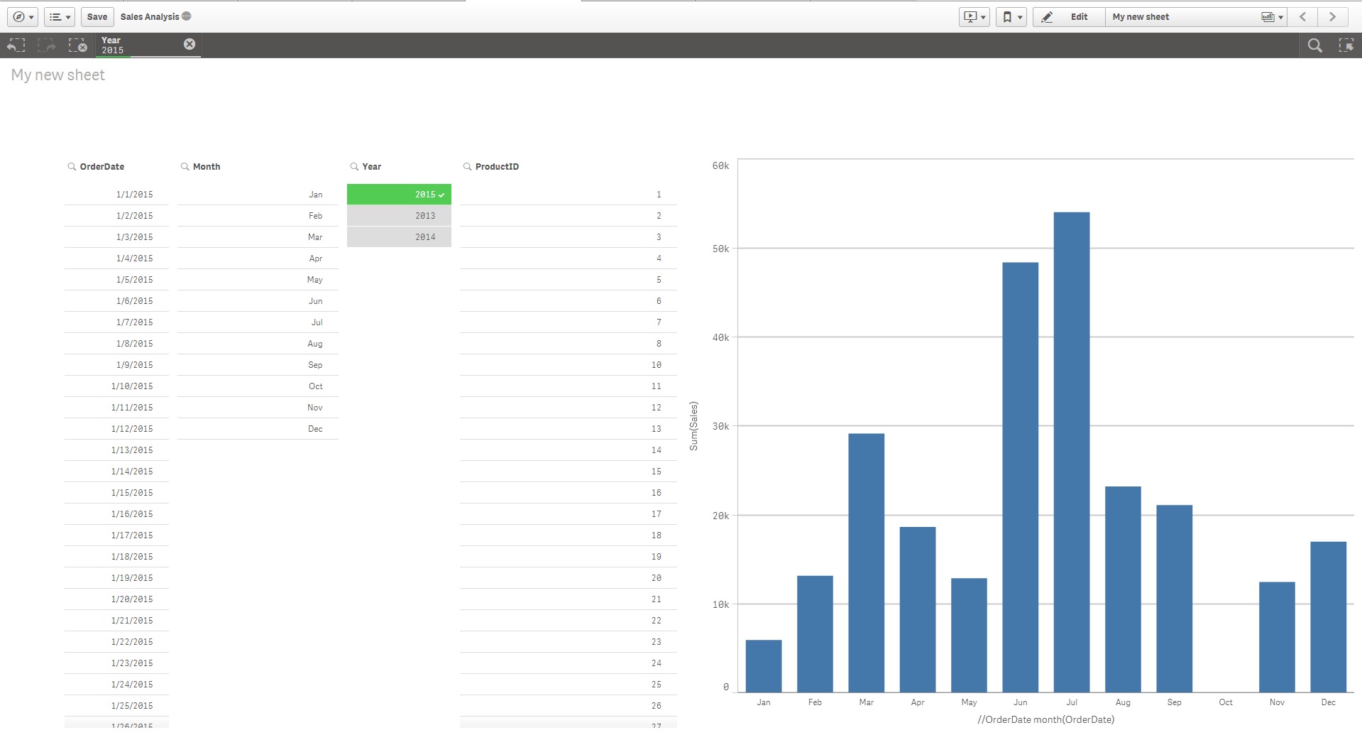
Nothing selected (oct showing blank [ GREAT ]);
Product_ID 15 selected (Gaps back into play [NO BUENO]);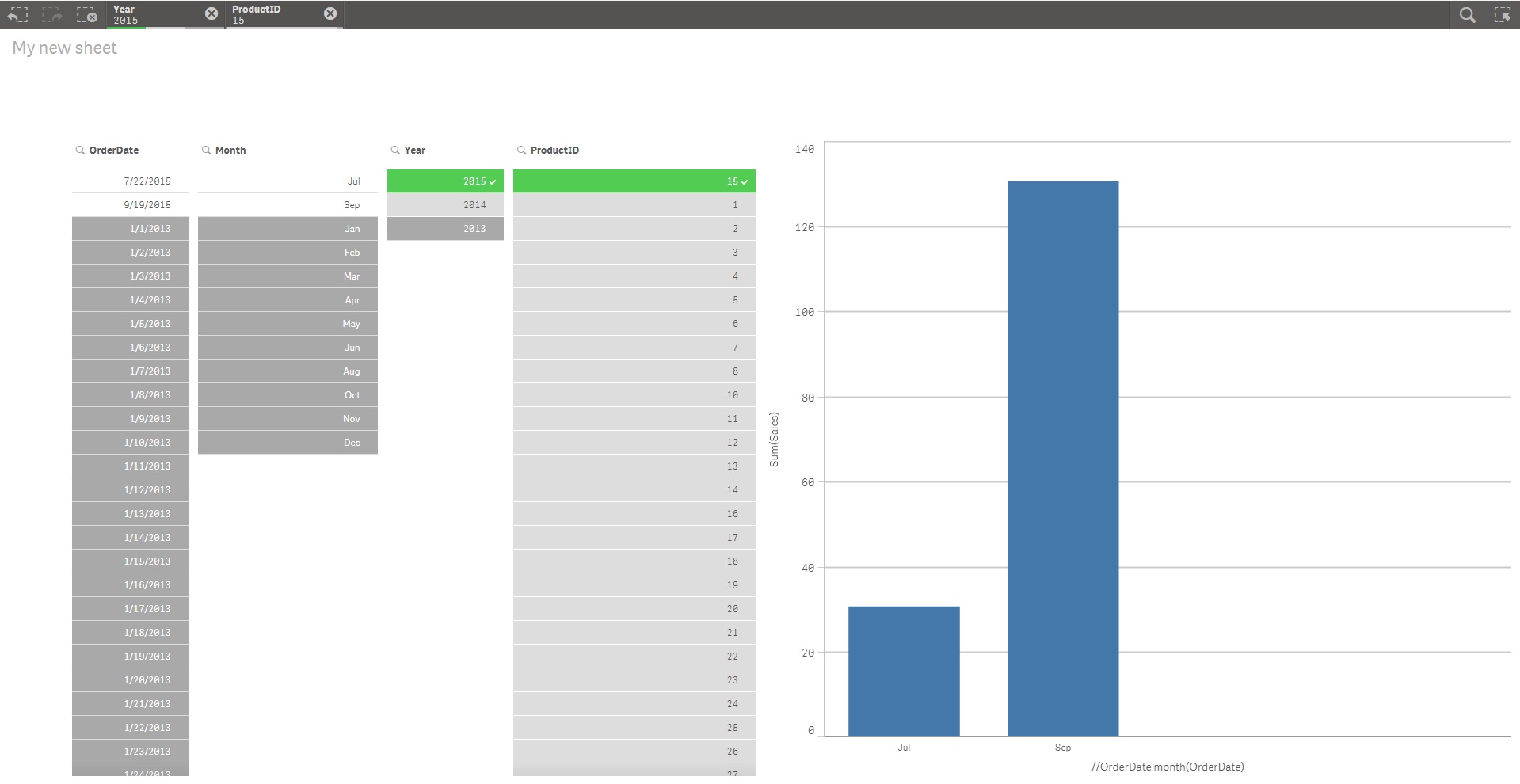
Thanks in advance
Antonio
- Tags:
- master calendar
- Mark as New
- Bookmark
- Subscribe
- Mute
- Subscribe to RSS Feed
- Permalink
- Report Inappropriate Content
Taking a look
Mike Tarallo
Qlik
- Mark as New
- Bookmark
- Subscribe
- Mute
- Subscribe to RSS Feed
- Permalink
- Report Inappropriate Content
OK I see what you are saying - when you select a ProductID for example you only see the dates where a product was sold and not a continuous axis.

This is by design - as it is associating the values that are selected - however there should be a workaround for this. Many I searched for state needing to load 0 values manually for measures that do not have a value - and then use intervalmatch() - however let me check with HIC to see if there is a better / easier way.
hic - can you assist? - When using a Master Calendar - how can you get it to fill in the missing date values when a selection occurs?
Mike Tarallo
Qlik
- Mark as New
- Bookmark
- Subscribe
- Mute
- Subscribe to RSS Feed
- Permalink
- Report Inappropriate Content
When you make a selection, some dates get excluded, and these are by default NOT shown on the x-axis. I can assure you that this is the way you want it to work in most cases - in cases where the dimension is discrete and non-numeric.
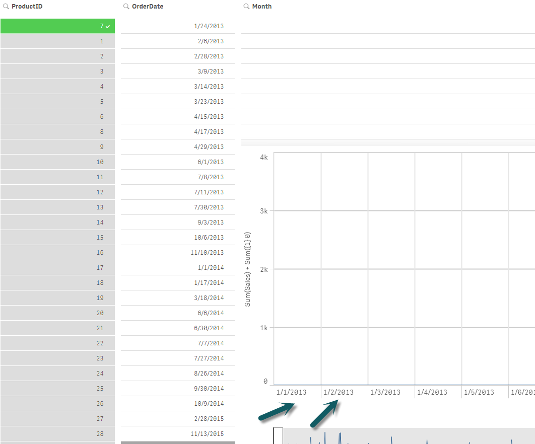
But you are right that dates are different: These are numeric and you want to show them spaced according their numeric value, so you get the proper gaps. To get this, you should check "Use Continuous Scale".
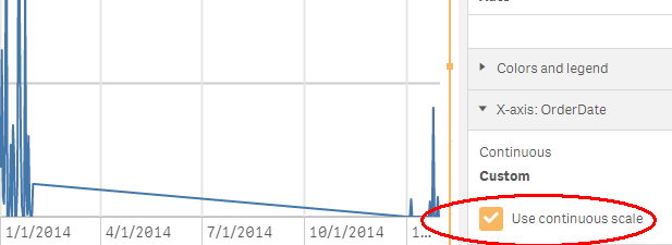
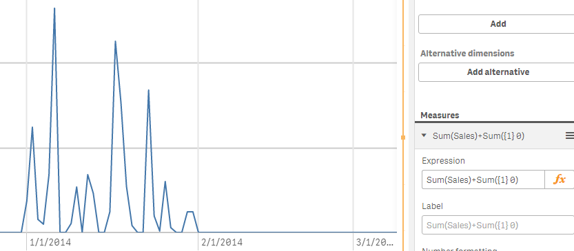
Then you will get the spacing you want. For line charts there is however one more problem: A line will be drawn straight across the gap, connecting the data points. But you most likely want the gap to be empty. For this, there is a small trick: Change the measure to Sum(Sales) + Sum({1} 0).
HIC
- Mark as New
- Bookmark
- Subscribe
- Mute
- Subscribe to RSS Feed
- Permalink
- Report Inappropriate Content
Thank you HIC - this is perfect.
I attached another sample to the post using Sum(Sales) + Sum({1} 0) as the measure:
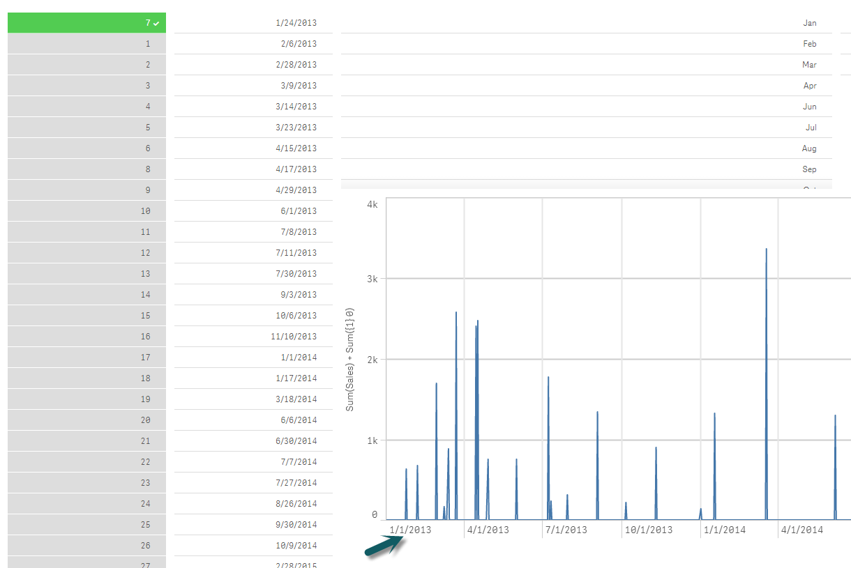
scroll with scroll wheel on mouse:
Mike Tarallo
Qlik
- Mark as New
- Bookmark
- Subscribe
- Mute
- Subscribe to RSS Feed
- Permalink
- Report Inappropriate Content
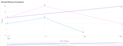
This is a good solution to getting 0 values for those missing dates however it causes the x axes to always be from the minimum date dimension to the maximum date value.
SUM(Sales) + SUM({1} 0)
Normally when you apply the filters the x axes would shrink as appropriate. Any ideas on how to get around this or can we only have 1 or the other.
- Mark as New
- Bookmark
- Subscribe
- Mute
- Subscribe to RSS Feed
- Permalink
- Report Inappropriate Content
I managed to work out a way to be able to filter on the x axes and keep 0 values where there was no data for that month.
So instead of + SUM({1}0) I used
+ SUM({1<xAxisDimension={"$(=If(IsNull(GetFieldSelections(xAxisDimension)), '*', GetFieldSelections(xAxisDimension,'","')))"}>}0).
Hope it helps someone.
