Unlock a world of possibilities! Login now and discover the exclusive benefits awaiting you.
- Qlik Community
- :
- Forums
- :
- Analytics & AI
- :
- Products & Topics
- :
- App Development
- :
- Multi KPI - icons and conditional coloring
- Subscribe to RSS Feed
- Mark Topic as New
- Mark Topic as Read
- Float this Topic for Current User
- Bookmark
- Subscribe
- Mute
- Printer Friendly Page
- Mark as New
- Bookmark
- Subscribe
- Mute
- Subscribe to RSS Feed
- Permalink
- Report Inappropriate Content
Multi KPI - icons and conditional coloring
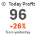
The following graphic is from the Qlik help site. Does anyone have a code sample showing how to conditionally set icons and colors?
- Mark as New
- Bookmark
- Subscribe
- Mute
- Subscribe to RSS Feed
- Permalink
- Report Inappropriate Content
this is you can achieve under each measure section
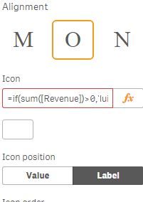
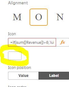
you can simply select the icon for each measure by clicking below icon
or you can give condition in set expression like if(sum([Revenue])>0,'lui-icon lui-icon--log-in', 'lui-icon lui-icon--person')
giving icon based on dimension is not possible.
- Mark as New
- Bookmark
- Subscribe
- Mute
- Subscribe to RSS Feed
- Permalink
- Report Inappropriate Content
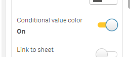
Thanks, I've got a similar issue - wondering how you do this for colours though. the image provided by Qlik seems to show conditional colours based on value - but im having trouble finding it. I saw this "conditional value colour" but it doesn't bring up an FX to enter the condition.
- Mark as New
- Bookmark
- Subscribe
- Mute
- Subscribe to RSS Feed
- Permalink
- Report Inappropriate Content
Hello, in order for this to work, you need to set the conditional colours at the Master Item (measure) level.
Cheers!
- Mark as New
- Bookmark
- Subscribe
- Mute
- Subscribe to RSS Feed
- Permalink
- Report Inappropriate Content
This is the correct solution, thanks!
- Mark as New
- Bookmark
- Subscribe
- Mute
- Subscribe to RSS Feed
- Permalink
- Report Inappropriate Content
Hello all,
I have got the same question : as someone know how they did this ? Like reduce the space between each measure ? or how they succeed to put the description of the measure at the top of the measure and at the same time at the bottom ?
Thanks a lot,
- Mark as New
- Bookmark
- Subscribe
- Mute
- Subscribe to RSS Feed
- Permalink
- Report Inappropriate Content
can anyone tell me in detail how you add the "-26%' at this size ? Is it the second row ? Can you share a sample please it would be grateful ! Thanks
- Mark as New
- Bookmark
- Subscribe
- Mute
- Subscribe to RSS Feed
- Permalink
- Report Inappropriate Content
Has anybody found how to add in the multiple KPI the lower measure and label (e.g.:"▼26%" "from yesterday") for each main measure with different font dimension and label under the value?
- Mark as New
- Bookmark
- Subscribe
- Mute
- Subscribe to RSS Feed
- Permalink
- Report Inappropriate Content
Here:
=If([value]>0, 'lui-icon lui-icon--triangle-top',' lui-icon lui-icon--triangle-bottom')


