Unlock a world of possibilities! Login now and discover the exclusive benefits awaiting you.
- Qlik Community
- :
- Forums
- :
- Analytics & AI
- :
- Products & Topics
- :
- App Development
- :
- Normalise a chart to 0-1
- Subscribe to RSS Feed
- Mark Topic as New
- Mark Topic as Read
- Float this Topic for Current User
- Bookmark
- Subscribe
- Mute
- Printer Friendly Page
- Mark as New
- Bookmark
- Subscribe
- Mute
- Subscribe to RSS Feed
- Permalink
- Report Inappropriate Content
Normalise a chart to 0-1
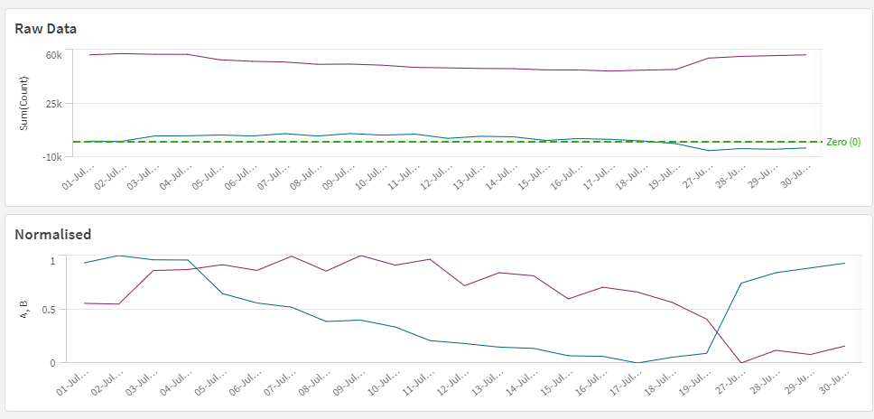
This is super easy to do in Python / Excel - but given a line chart with say a time series axis, a categorical dimension , and a range of values from negative to positive, is there an easy way to scale them?
If I have value x for example, where x ranged from - 1000 to +2000 then for the normalised scale I'd have
x' = ( x - min(x) ) / ( max(x) - min(x) )
Is there a function to do this in QlikSense that I'm missing?
Yes I can do it in load script , however it'd be more useful as a chart function as it'd work based on selection context.
- Mark as New
- Bookmark
- Subscribe
- Mute
- Subscribe to RSS Feed
- Permalink
- Report Inappropriate Content
Should be the same, but you might need to use aggr() to tell Qlik what the max and min values are aggregated by since it won't be aware of what your dimensions are otherwise.
e.g. Max(Aggr(Sum(Count),Date))
- Mark as New
- Bookmark
- Subscribe
- Mute
- Subscribe to RSS Feed
- Permalink
- Report Inappropriate Content
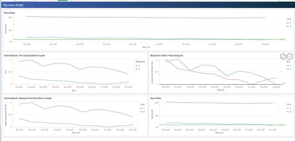
I ended up doing this for a really simple example , where the X Axis is Time Series, Y Axis is Count, and the 'Line' Dimension is the 'Bin' for the individual lines.
(
	Sum(Count)-  Min(total <Bin>   Count)

)
/
(
	Max(total <Bin>   Count) -  Min(total <Bin>   Count)
)
The bottom chart in the example does it with parameters from load script, and shows the same as the pre-calculated normalised data chart
Up top is the original data set. Ignore the fact Qlik is picking arbitrarily between colours for A and B 😄
It'd be cool to have it as a feature like the modifiers for cumulative sum etc as an option in Qlik.

