Unlock a world of possibilities! Login now and discover the exclusive benefits awaiting you.
- Qlik Community
- :
- Forums
- :
- Analytics & AI
- :
- Products & Topics
- :
- App Development
- :
- OBJECT WITH CONDITIONAL COLOR IN BACKGROUND
- Subscribe to RSS Feed
- Mark Topic as New
- Mark Topic as Read
- Float this Topic for Current User
- Bookmark
- Subscribe
- Mute
- Printer Friendly Page
- Mark as New
- Bookmark
- Subscribe
- Mute
- Subscribe to RSS Feed
- Permalink
- Report Inappropriate Content
OBJECT WITH CONDITIONAL COLOR IN BACKGROUND
Hi everybody
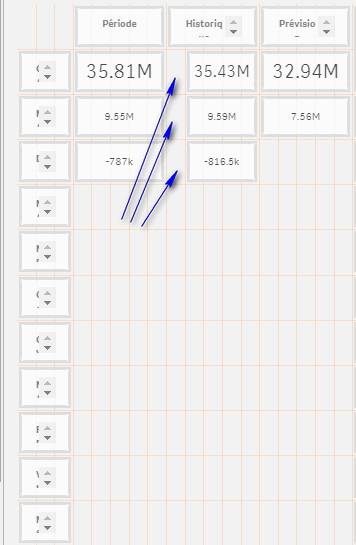
I'm creating a dashboard with several KPI and comparative values like this (i can't create a simple or pivot table with my datas model)
I just want objects in the boxes shown where i can put expression that change background in red when the value in the left < and in green when this value is >
In summary I want to create a kind of traffic light but i have no table or gauge to do that in my dashboard
Any idea ?
Maybe an extension or a KPI or a text box with special settings ?
Help will be appreciate
Regards
Philippe
Accepted Solutions
- Mark as New
- Bookmark
- Subscribe
- Mute
- Subscribe to RSS Feed
- Permalink
- Report Inappropriate Content
Hi
I found a solution to my issue
I post it in case it can be useful to someone
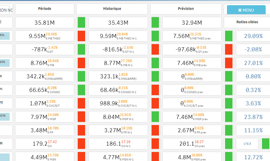
I used the extension Climber KPI
here is the result :

Regards
Philippe
- Mark as New
- Bookmark
- Subscribe
- Mute
- Subscribe to RSS Feed
- Permalink
- Report Inappropriate Content
Hi
I found a solution to my issue
I post it in case it can be useful to someone
I used the extension Climber KPI
here is the result :

Regards
Philippe