Unlock a world of possibilities! Login now and discover the exclusive benefits awaiting you.
- Qlik Community
- :
- Forums
- :
- Analytics & AI
- :
- Products & Topics
- :
- App Development
- :
- Re: Pareto chart in Sense
- Subscribe to RSS Feed
- Mark Topic as New
- Mark Topic as Read
- Float this Topic for Current User
- Bookmark
- Subscribe
- Mute
- Printer Friendly Page
- Mark as New
- Bookmark
- Subscribe
- Mute
- Subscribe to RSS Feed
- Permalink
- Report Inappropriate Content
Pareto chart in Sense
Dear Community
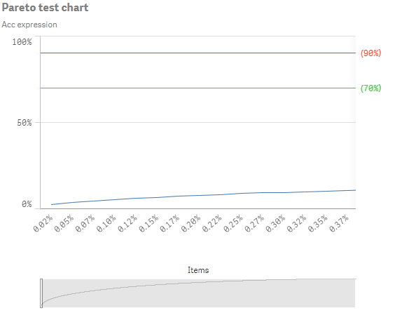
I created a Pareto chart in Sense but there is one problem.
My x-axis has more then 4,000 values (which is no problem in QV) but due to the
Responsive Web Design of Sense I couldn't find a way the show all values without the scroll bar.
Unfortunately I think there is no way yet to achieve this but if someone has an idea please share it.
Regards,
Ronny
- Mark as New
- Bookmark
- Subscribe
- Mute
- Subscribe to RSS Feed
- Permalink
- Report Inappropriate Content
Hi Ronny,
I fear you are correct at the moment. You could compress your X-axis such that there is a much smaller number of values so that it fits the real-estate you are able to make available but otherwise you could look at putting together an extension object that would do it. For examples of other extension objects take a look at branch.qlik.com if you haven't already.
Cheers,
Rod
- Mark as New
- Bookmark
- Subscribe
- Mute
- Subscribe to RSS Feed
- Permalink
- Report Inappropriate Content
Hi Rod
I already take a look at branch but didn't saw anything which could help me.
Regards,
Ronny
- Mark as New
- Bookmark
- Subscribe
- Mute
- Subscribe to RSS Feed
- Permalink
- Report Inappropriate Content
I found the "D3 Visualization library" extension from skokenes in qlik branch, which include a Line chart which not use scrolling.
But there also disadvantages like no reference lines, etc.
Looks like to create own D3 extension which fits the requirements are the only way at the moment.
Regards,
Ronny
- Mark as New
- Bookmark
- Subscribe
- Mute
- Subscribe to RSS Feed
- Permalink
- Report Inappropriate Content
Hi,
think about to put x-axis values into groups ?
0 - 5 %
5 -10%
...
- Mark as New
- Bookmark
- Subscribe
- Mute
- Subscribe to RSS Feed
- Permalink
- Report Inappropriate Content
Excellent, I was hoping you'd find something like that.
cheers,
Rod
- Mark as New
- Bookmark
- Subscribe
- Mute
- Subscribe to RSS Feed
- Permalink
- Report Inappropriate Content
Dear Xavier
thanks for your idea but I think only reducing the data points in such drastic way (from ~4,000 to ~20) isn't the best idea. Just think about the shape of the curve.
To get a correct curve, all data points necessary.
Regards,
Ronny